Trends in Mortality Differentials and Life Expectancy for Male Social Security-Covered Workers, by Socioeconomic Status
Social Security Bulletin, Vol. 67, No. 3, 2007 (released April 2008)
This article presents an analysis of trends in mortality differentials and life expectancy by socioeconomic status for male Social Security-covered workers aged 60 or older. Mortality differentials, cohort life expectancies, and period life expectancies by average relative earnings are estimated. Period life expectancy estimates for the United States are also compared with those of other Organisation for Economic Co-operation and Development (OECD) countries.
The author is with the Division of Economic Research, Office of Research, Evaluation, and Statistics, Office of Retirement and Disability Policy, Social Security Administration.
Acknowledgments: The author would like to thank Harriet Duleep, Lionel Deang, Susan Grad, Howard Iams, Bert Kestenbaum, Joyce Manchester, Linda Maxfield, David Pattison, Alice Wade, and Alvin Winters for their helpful comments and suggestions.
Contents of this publication are not copyrighted; any items may be reprinted, but citation of the Social Security Bulletin as the source is requested. The findings and conclusions presented in the Bulletin are those of the authors and do not necessarily represent the views of the Social Security Administration.
Summary
This article presents an analysis of trends in mortality differentials and life expectancy by average relative earnings for male Social Security–covered workers aged 60 or older. Because average relative earnings are measured at the peak of the earnings distribution (ages 45–55), it is assumed that they act as a rough proxy for socioeconomic status. The historical literature reviewed in this analysis generally indicates that mortality differentials by socioeconomic status have not been constant over time. For this study, time trends are examined by observing how mortality differentials by average relative earnings have been changing over 29 years of successive birth cohorts that encompass roughly the first third of the 20th century. Deaths for these birth cohorts are observed at ages 60–89 from 1972 through 2001, encompassing roughly the last third of the 20th century. The large size and long span of death observations allow for disaggregation by age and year-of-birth groups in the estimation of mortality differentials by socioeconomic status.
This study finds a difference in both the level and the rate of change in mortality improvement over time by socioeconomic status for male Social Security–covered workers. Average relative earnings (measured as the relative average positive earnings of an individual between ages 45 and 55) are used as a proxy for adult socioeconomic status. In general, for birth cohorts spanning the years 1912–1941 (or deaths spanning the years 1972–2001 at ages 60–89), the top half of the average relative earnings distribution has experienced faster mortality improvement than has the bottom half. Specifically, male Social Security–covered workers born in 1941 who had average relative earnings in the top half of the earnings distribution and who lived to age 60 would be expected to live 5.8 more years than their counterparts in the bottom half. In contrast, among male Social Security–covered workers born in 1912 who survived to age 60, those in the top half of the earnings distribution would be expected to live only 1.2 years more than those in the bottom half.
The life expectancy estimates in this article represent one possible outcome under one set of assumptions. These projections should not be regarded as an accurate depiction of the future. Specifically, this study adopts a simple projection method in which differentials are assumed to follow the pattern observed over the last 30 years of the 20th century for the first 30 years of the 21st century. This assumption lacks theoretical underpinnings because the causes of the widening differentials observed over the past 30 years have not been determined. On the one hand, if the trend of widening mortality differentials by year of birth observed over the past 30 years does not continue, the projection method used in this analysis could lead to an overestimation of future differences in life expectancy between socioeconomic groups. On the other hand, if mortality differentials do not narrow by age as observed in the past, the projection method used could lead to an underestimation of the differences in life expectancy between socioeconomic groups aged 60 or older.
Introduction
This article analyzes trends in mortality differentials and life expectancy for male Social Security–covered workers aged 60 or older, by average relative earnings group. Average relative earnings are measured as the average relative positive earnings of an individual between ages 45 and 55. Time trends are examined by observing how mortality differentials by average relative earnings have been changing over 29 years of successive birth cohorts of male Social Security–covered workers who encompass roughly the first third of the 20th century. Deaths for these birth cohorts are observed at ages 60–89 from 1972 through 2001, encompassing roughly the last third of the 20th century. Note that the sample is expected to be selectively healthier than the general population because of a requirement that men included in the sample have some positive earnings from ages 45 through 55. This requirement is expected to exclude some of the most at-risk members of the U.S. population because of the strong correlation between labor force participation and health.
A major contribution of this analysis is its use of a large, longitudinal data set in which deaths are observed over a span of 29 years. The large size and long span of death observations allow for disaggregation by age and year-of-birth groupings in the estimation of mortality differentials by socioeconomic status (as proxied by average relative earnings). This method of estimation has the advantage of avoiding linearity assumptions with regard to interactions between age, year of birth, and earnings category. In addition, life expectancy estimates, which do use a linearity assumption, still retain fairly low standard errors, again due to the unusually large size of the data set.1
From a Social Security policy perspective, differences in risk of death by socioeconomic status could have implications for the distributional outcome of policies in which longevity is an important variable. Thus, substantial heterogeneity in mortality by socioeconomic status could indicate that microsimulation modelers may wish to include differences in longevity when evaluating the distributional effects of various Social Security policy proposals. Such an inclusion would help policymakers determine whether longevity differences by socioeconomic status are large enough to have a non-negligible impact on the distributional outcome of various Social Security proposals.
Both differences in mortality differentials by socioeconomic status and trends in these differentials over time can be important in evaluating policy proposals. Mortality differentials by socioeconomic status have been documented since at least the 17th century (Antonovsky 1967). Individuals of lower socioeconomic status demonstrate greater risk of death than individuals of higher socioeconomic status. On the one hand, if the risk of death is greater for low-status individuals relative to high-status individuals but is constant across time, then these mortality differentials by socioeconomic status will show no trend over time. On the other hand, if probabilities of death for the longer-lived group decline more rapidly than for the shorter-lived group, then mortality differentials will widen over time. Conversely, if probabilities of death for the shorter-lived group decline more rapidly than for the longer-lived group, then mortality differentials will narrow over time. Mortality differentials could also narrow if probabilities of death increase for the longer-lived group while rates for the shorter-lived group decline or stagnate, or the differentials could widen if probabilities of death increase for the shorter-lived group while declining or stagnating for the longer-lived group.
The historical literature reviewed in this study generally indicates that mortality differentials by socioeconomic status have not been constant over time. If probabilities of death do not decline equally for both groups over time, then trends in average life expectancy over time can be affected by disparate group-specific rates of decline. As Keyfitz and Littman (1979, 333) point out, "In a homogeneous population the reduction [of the death rate] and the extension [of life] are equal: a drop of one per cent in the death rate is equivalent to an increase of one per cent in the expectation of life. In a heterogeneous population, on the other hand, the reduction and the extension can be very different." In addition, if declines in probabilities of death by socioeconomic groups are not constant across time, differences in patterns of heterogeneity within the populations of wealthy developed countries could complicate models that incorporate international mortality trends into U.S. forecasts.
After a literature review, the data used in this study are described, followed by a section on the methods used to analyze the data. The findings of the study are then described, followed by a brief conclusion. This study builds on many suggestions and insights made by Duleep (1989, 349) in her discussion of the potential uses of Social Security administrative data for the monitoring of mortality differentials over time. Specifically, as recommended by Duleep, this analysis uses the Continuous Work History Sample (CWHS) to measure mortality rates over time and measures mortality rates over time by earnings percentiles.
Literature
In general, the limited evidence available for the first half of the 20th century indicates that mortality differentials by socioeconomic status narrowed sometime between 1900 and the 1930s or 1940s. More recent data covering roughly the second half of the 20th century indicate that mortality differentials by socioeconomic status have generally widened from around the 1950s or 1960s through the 1990s.
For the period covering roughly the first half of the 20th century, several researchers have conducted impressive literature reviews of studies of mortality differentials by socioeconomic status (what these authors frequently refer to as social class). Antonovsky (1967) infers from an extensive review of the available empirical data that a class gap in life expectancy emerged from 1650 to 1850, when the population in the Western world was increasing rapidly. Others argue that gaps in life expectancy existed before the 17th century; most empirical evidence of class differences only goes back to the 17th century. Opinions about when inequalities in death emerged are not in agreement (Whitehead 1997, 11–12). Antonovsky finds that inequalities began to narrow between the late 1800s and 1930, so that by the 1930s and 1940s the differential between the highest- and lowest-class groups had dropped from a 2:1 ratio to 1.4:1 or 1.3:1 (Antonovsky 1967, 38, 67). Kitagawa and Hauser (1973) report that in a Chicago area study, socioeconomic differentials under age 65 narrowed from 1930 to 1940 and then widened from 1940 to 1960. At ages 65 or older, differentials widened from 1930 to 1960. Pamuk (1985, 27) reports that "class inequality in mortality among occupied and retired adult males [in England and Wales] declined in the 1920s and that inequality increased again during the 1950s and 1960s, so that, by the early 1970s it was greater than it had been in the early part of the century, both in absolute and relative terms."
Several studies in the United States have found socioeconomic mortality differentials widening since the 1960s. Feldman and others (1989, 919) studied mortality differentials by education among men aged 45–64, 65–74, and 75–84. They found that while there was little difference in mortality differentials by education for these age groups in 1960, by 1971–1984 probabilities of death had declined more for the high educated than the low educated, resulting in mortality differentials by education at these ages. Feldman and others attribute this differential decline in probabilities of death by education to differential rates of decline in deaths due to heart disease over that time period. Also of interest was that low-educated men were still at higher risk of death from heart disease than higher-educated men even after controls for cigarette smoking, systolic blood pressure, body mass index, and serum cholesterol (Feldman and others, 927). A study of British male civil servants found a similar result (Feldman and others, 928, citing Rose and Marmot 1981).
Duleep (1989) used Social Security administrative data covering the period 1973–1978 to study the change in the relationship of the mortality risk by income and education level of white men aged 25 to 64 from 1960 to the 1973–1978 period. Duleep's general conclusion was that mortality differentials by education and income had not narrowed from 1960 to the 1973–1978 period. Although Duleep does not discuss this observation in her narrative, results (Table 1, 347) are generally indicative of a slight widening of differentials over this time period. (This observation was first made by Pappas and others (1993, 107).)
Pappas and others (1993) found steeper declines in probabilities of death from 1960 to 1986 among high-educated white men than low-educated white men aged 25–64. Preston and Elo (1995) found that mortality differentials by education for white men widened at ages 25–64 and 65–74 from 1960 to the 1979–1985 period. Their study adjusted for the changing proportions of men in each education category over time. Also adjusting for the changing percentile of the population at each education level, Waldron (2004) found that mortality differentials by education widened from birth cohorts 1908 to 1931 (deaths observed in years 1973–1997) at ages 65–89 for male, retired Social Security–covered worker beneficiaries.
Outside the United States, an examination of mortality trends in socioeconomic differences in mortality from the 1981–1985 time period to the 1991–1995 period found that higher socioeconomic groups in Finland, Sweden, Norway, Denmark, England and Wales, and Italy (city of Turin only) experienced faster mortality declines than lower socioeconomic groups (Mackenbach and others 2003). Excluding the city of Turin, differential declines in cardiovascular disease mortality accounted for about half of the different rates of decline, with the remainder of the difference attributed to other causes including increasing probabilities of death for some causes. Mackenbach and others note that smoking rates have declined faster for upper socioeconomic groups in northern Europe, which may explain some of the widening differential rates of decline.
Martikainen and others (2001) studied trends in Finnish mortality declines by social class from 1971–1995 and concluded that the majority of the increases in inequality occurred in the 1980s. The authors (2001, 498) hypothesize that the introduction of new methods of treatment and prevention of cardiovascular disease benefited the upper classes more than the lower classes. They note that bypass operations were 35 percent more common among male nonmanual workers than manual workers, even though manual workers had higher morbidity (Keskimaki and others (1997), as cited in Martikainen and others (2001)). In a similar vein, White, Galen, and Chow (2003, 35) suggest that a narrowing of the mortality gap between manual and nonmanual male workers in England and Wales observed between the 1993–1996 period and the 1997–1999 period may have been due to "more equitable access to life saving procedures such as revascularization, and the effectiveness of simple treatments such as aspirin, ACE inhibitors and beta blockers given to survivors of myocardial infarction."
Socioeconomic differences in mortality due to ischemic heart disease diminished from 1971 to 1996 for urban neighborhoods in Canada, and the poorest neighborhoods (for men) experienced the greatest declines (Wilkins, Berthelot, and Ng 2002). During roughly the same time period, an area study in the United States found that male deaths attributable to cardiovascular disease declined faster from 1968 to 1998 in counties of higher socioeconomic rank (Singh and Siahpush 2002). Overall, in Canada the gap in life expectancy at birth between neighborhood income quintiles diminished between 1971 and 1996, and the probability of surviving to age 75 by income quintile remained roughly constant from 1970 to 1996.2
An area study comparing cancer survival in Toronto, Ontario, to that in Detroit, Michigan (both located on the Great Lakes) found low-income residents of Toronto experiencing greater survival rates than their counterparts in Detroit for 13 of 15 cancer sites, while middle- and high-income groups exhibited no survival difference by city of residence (Gory and others 1997). Within each city, Detroit residents exhibited a significant association between socioeconomic status and survival for 12 of 15 cancer sites, while Toronto residents exhibited no association for 12 of 15 sites. The authors note that both within-country disparities (for the United States) and between-country disparities occurred at the 1-year follow-up and then increased at the 5-year follow-up, which suggests a difference in both prognostic and treatment factors (Gory and others 1997, 1,160).3
Overall, the literature reviewed generally indicates that when mortality differentials have widened over time in the past, probabilities of death have usually fallen faster for high-status groups than for low-status groups. Preston (1996, 8–9) discusses how the discovery of the germ theory of disease in the late 1800s led to massive public health campaigns in the early 1900s on the importance of hygiene measures such as hand washing. When he compared childhood mortality by father's occupation in 1905 with that in the 1922–1924 period, the probabilities of death of professionals' children had dropped far more than the probabilities of death of laborers' children from 1905 to the 1922–1924 period. In 1895, physicians' children were very close to the national average in terms of mortality risk and 35 percent below it by 1924 (Preston 1996, 8), highlighting the fact that advancement in health practices did not affect all members of society at the same pace. Also note that mortality declined faster for higher-status individuals in spite of massive public health campaigns that were presumably targeted to all members of society.
This same pattern of public health campaigns having a greater impact on higher-status individuals was repeated in rates of smoking declines by socioeconomic status. Pampel's (2002) work on smoking diffusion describes how smoking tends to be adopted by high-status groups, spreads throughout a population, and then is eventually dropped by high-status groups when health consequences become clear, producing a widening gradient of smoking-related health problems by socioeconomic status over time.
With regard to cardiovascular disease, probabilities of death from 1980 to 2000 have generally fallen for higher-status groups more than for lower-status groups over a time period in which improvements in the treatment of cardiovascular disease occurred, a pattern observed in Finland, Sweden, Norway, Denmark, England and Wales, and the United States. However, this pattern was not observed for Canada, suggesting that these trends are not inevitable.
Given the historical evidence reviewed here, the problem for the forecaster of mortality is twofold:
- over the 20th century we have seen a period of narrowing and a period of widening of socioeconomic differentials, giving us little basis for extrapolating which way the differential will move next; and
- the length of the lags between mortality declines for high socioeconomic classes and low classes can be quite long—certainly long enough to influence mortality rates for some time into the future.
An additional problem for the forecaster is that recent research indicates that socioeconomic status in childhood can have lasting effects on adult health and that the effects of socioeconomic status on health can accumulate over the life course (Singh-Manoux and others 2004; Case, Lubotsky, and Paxson 2001; Currie and Stabile 2002; Smith and others 1997). Influences of childhood status on adult health could imply the existence of a complex cohort model in which changes in socioeconomic status over time (such as differences in real wage growth by education or skill level) could interact with the overall trend of general health improvements over the 20th century to influence the divergence of these trends by socioeconomic status. This study does not attempt to identify or disentangle these possible causal pathways.
The Data
This section discusses the death and earnings data used in the analysis. Changes in Social Security coverage over time, the composition of the sample, and the birth cohorts included in the sample are also discussed.
Death Data
The Social Security Administration's (SSA's) Continuous Work History Sample (CWHS) is a longitudinal 1 percent sample of issued Social Security numbers. The CWHS active file contains annual Social Security taxable wages from 1951 through the most recent year on the file (in this case, 2001).4 The CWHS data used for this analysis is matched to a 1 percent sample of SSA's Numident (official death) file and a 1 percent sample of SSA's Master Beneficiary Record (MBR) file.5 All three files provide death information for this study.6 To be selected for the sample used for this study, an individual must have a CWHS record and a Numident record.7 The Numident record match is required because the Numident is the primary source of death data for nonbeneficiaries, and most of the MBR's death reports are for Social Security beneficiaries. Because the sample in this study is not limited to Social Security beneficiaries, only the Numident is required for a match to the CWHS and thus inclusion in the sample used for analysis here.
Earnings Data
Earnings from ages 45 through 55 for each individual are measured relative to the national average wage that corresponds to the year the earnings are recorded in the administrative earnings records. The relative earnings are then averaged over the number of years each individual has nonzero earnings from ages 45 through 55. To avoid unintended interactions between year of birth and earnings level, the percentile of the earnings distribution in which an individual falls is based on the distribution of average nonzero relative earnings for that individual's year of birth. Zeroes are not averaged in because, over the time period that earnings are observed, the administrative earnings records do not allow one to distinguish between periods of unemployment and periods of employment with earnings not covered by Social Security. For this reason, men with no positive earnings at ages 45–55 are dropped from the sample. Approximately 15.6 percent (54,557) of men in the sample (N=294,451 or 349,008 minus 54,557) used for the cohort regression analysis are dropped because of the positive earnings requirement. Before an average of earnings from ages 45 through 55 is taken, earnings censored by the Social Security taxable maximum are imputed using a tobit regression.8
Changes in Social Security Coverage Over Time
The annual earnings observed for this analysis are Social Security taxable earnings. For earnings to be Social Security taxable they must come from employment that is covered by the Social Security Act. Since the passage of the Social Security Act in 1935, which only covered employees in industry and commerce (other than railroad workers) under age 65 (Myers 1993), coverage has been expanded many times. Specifically, laws enacted in 1939, 1946, 1950, 1951, 1954, 1956, 1960, 1965, 1967, 1972, 1977, 1983, 1984, 1986, 1987, and 1994 have contained changes to covered employment provisions of the Social Security Act (SSA 2005, Table 2.A1). For changes in Social Security coverage over time to affect the trends observed in this analysis, groups entering the pool of Social Security–covered workers over time would have to be both statistically different from the existing pool of covered workers and large enough to have an impact on observed trends. In terms of size, the biggest extensions of coverage occurred under the 1950, 1954, and 1956 acts (Myers 1993, 234).
For this reason, although annual earnings are first available in a standardized form in 1951 on the CWHS file, they are first observed in 1957 for this analysis. The reason is that jumps in coverage were empirically observed from 1951 through 1956 and are likely to be related to the changes in Social Security law that brought more workers into the Social Security program during this period. Therefore, these years are dropped because of concern that differences in composition of the sample in these years could confuse the interpretation of the mortality trends.
Note, however, that several groups that were still not covered under Social Security after 1957 were then subsequently covered in later years. The biggest of these groups are probably self-employed physicians (covered by the 1965 act), newly hired employees of nonprofit organizations (covered by the 1983 act), and federal employees newly hired after 1983 (covered by the 1983 act).9 In addition, some categories of workers are only covered if their earnings meet a statutory threshold amount. Because these threshold amounts have generally not been adjusted for wage growth over time, an increasing percentage of the workforce in these categories has moved into compulsory coverage over time. Most notably, the nonfarm self-employed must have earnings of at least $400 to be deemed self-employed and thus covered by Social Security.10 Because this amount was set in the 1951 act, a rising proportion of the self-employed have become statutorily covered over time. In addition, farm workers and domestic workers are subject to dollar thresholds that have resulted in de facto extensions of coverage over time.11 A further caveat is that statutory coverage and actual compliance are not always equivalent. Traditionally, compliance has been somewhat lower for domestic workers, farm workers, and the self-employed (Myers 1993, 34). Because this analysis is focused on trends over time, an additional concern could be the potential for changes in compliance in response to changes in enforcement.
A definitive determination of whether these changes in coverage over time are powerful enough to affect this analysis requires an extensive empirical study of the size and characteristics of formerly excluded groups. However, one could speculate that certain excluded groups could be expected to have higher earnings than average and that other groups could be expected to have lower earnings than average. Those with higher earnings would probably include self-employed physicians, and those with lower earnings would probably include self-employed workers with earnings below the $400 threshold, domestic workers, and farm workers. If newly covered high-earning groups have a propensity to have longer lives than those high earners already in the covered worker pool or if newly covered low-earning groups have a propensity to have shorter lives than those low earners already in the pool of covered workers, then trends in mortality differentials over time could be reflecting a shift in the composition of that pool over time. To test this hypothetical possibility, self-employment earnings were set to zero, so that changes in self-employment coverage over time were effectively neutralized. In practice, this adjustment was equivalent to limiting the analysis to wage and salary earnings only and had the effect of eliminating some, but not all, of the potential problem groups. Trends in mortality differentials over time were not found to change with this sample restriction.
Sample Composition
The sample used for this analysis is not representative of the U.S. population. The sample is expected to be selectively healthier than the general population because of the requirement that men have some positive earnings from ages 45 through 55 to be included in the sample.12 This requirement is expected to exclude some of the most at-risk members of the U.S. population because of the strong correlation between labor force participation and health.13 For an idea of the magnitude of the correlation between labor force participation and health, note that Rogot and others (1992) found that life expectancy at age 45 was 9 years lower for white men who were not participating in the labor force compared with those who were participating at that age.
In addition, some men may have low observable covered earnings and higher unobservable non–Social Security–covered earnings. These men would be misclassified as low earners in the data. It is unclear how many men are in this group, but their presence would push the mortality risk of low earners downward.
For these reasons, the results in this article may underestimate the mortality risk of men in the lowest socioeconomic group, particularly if one attempts to extrapolate these results to the entire U.S. population.
Birth Cohorts
This analysis includes birth cohorts 1912–1941. Year of birth 1912 is the earliest cohort observed because men born in 1912 were aged 45 in 1957, the first year of earnings data used in this analysis. Year of birth 1941 is the latest cohort observed because men born in 1941 were aged 60 in 2001, the last year of death data observed in this analysis. This analysis is focused on trends in mortality at older ages; thus age 60 is selected as the youngest age of death to be observed. Age 89 is the oldest age of death observed because the 1912 birth cohort was aged 89 in 2001. Future work will examine probabilities of death at younger ages.
Methods
This section discusses the methods used to produce the findings presented in this article.
Mortality Differentials, Cohort Life Expectancies, and Period Life Expectancies
The data are used to create three different but related types of estimates. First, estimates of mortality differentials disaggregated by age and year of birth over the period covered by the data are constructed. Similar but less disaggregated estimates are then extrapolated to give estimated cohort life expectancies by birth cohort and earnings. Finally, a set of period life expectancies, more finely divided by earnings than the first estimates, is constructed to allow comparison of U.S. period expectancies with estimates from other countries.
Mortality differentials measure relative differences in the timing of death between different groups. Probabilities of death for persons still alive at each particular age are used to calculate life expectancy. The major difference between the two measures is that differentials measure the mortality risk of one group relative to that of another group, whereas probabilities of death (qx in a life table) measure the level of mortality a particular group has experienced. Probabilities of death are needed to convert mortality differentials into life expectancy differences between groups, because life expectancy is a measure of remaining years of life—that is, the average length (level) of survival a particular group can be expected to experience.
Difference Between Cohort and Period Life Expectancies. This analysis presents cohort and period life expectancy estimates. A period life table is a snapshot of a population's mortality experience at a point in time. For example, a period life table for 2000 would include the probability of death for 1-year-olds in 2000 (who were born in 1999), the probability of death for 45-year-olds in 2000 (who were born in 1955), and the probability of death for 90-year-olds in 2000 (who were born in 1910). In contrast, a cohort life table follows individuals born in the same year over time. For example, a cohort table for the 2000 birth cohort would include the probability of death for 1-year-olds in 2001, the probability of death for 45-year-olds in 2045, and the probability of death for 90-year-olds in 2090. The difference between period and cohort tables is briefly illustrated below.
| Age | Year of probability of death (qx) |
Year of birth |
|---|---|---|
| Period table | ||
| 1 | 2000 | 1999 |
| 45 | 2000 | 1955 |
| 90 | 2000 | 1910 |
| Cohort table | ||
| 1 | 2001 | 2000 |
| 45 | 2045 | 2000 |
| 90 | 2090 | 2000 |
| SOURCE: Author's calculations. | ||
Because of expected improvements in mortality rates over time, the life expectancy estimated for the 2000 birth cohort will be higher than the period life expectancy estimated in 2000. However, the life expectancy estimated for the 2000 birth cohort is more uncertain, because it is almost entirely based on projections rather than on the currently observed data used in constructing the 2000 period life table.
Sample Frailty. Logically, a baby born in 2000 would be expected to have a higher probability of surviving to age 1 than a baby born in 1900 because of improvements in nutrition, medical care, and living conditions over the 20th century. For similar reasons, an individual aged 85 in 2015 (born in 1930) would be expected to have a higher probability of surviving to age 86 than an individual aged 85 in 1985 (born in 1900), because the individual born later has the potential to have benefited from an additional 30 years of possible improvements in medical care and health practices.
However, the comparison of two 85-years-olds born 30 years apart is more ambiguous than the comparison of infants born 30 years apart because the sample of individuals who survive to age 85 in both cases has been subject to mortality risk from birth to age 85. Because this mortality risk occurred earlier in history for the 1900 birth cohort than for the 1930 birth cohort, the 1900 birth cohort faced higher probabilities of death at the ages between birth and 85. Thus, individuals surviving to age 85 in 1985 may have been more robust than individuals surviving to age 85 in 2015, because it was more difficult to survive to age 85 for the former group. As a result, the proportion of mortality improvement at age 85 for the 1900 birth cohort attributable to the proportion of robust individuals still alive at age 85 may be difficult to separate from the proportion of improvement attributable to other causes. Conversely, higher frailty among the age 85 population in 2015 (due to a greater probability of survival to age 85 for the whole population) could cause probabilities of death to be higher in 2015 than in 1985 for this age group, depending on whether overall mortality improvement at age 85 was large enough to overcome the decreased robustness (increased frailty) of the sample. Vaupel and Yashin (1985, 182) make a similar point.
This analysis makes no attempt to control for changes in the frailty of the sample over time. Therefore, the magnitude of sample frailty as a contributing factor to trends in mortality differentials by average relative earnings is unknown. Because changes in sample frailty are not eliminated as a possible cause of mortality trends by average relative earnings groups in this analysis, the qualitative interpretation of the results reported here is ambiguous. Theoretically, if more frail members of lower-earnings groups are making it into the sample at older ages than in the past, then they could push up mortality differentials relative to the past. Hypothetically, it is possible that widening mortality differentials can indicate improvement for the lower-earnings groups, if such widening is an indication of their survival in greater numbers to ages at which previously only the strongest amongst them survived. Vaupel, Manton, and Stallard (1979) discuss in greater detail the idea that heterogeneity can sometimes lead to underestimates of mortality declines. The authors (1979, 449) also note that because future populations will tend to be frailer than current populations due to reductions in probabilities of death by age, future mortality rates could rise unless future progress in mortality reduction counteracts the greater frailty present in the sample over time.
Regression Model
The model used to estimate mortality risk in this analysis is a discrete-time logistic regression, which is a type of survival model. Because survival time is measured in years for this analysis, the data include a large number of ties (that is, two or more events appearing to happen at the same time).14 The discrete-time logistic regression model is equivalent to the discrete-time proportional odds model proposed by Cox when there are many ties in the data (Allison 1995, 212). The model employs the simplifying assumption that events (deaths) occur at discrete times.15 The discrete-time logistic regression model allows for the incorporation of time-dependent variables, which for this analysis means that both age and year of birth can be included in the same regression, with age being measured as a time-dependent variable measured from the point of initial measurement until death or censoring.
Waldron (2002) compared the discrete-time logistic regression survival model used here with a complementary log-log model for continuous time. The complementary log-log model estimates an underlying Cox proportional hazards model for continuous time (Allison 1995, 212).16 The parameter estimates and standard errors were found to be very similar between the computationally complex complementary log-log model and the more computationally efficient discrete-time logit model.
The data are set up similarly for the estimates of mortality differentials and cohort life expectancies produced in this study. The data for the estimates of period life expectancies are set up somewhat differently and are discussed when the period estimates are presented.
Specifically, for estimates of mortality differentials that are used to calculate cohort life expectancies, observations begin in the year the individual turns age 60 and end in the earlier of the year of death or the end of the observation period (2001). The dependent variable is equal to 1 in the year the worker dies and 0 in every year the worker survives. Counting all annual observations for the 294,451 individuals in the sample, there are 110,088 person-years in which a worker died and 3,356,700 person-years in which a worker survived, for a total of 3,466,788 pooled observations. The model measures the logit or log-odds of dying on these 3,466,788 pooled observations using the maximum likelihood method of estimation.17
The Regression Equation for Cohort Life Expectancy Estimates. The regression equation form is as follows: dead (coded as 1 or 0) = intercept + β1(age) + β2(year of birth) + β3(age*year of birth) + β4(earnings dummy) + β5(age*earnings dummy) + β6(year of birth*earnings dummy) + β7(age*year of birth*earnings dummy) + error term. As discussed previously, this equation is estimated as a discrete-time logistic regression. The earnings dummy equals 1 if an individual's average nonzero relative earnings from age 45 to age 55 are in the bottom half of the earnings distribution for that individual's year of birth, and the earnings dummy equals 0 if an individual's average nonzero relative earnings from age 45 to age 55 are in the top half of the earnings distribution for that individual's year of birth.
The probability of death by age, year of birth, and earnings position or qx is calculated from the parameter estimates of the model. Life expectancy values are then calculated from qx values using the standard formulas for constructing a life table as described in Bell and Miller (2005). Probabilities of death are calculated from the regression coefficients for ages 60–89. After age 89, probabilities of death are grown by the rate of growth of the probabilities of death by age and year of birth projected by SSA's Office of the Chief Actuary (OCACT) based on the intermediate assumptions of the 2004 Trustees Report. Confidence intervals for the life expectancy estimates are estimated by a Monte Carlo simulation that takes 1,000 random draws from a multivariate normal distribution using the variance-covariance matrix and parameter estimates of the regression model.
The Regression Equation for Estimates of Mortality Differentials. For estimates of mortality differentials by small age and year-of-birth groupings, a similar setup is used. For example, to estimate mortality differentials for ages 60–64, observations begin in the year the individual turns age 60 and end in the earlier of the year of death or the year the individual turns age 64. The data are pooled in the same manner as described above. The regression equation form is as follows: dead (coded as 1 or 0) = intercept + β1(age) + β2(earnings dummy) + error term. The earnings dummy is identical to the one described in the previous section. A separate regression is run for each small age and year-of-birth grouping, so year of birth is not estimated separately from age and no interactions with earnings are modeled. Sample counts and detailed regression results are shown in the Appendix.
Findings
Estimates of mortality differentials over time and cohort and period life expectancies by earnings categories are presented here.
Mortality Differentials Over Time
This section examines how mortality differentials by average relative earnings category have changed over time. To estimate mortality differentials, the sample is broken into small age and year-of-birth groupings, and a regression is estimated for each group separately. This method of estimation has the advantage of avoiding linearity assumptions with regard to interactions between age, year of birth, and earnings category.18 As is evident from the wide confidence intervals in Table 1, however, small age and year-of-birth groupings create more imprecise point estimates. Thus, one should keep in mind that the general pattern of the numbers in the table is more informative than a particular odds ratio reported in a particular cell.
| Year of birth | 60–64 | 65–69 | 70–74 | 75–79 | 80–84 | 85–89 |
|---|---|---|---|---|---|---|
| 1912–1915 | 1.27 (1.19–1.35) * |
1.24 (1.17–1.31) * |
1.20 (1.13–1.26) * |
1.13 (1.07–1.19) * |
1.09 (1.03–1.15) * |
0.94 (0.88–1.00) ** |
| 1916–1919 | 1.51 (1.42–1.62) * |
1.36 (1.29–1.44) * |
1.34 (1.27–1.41) * |
1.20 (1.14–1.27) * |
1.05 (0.99–1.11) |
. . . |
| 1920–1923 | 1.50 (1.40–1.60) * |
1.40 (1.32–1.48) * |
1.34 (1.27–1.41) * |
1.31 (1.24–1.38) * |
. . . | . . . |
| 1924–1927 | 1.51 (1.41–1.62) * |
1.53 (1.44–1.63) * |
1.48 (1.41–1.57) * |
. . . | . . . | . . . |
| 1928–1931 | 1.71 (1.59–1.84) * |
1.61 (1.51–1.71) * |
. . . | . . . | . . . | . . . |
| 1932–1935 | 1.75 (1.62–1.89) * |
1.73 (1.59–1.88) * |
. . . | . . . | . . . | . . . |
| 1936–1938 | 1.84 (1.68–2.03) * |
. . . | . . . | . . . | . . . | . . . |
| SOURCE: Author's calculations on a matched 2001 Continuous Work History Sample. | ||||||
| NOTES: Confidence intervals are shown in parentheses. | ||||||
| For regressions for each age and year-of-birth group cell, dead (coded as 1 or 0) = intercept + B1(age) + B2(earnings dummy) + error term. Earnings dummy = 1 if average nonzero relative lifetime earnings are in the bottom half of the earnings distribution. | ||||||
| The odds ratios displayed in the table represent the odds of death for the bottom half of the earnings distribution relative to the top half of the earnings distribution for each cell. | ||||||
| * = standard error significant at the 1 percent level; ** = standard error significant at the 10 percent level. | ||||||
In Table 1, the odds ratios measure the odds of dying for male Social Security–covered workers in the bottom half of the average relative earnings distribution, relative to male Social Security–covered workers in the top half of the average relative earnings distribution.19 By reading down the columns by age grouping, one can observe that the greater odds of dying for men in the bottom half of the distribution have widened over time, particularly at ages 60–74. For example, at ages 60–64 the odds of dying for male Social Security–covered workers born early in the 20th century in the bottom half of the earnings distribution were 27 percent greater than for men in the top half of the earnings distribution. By birth years 1936–1938, the odds of dying were 84 percent greater for male Social Security–covered workers in the bottom half of the distribution relative to men in the top half, an increase of 57 percentage points.
By reading across the rows by years of birth groupings, one can observe a narrowing of the mortality differentials by age for birth cohorts 1912–1923. For example, for years of birth 1916–1919, the odds of dying for male Social Security–covered workers in the bottom half of the earnings distribution were 51 percent greater than for men in the top half at ages 60–64 and were statistically indistinguishable by ages 80–84.
The cells in the table that are not filled out help highlight the difficulty in separating age effects from cohort or period effects. By reading down the columns by age grouping, one can observe that younger ages include more birth cohorts than older ages. Thus, the difference in magnitude by age of the trend over time for the mortality differentials by earnings category could be attributed to either the biological age at which the differential is measured or the presence of younger birth cohorts in the sample at younger ages. Suppose that one simply assumes that the increased widening is caused by a cohort or period effect rather than a biological age effect. The matter still is not settled. One still does not know how much of the widening of the mortality differentials over time is attributable to changes in sample frailty as opposed to changes in the rate of change of mortality improvement over time, independent of changes in sample frailty. If the widening of the mortality differentials over time is due to less robust members of a population living to the ages observed in the sample than in the past, then the widening could represent progress for members of these less robust populations, relative to the past. Because we cannot observe frail members at older ages in the sample (they are already dead), we may not be estimating the true starting level of their life expectancy at the beginning of the sample period. It is therefore possible that sample frailty could cause one to underestimate the rate of improvement for less robust subpopulations over time. For this reason, this analysis should be regarded as a preliminary empirical look at the data. Future work on a model that incorporates sample frailty may contribute more knowledge to the appropriate qualitative interpretation of these results.
Nevertheless, given these caveats, these data indicate that the mortality risk differentials were not constant over time (where time is defined as a change over successive birth cohorts, observed by reading down the rows of Table 1), but rather have widened. Thus, setting aside the important caveat about sample frailty discussed above, a difference in both the level and the rate of change in mortality improvement over time has occurred at ages 60–79.
Cohort Life Expectancy Estimates by Earnings Category
In this article, the empirical estimates of mortality differentials by earnings group, age, and year of birth are the most certain, because these estimates are based purely on observed data. However, to create cohort life expectancies, mortality differentials by earnings group must be projected into the future. Because the causal pathways by which mortality varies with socioeconomic status are still under investigation in the literature, projections of these mortality differentials by earnings category involves a level of uncertainty greater than that associated with projections of events for which underlying causal relationships are known. Therefore, it is important to keep in mind that these cohort life expectancies represent a hypothetical possibility; many other life expectancy trajectories by earnings group are possible, and all of them depend on the path that mortality differentials by earnings take in the future.
Parameter estimates from the regression model used to estimate cohort life expectancies are converted into probabilities of death as described in the Methods section. To use probabilities of death to estimate cohort life expectancies, projections of probabilities of death are required. This is because as year of birth increases, the age at which an actual probability of death for the cohort can be observed decreases. For example, the 1941 birth cohort was only age 60 in 2001. Therefore, probabilities of death beyond age 60 must be projected for this birth cohort. In general, probabilities of death are lower for people born later in the 20th century than for people born earlier in the 20th century, because of improvements in medicine and health practices during that time period. Probabilities of death are also higher at older ages than at younger ages because the risk of death generally increases with biological age.
By estimating cohort life expectancies, one can study whether life expectancy levels can be expected to improve at different speeds for different earnings groups. Different rates of life expectancy improvement for different earnings groups could suggest that general improvements in medicine and health practices do not necessarily affect individuals of differing socioeconomic status equally. To capture such an interaction, the probability of death is modeled as being a function of age, year of birth, earnings group, and a three-way interaction of the former three variables. Note that this method is slightly different from the method used to estimate the mortality differentials reported previously. The previous method broke the sample into small age and year-of-birth groupings and estimated a regression for each group separately. This method groups all the ages and years of birth together and estimates a single regression in which the interactions between age, year of birth, and earnings are forced to be linear. The loss of detail involved in the linearity assumption was made to reduce standard errors. Without sample consolidation, probability of death levels tend to be more volatile, most likely because of the reduction in the number of death observations in each individual regression.
Because older birth cohorts are observed at older ages in the data than are younger birth cohorts, by necessity, the number of years over which life expectancy is projected increases by birth cohort. As indicated in Table 2, the 1913 birth cohort's mortality differentials by earnings group are observed at ages 60–88, while the 1941 birth cohort's differentials are only observed at age 60. Thus, life expectancy is projected from the parameter estimates of the regression model for 2002 for the 1913 birth cohort and for 2002–2030 for the 1941 birth cohort. At ages 90–119, probabilities of death for all birth cohorts are grown by the rate of growth of the probabilities of death by age and year of birth projected by SSA's Office of the Chief Actuary, based on the intermediate assumptions of the 2004 Trustees Report.
| Year of birth | Age(s) death observed |
Period(s) death observed |
Period(s) earnings observed |
Period(s) death projected a |
|---|---|---|---|---|
| 1912 | 60–89 | 1972–2001 | 1957–1967 | None |
| 1913 | 60–88 | 1973–2001 | 1958–1968 | 2002 |
| 1920 | 60–81 | 1980–2001 | 1965–1975 | 2002–2009 |
| 1930 | 60–71 | 1990–2001 | 1975–1985 | 2002–2019 |
| 1941 | 60 | 2001 | 1986–1996 | 2002–2030 |
| SOURCE: Author's calculations. | ||||
| a. The years in this chart represent the years over which deaths are projected from the parameter estimates of the regression. All cohort life expectancies include projections from age 90 through age 119. See the methodology section for more details. | ||||
Recall that the regression model used to create the parameter estimates used for projections of probabilities of death from ages 60–89 is a discrete-time logistic regression model in the following form: dead (coded as 1 or 0) = intercept + β1(age) + β2(year of birth) + β3(age*year of birth) + β4(earnings dummy) + β5(age*earnings dummy) + β6(year of birth*earnings dummy) + β7(age*year of birth*earnings dummy) + error term. The three-way interaction between age, year of birth, and the earnings dummy means that the projected probabilities of death include the narrowing of mortality differentials by age and the widening of mortality differentials by year of birth observed over the past 30 years.
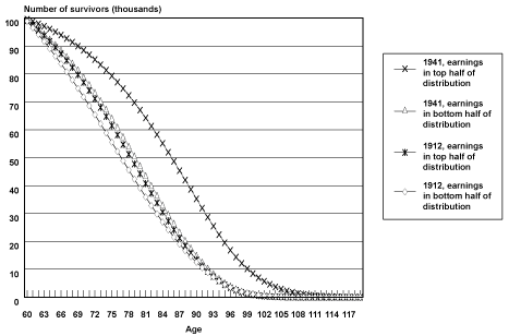
Projected Cohort Survival Curves. Chart 1 illustrates survival curves (calculated from probabilities of death by age, birth cohort, and earnings position) for the oldest and youngest birth cohorts observed in the sample, by earnings group. When analyzing the survival curves it is important to remember that they incorporate the projections and accompanying assumptions described above.
Selected cohort survival curves for male Social Security-covered workers, by age and earnings group
| Age | 1912, earnings in bottom half of distribution |
1912, earnings in top half of distribution |
1941, earnings in bottom half of distribution |
1941, earnings in top half of distribution |
|---|---|---|---|---|
| 60 | 98.872400 | 99.174300 | 99.268300 | 99.626800 |
| 61 | 96.569900 | 97.470200 | 97.754400 | 98.850200 |
| 62 | 94.172600 | 95.658900 | 96.136900 | 98.011100 |
| 63 | 91.680700 | 93.736500 | 94.411200 | 97.105100 |
| 64 | 89.095200 | 91.699700 | 92.573000 | 96.127700 |
| 65 | 86.417600 | 89.545400 | 90.618100 | 95.074200 |
| 66 | 83.650400 | 87.271500 | 88.543000 | 93.939900 |
| 67 | 80.796700 | 84.876300 | 86.344600 | 92.719900 |
| 68 | 77.860600 | 82.359000 | 84.020600 | 91.409100 |
| 69 | 74.847100 | 79.720000 | 81.569500 | 90.002700 |
| 70 | 71.762300 | 76.960800 | 78.991000 | 88.495700 |
| 71 | 68.613300 | 74.084200 | 76.285700 | 86.883400 |
| 72 | 65.408300 | 71.094300 | 73.455700 | 85.161200 |
| 73 | 62.156500 | 67.997300 | 70.505000 | 83.325000 |
| 74 | 58.868400 | 64.800800 | 67.438800 | 81.370900 |
| 75 | 55.555500 | 61.514400 | 64.264700 | 79.295700 |
| 76 | 52.230100 | 58.149900 | 60.992200 | 77.097100 |
| 77 | 48.905800 | 54.721000 | 57.633000 | 74.773400 |
| 78 | 45.596700 | 51.243500 | 54.201200 | 72.324200 |
| 79 | 42.317900 | 47.735200 | 50.713000 | 69.750200 |
| 80 | 39.084800 | 44.215800 | 47.187300 | 67.053800 |
| 81 | 35.913200 | 40.706900 | 43.645000 | 64.238900 |
| 82 | 32.818800 | 37.231400 | 40.108700 | 61.311300 |
| 83 | 29.817400 | 33.813000 | 36.603200 | 58.278900 |
| 84 | 26.924000 | 30.476500 | 33.154100 | 55.151900 |
| 85 | 24.152900 | 27.246200 | 29.788000 | 51.942800 |
| 86 | 21.517400 | 24.146100 | 26.531400 | 48.666500 |
| 87 | 19.029100 | 21.198800 | 23.410200 | 45.340600 |
| 88 | 16.698100 | 18.424800 | 20.448900 | 41.984700 |
| 89 | 14.532300 | 15.842000 | 17.669500 | 38.621000 |
| 90 | 12.506100 | 13.440600 | 15.072600 | 35.261500 |
| 91 | 10.600700 | 11.214300 | 12.663200 | 31.925200 |
| 92 | 8.836800 | 9.185790 | 10.467600 | 28.648500 |
| 93 | 7.234530 | 7.375200 | 8.503600 | 25.466300 |
| 94 | 5.810420 | 5.796990 | 6.780560 | 22.411100 |
| 95 | 4.575180 | 4.457320 | 5.302780 | 19.519100 |
| 96 | 3.532060 | 3.352590 | 4.067800 | 16.827600 |
| 97 | 2.674470 | 2.467700 | 3.062110 | 14.364600 |
| 98 | 1.987800 | 1.778920 | 2.263770 | 12.147600 |
| 99 | 1.451900 | 1.257550 | 1.645550 | 10.184000 |
| 100 | 1.042640 | 0.872192 | 1.176630 | 8.466170 |
| 101 | 0.735501 | 0.592887 | 0.826746 | 6.975820 |
| 102 | 0.509169 | 0.394556 | 0.570206 | 5.694270 |
| 103 | 0.345546 | 0.256728 | 0.385570 | 4.602520 |
| 104 | 0.229617 | 0.163102 | 0.255287 | 3.681580 |
| 105 | 0.149207 | 0.101016 | 0.165271 | 2.912770 |
| 106 | 0.094676 | 0.060887 | 0.104457 | 2.277930 |
| 107 | 0.058570 | 0.035649 | 0.064346 | 1.759760 |
| 108 | 0.035264 | 0.020231 | 0.038561 | 1.341960 |
| 109 | 0.020625 | 0.011103 | 0.022436 | 1.009430 |
| 110 | 0.011693 | 0.005877 | 0.012645 | 0.748359 |
| 111 | 0.006410 | 0.002992 | 0.006886 | 0.546341 |
| 112 | 0.003390 | 0.001460 | 0.003614 | 0.392402 |
| 113 | 0.001724 | 0.000680 | 0.001821 | 0.276998 |
| 114 | 0.000840 | 0.000301 | 0.000879 | 0.191966 |
| 115 | 0.000391 | 0.000126 | 0.000404 | 0.130454 |
| 116 | 0.000173 | 0.000050 | 0.000176 | 0.086818 |
| 117 | 0.000072 | 0.000018 | 0.000073 | 0.056506 |
| 118 | 0.000028 | 0.000006 | 0.000028 | 0.035912 |
| 119 | 0.000010 | 0.000002 | 0.000010 | 0.022251 |
In Chart 1, all birth cohort groups start out with 100,000 members at age 60. As members of each group age and die, the number of survivors falls, until almost no one is left at age 100 and beyond. The chart helps illustrate differences in both the change in rates of survival improvement over time between the earnings groups and in differences in the age to which a typical member of a group is likely to survive.
One way of understanding these differences is to compare the first age at which each group has less than half its members alive. In Table 3, the age at which less than half of male Social Security–covered workers in the bottom half of the earnings group were alive was 77 for the 1912 birth cohort and 80 for the 1941 birth cohort. The comparable ages for the top half of the earnings distribution were 79 for the 1912 birth cohort and 86 for the 1941 birth cohort. Thus, the age to which less than half the group is projected to survive increases by 3 years from birth year 1912 to birth year 1941 for the bottom half of the distribution and by 7 years for the top half of the distribution. This can be observed in Chart 1 as a greater shift outward in the survival curve for male Social Security–covered workers in the top half of the earnings distribution compared with men in the bottom half of the earnings distribution. The difference in levels between the two groups is also striking; by birth year 1941, the bottom half of the distribution is not projected to reach the survival age projected to be attained by the top half of the distribution by birth year 1922.
| Earnings group | 1912 | 1922 | 1932 | 1941 |
|---|---|---|---|---|
| Age for bottom half of distribution | 77 | 78 | 79 | 80 |
| Age for top half of distribution | 79 | 81 | 84 | 86 |
| SOURCE: Author's calculations using a matched 2001 Continuous Work History Sample. | ||||
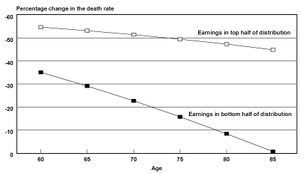
Projected Probabilities of Death by Age. Another way of understanding how the survival experience of the two groups has diverged over time is to examine how probabilities of death by age are projected to change over time for those groups. Chart 2 shows the projected percentage decrease in probabilities of death by age from birth year 1912 to birth year 1941. In general, probabilities of death for male Social Security–covered workers in the top half of the distribution are projected to be cut in half fairly evenly over the age range of the 29 birth cohorts studied. In contrast, the reduction of probabilities of death for men in the bottom half of the distribution are not projected to be even across the age range. Instead, the extent to which the bottom half lags behind the top half in mortality reduction increases as one moves up the age range.
Percentage change in the death rate for male Social Security-covered workers, by selected age and earnings group from birth years 1912–1941
| Age | Earnings in bottom half of distribution |
Earnings in top half of distribution |
|---|---|---|
| 60 | 35.1 | 54.8 |
| 65 | 29.1 | 53.2 |
| 70 | 22.7 | 51.5 |
| 75 | 15.7 | 49.5 |
| 80 | 8.3 | 47.4 |
| 85 | 0.6 | 44.9 |
However, recall that probabilities of death were actually lower for male Social Security–covered workers born in 1912 in the bottom half of the earnings distribution relative to the top half of the distribution at ages 85–89. It is these probabilities of death in 1912 that are being compared with projected probabilities of death in 1941. Thus, part of the sharp drop in the reduction of probabilities of death by age for the bottom half of the earnings distribution could be a reflection of sample selection for robustness (frailty), if frailty is, in fact, a valid explanation for the crossover in mortality differentials observed for birth years 1912–1915.
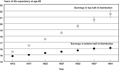
Projected Cohort Life Expectancies. Chart 3 converts the projected probabilities of death into cohort life expectancies by age and earnings group. Estimates of life expectancy at age 65 and the 95 percent confidence intervals surrounding these estimates for the top and bottom half of the earnings distribution for male Social Security–covered workers by selected years of birth are shown. From the chart, it is apparent that the expected years of life remaining between the two earnings groups are projected to widen over time. In addition, note that for the later birth years, confidence intervals begin to overlap and widen between birth cohorts in a particular earnings group, indicating the greater uncertainty of these estimates.
Cohort life expectancy at age 65 (and 95 percent confidence intervals) for male Social Security-covered workers, by selected birth years and earnings group
| Year | Earnings in bottom half of distribution |
Earnings in top half of distribution |
||||
|---|---|---|---|---|---|---|
| Years of life expectancy |
95% confidence interval lower bound |
95% confidence interval upper bound |
Years of life expectancy |
95% confidence interval lower bound |
95% confidence interval upper bound |
|
| 1912 | 14.8 | 14.7 | 14.9 | 15.5 | 15.4 | 15.6 |
| 1917 | 15.0 | 15.0 | 15.1 | 16.5 | 16.4 | 16.6 |
| 1922 | 15.3 | 15.2 | 15.4 | 17.5 | 17.4 | 17.6 |
| 1927 | 15.5 | 15.3 | 15.7 | 18.5 | 18.3 | 18.8 |
| 1932 | 15.7 | 15.5 | 16.0 | 19.6 | 19.2 | 19.9 |
| 1937 | 16.0 | 15.6 | 16.3 | 20.6 | 20.1 | 21.1 |
| 1941 | 16.1 | 15.7 | 16.5 | 21.5 | 20.9 | 22.2 |
Table 4 provides a more detailed look at projected life expectancies from ages 60–90 and the projected differences between the top and bottom of the earnings distribution. For example, at age 60 and birth year 1912 only 1.2 more years of expected life separated the bottom half of the earnings distribution from the top half; by birth year 1941, that difference had increased to 5.8 years. Additionally, by reading across the rows for those projected to survive to age 60, one can see that over the 29 birth cohorts examined, the bottom half of the distribution is projected to gain 1.9 years of life (19.6 years minus 17.7 years), while the top half of the distribution is projected to gain 6.5 years of life (25.4 years minus 18.9 years). However, it is important to keep in mind that the amount of data that is projected increases with year of birth. This means that the estimate for the 1941 birth cohort is almost entirely reliant on the assumption that the trends observed in the last 30 years of the 20th century will continue on into the first 30 years of the 21st century.
| Age | 1912 | 1917 | 1922 | 1927 | 1932 | 1937 | 1941 |
|---|---|---|---|---|---|---|---|
| Top half of earnings distribution | |||||||
| 60 | 18.9 (18.7–19.0) |
20.0 (19.9–20.0) |
21.1 (21.0–21.2) |
22.2 (22.0–22.4) |
23.3 (23.0–23.7) |
24.5 (24.0–25.0) |
25.4 (24.9–26.1) |
| 65 | 15.5 (15.4–15.6) |
16.5 (16.4–16.6) |
17.5 (17.4–17.6) |
18.5 (18.3–18.8) |
19.6 (19.2–19.9) |
20.6 (20.1–21.1) |
21.5 (20.9–22.2) |
| 70 | 12.6 (12.4–12.7) |
13.4 (13.3–13.5) |
14.3 (14.1–14.4) |
15.2 (14.9–15.4) |
16.1 (15.7–16.5) |
17.0 (16.5–17.6) |
17.8 (17.2–18.5) |
| 75 | 10.0 (9.8–10.1) |
10.7 (10.6–10.8) |
11.4 (11.3–11.6) |
12.2 (11.9–12.4) |
13.0 (12.6–13.4) |
13.8 (13.3–14.4) |
14.5 (13.9–15.2) |
| 80 | 7.7 (7.6–7.9) |
8.3 (8.2–8.4) |
9.0 (8.8–9.1) |
9.6 (9.3–9.9) |
10.3 (9.9–10.7) |
11.0 (10.5–11.5) |
11.6 (11.0–12.3) |
| 85 | 5.9 (5.8–6.0) |
6.4 (6.3–6.4) |
6.9 (6.7–7.0) |
7.4 (7.2–7.6) |
8.0 (7.6–8.4) |
8.5 (8.1–9.1) |
9.0 (8.5–9.7) |
| 90 | 4.3 (4.2–4.4) |
4.7 (4.6–4.8) |
5.1 (5.0–5.3) |
5.6 (5.4–5.8) |
6.1 (5.8–6.4) |
6.6 (6.1–7.0) |
7.0 (6.5–7.6) |
| Bottom half of earnings distribution | |||||||
| 60 | 17.7 (17.6–17.8) |
18.0 (18.0–18.1) |
18.4 (18.3–18.5) |
18.7 (18.6–18.9) |
19.0 (18.8–19.3) |
19.3 (19.0–19.6) |
19.6 (19.2–20.0) |
| 65 | 14.8 (14.7–14.9) |
15.0 (15.0–15.1) |
15.3 (15.2–15.4) |
15.5 (15.3–15.7) |
15.7 (15.5–16.0) |
16.0 (15.6–16.3) |
16.1 (15.7–16.5) |
| 70 | 12.2 (12.1–12.3) |
12.4 (12.3–12.4) |
12.5 (12.4–12.6) |
12.6 (12.5–12.8) |
12.8 (12.5–13.1) |
12.9 (12.6–13.3) |
13.0 (12.6–13.5) |
| 75 | 9.9 (9.8–10.0) |
10.0 (9.9–10.1) |
10.1 (10.0–10.2) |
10.1 (9.9–10.3) |
10.2 (9.9–10.5) |
10.3 (9.9–10.7) |
10.3 (9.9–10.8) |
| 80 | 7.9 (7.8–8.1) |
8.0 (7.9–8.1) |
8.0 (7.9–8.1) |
8.0 (8.0–8.2) |
8.0 (7.7–8.3) |
8.0 (7.6–8.4) |
8.0 (7.6–8.5) |
| 85 | 6.2 (6.1–6.3) |
6.2 (6.1–6.3) |
6.2 (6.1–6.3) |
6.2 (6.0–6.4) |
6.2 (6.0–6.4) |
6.1 (5.8–6.5) |
6.1 (5.7–6.5) |
| 90 | 4.6 (4.5–4.7) |
4.6 (4.6–4.7) |
4.6 (4.5–4.7) |
4.6 (4.4–4.8) |
4.6 (4.4–4.9) |
4.5 (4.2–4.8) |
4.5 (4.2–4.9) |
| Difference between top and bottom half of earnings distribution | |||||||
| 60 | 1.2 | 1.9 | 2.7 | 3.5 | 4.3 | 5.1 | 5.8 |
| 65 | 0.7 | 1.5 | 2.2 | 3.0 | 3.8 | 4.6 | 5.3 |
| 70 | 0.4 | 1.0 | 1.8 | 2.5 | 3.3 | 4.1 | 4.8 |
| 75 | 0 | 0.7 | 1.3 | 2.0 | 2.8 | 3.5 | 4.2 |
| 80 | -0.2 | 0.4 | 1.0 | 1.6 | 2.3 | 3.0 | 3.5 |
| 85 | -0.3 | 0.2 | 0.7 | 1.2 | 1.8 | 2.4 | 3.0 |
| 90 | -0.3 | 0.1 | 0.5 | 1.0 | 1.5 | 2.0 | 2.5 |
| SOURCE: Author's calculations using a matched 2001 Continuous Work History Sample. | |||||||
| NOTES: The impact of the projection assumption on remaining life expectancy by earnings group increases as year of birth increases. | |||||||
| The 95 percent confidence intervals are shown in parentheses. | |||||||
Rough Benchmark of Projected Cohort Life Expectancies. Male cohort life expectancy projections that are based on the intermediate assumptions of the 2004 Trustees Report are shown in Table 5 to provide a rough benchmark for the estimates presented in this study. In other words, the projections are intended to allow the reader to judge whether he or she considers the estimates presented in this article to be plausible or wildly off the mark.
| Age | 1912 | 1917 | 1922 | 1927 | 1932 | 1937 | 1941 |
|---|---|---|---|---|---|---|---|
| 60 | 17.3 | 18.0 | 18.6 | 19.1 | 19.7 | 20.2 | 20.5 |
| 65 | 14.4 | 14.9 | 15.3 | 15.8 | 16.2 | 16.6 | 16.9 |
| 70 | 11.7 | 12.1 | 12.4 | 12.8 | 13.1 | 13.4 | 13.7 |
| 75 | 9.2 | 9.5 | 9.7 | 10.0 | 10.2 | 10.5 | 10.7 |
| 80 | 7.0 | 7.2 | 7.3 | 7.4 | 7.6 | 7.8 | 8.0 |
| 85 | 5.1 | 5.2 | 5.2 | 5.3 | 5.5 | 5.6 | 5.7 |
| 90 | 3.6 | 3.6 | 3.7 | 3.8 | 3.9 | 4.0 | 4.1 |
| SOURCE: The life expectancies cover a different population than the Continuous Work History Sample and are calculated by the author from qx values provided by the Office of the Chief Actuary that are based on the intermediate assumptions of the 2004 Trustees Report. See the 2004 Trustees Report for details. | |||||||
The estimates by earnings group presented in Table 4 are not exactly centered around the benchmark presented in Table 5; instead, the bottom half of the population used for this analysis is slightly closer to the benchmark than the top half. This probably reflects the fact that the earnings sample used in this analysis is expected to be healthier than the general population because the sample of male Social Security–covered workers in the bottom half of the earnings distribution excludes zero earners (who are likely to be in the worst health).
An apparent oddity in the table is that the expected remaining years of life are actually lower in the benchmark series than in the bottom half of the sample at old ages for early birth cohorts. This could reflect both sample differences due to the nonzero and covered earnings requirements applied to the analysis sample and the fact that the projection method used in this analysis for ages 60–89 is more crude than that used by the 2004 Social Security Trustees. However, note that a comparison of the growth over time of expected remaining years of life between the top half of the earnings sample and the benchmark projections at older ages leads to the same general conclusion—that the majority of mortality improvement is projected to be concentrated in the top half of the earnings distribution. This projection is a result of the central finding of this study—that the two Social Security–covered earnings groups into which the sample is divided have not experienced the same rate of mortality improvement over time. In addition, confidence intervals around these life expectancy estimates confirm that the differential rate of mortality improvement observed and projected between the two groups is large enough that it cannot be explained by mere sample fluctuations.
Period Life Expectancy Estimates from 1999 Through 2001, by Earnings Category
In contrast to the cohort life expectancy estimates just discussed, the period life expectancy estimates produced for years 1999–2001 in this analysis are almost fully based on observed data. However, these estimates tell us little about trends over time. In addition to the less extensive projections required, the primary advantage of these period life expectancy estimates is that they are more readily comparable with international life expectancy estimates, which are more frequently available in period form. This analysis compares period life expectancy estimates by various earnings groups for U.S. male Social Security–covered workers with aggregate period life expectancy estimates for other countries belonging to the Organisation for Economic Co-operation and Development (OECD).
For estimates of mortality risk that are used to calculate period life expectancies, observations begin at the age an individual reached in 1999 and end in the earlier of the year of death or at the age the individual reached in 2001. The dependent variable is equal to 1 in the year the worker dies and 0 in every year the worker survives. Counting all annual observations for the individuals in the CWHS sample, there are 21,607 person-years in which a worker died and 505,621 person-years in which a worker survived, for a total of 527,228 pooled observations. The model measures the logit or log-odds of dying on these 527,228 pooled observations using the maximum likelihood method of estimation.
Separate regressions are run on each male Social Security–covered earnings group subsample (the top half and bottom half of the distribution and the 0–25th, 26th–50th, 51st–75th, and 76th–100th percentiles of the average relative earnings distribution) using the same technique. Because only three adjacent ages are observed for each year of birth, each regression controls only for age, rather than for year of birth and age as in the cohort regressions. Specifically, the regression equation is in the following form: dead (coded as 1 or 0) = intercept + β1(age) + error term.
The probabilities of death by age that are used to create the period life tables are calculated from the regression coefficients produced by each individual earnings subgroup regression through age 89, the last age observed in the sample. After age 89, probabilities of death grow by the rate of growth of the probabilities of death by age and year (period) projected by SSA's Office of the Chief Actuary (OCACT) using the intermediate assumptions of the 2004 Trustees Report.20 Table 6 describes the data included in the regressions. Confidence intervals for the life expectancy estimates are estimated by a Monte Carlo simulation that takes 1,000 random draws from a multivariate normal distribution using the variance-covariance matrix and parameter estimates of the regression models.
| Year of birth |
Age(s) death observed |
Period(s) death observed |
Period(s) earnings observed |
|---|---|---|---|
| 1912 | 87–89 | 1999–2001 | 1957–1967 |
| 1913 | 86–89 | 1999–2001 | 1958–1968 |
| 1920 | 79–81 | 1999–2001 | 1965–1975 |
| 1930 | 69–71 | 1999–2001 | 1975–1985 |
| 1941 | 60 | 1999–2001 | 1986–1996 |
| SOURCE: Author's calculations. | |||
Period life expectancy estimates for various CWHS male Social Security–covered worker earnings groups are displayed and compared with OCACT's life expectancies in Table 7. The last two columns of the table display the average of the 1999–2001 male life expectancy estimates of SSA's Office of the Chief Actuary based on the intermediate assumptions of the 2004 Trustees Report and life expectancy estimates based on the full CWHS sample. Because the CWHS sample is selectively healthier than OCACT's series (due to the positive earnings requirement), the closeness of these two samples is somewhat unexpected. Nevertheless, Table 8 indicates that, at age 60, there was a difference of 2.6 years in life expectancy between the top and bottom half and 3.3 years between the top quarter and bottom quarter of the average relative earnings distribution for male Social Security–covered workers. The magnitude of the difference in life expectancy between earnings groups generally declines with age, until at age 80 there is no difference between the top and bottom half of the earnings distribution. The result at older ages is driven by the crossover effects present in the CWHS sample at older ages as discussed in the preceding sections.
| Age | 0–50th | 51st–100th | 0–25th | 26th–50th | 51st–75th | 76th–100th | Average life expectancy | |
|---|---|---|---|---|---|---|---|---|
| CWHS full sample |
OCACT a | |||||||
| 60 | 18.3 (18.2–18.4) |
20.9 (20.8–21.0) |
18.0 (17.8–18.1) |
18.7 (18.5–18.9) |
20.5 (20.3–20.7) |
21.3 (21.1–21.5) |
19.6 (19.5–19.7) |
19.4 |
| 65 | 14.9 (14.7–14.9) |
16.7 (16.6–16.9) |
14.7 (14.5–14.9) |
15.0 (14.9–15.2) |
16.5 (16.3–16.6) |
17.0 (16.9–17.2) |
15.8 (15.7–15.8) |
15.8 |
| 70 | 11.8 (11.7–11.9) |
13.0 (12.8–13.1) |
11.8 (11.7–12.0) |
11.7 (11.6–11.9) |
12.8 (12.7–13.0) |
13.1 (12.9–13.2) |
12.3 (12.3–12.4) |
12.6 |
| 75 | 9.1 (9.0–9.2) |
9.6 (9.5–9.7) |
9.3 (9.1–9.5) |
8.9 (8.8–9.1) |
9.6 (9.5–9.8) |
9.6 (9.5–9.8) |
9.4 (9.3–9.5) |
9.7 |
| 80 | 6.9 (6.8–7.0) |
6.9 (6.8–7.0) |
7.2 (7.0–7.4) |
6.6 (6.5–6.7) |
7.0 (6.8–7.2) |
6.8 (6.6–6.9) |
6.9 (6.9–7.0) |
7.2 |
| 85 | 5.1 (5.0–5.2) |
4.8 (4.7–4.9) |
5.5 (5.3–5.6) |
4.8 (4.6–4.9) |
4.9 (4.8–5.1) |
4.6 (4.5–4.7) |
5.0 (4.9–5.1) |
5.2 |
| SOURCE: Author's calculations on a matched 2001 Continuous Work History Sample. | ||||||||
| a. Life expectancies estimated by the Social Security Administration's Office of the Chief Actuary (OCACT) are based on the intermediate assumptions of the 2004 Trustees Report and cover a different population. The estimates were calculated by the author to represent an average of life expectancies reported for 1999, 2000, and 2001. See the 2004 Trustees Report for details. | ||||||||
| Age | Top half minus bottom half |
Top quarter minus bottom quarter |
|---|---|---|
| 60 | 2.6 | 3.3 |
| 65 | 1.9 | 2.3 |
| 70 | 1.2 | 1.3 |
| 75 | 0.5 | 0.3 |
| 80 | 0 | -0.4 |
| 85 | -0.4 | -0.9 |
| SOURCE: Author's calculations on a matched 2001 Continuous Work History Sample. | ||
Comparison With Other OECD Countries. To explore how these period life expectancy estimates, by male Social Security–covered worker earnings groups, compare with aggregate period estimates for other OECD countries, the CWHS estimates by earnings group are included in a table of life expectancy estimates for the OECD (Table 9).21 International trends in mortality decline are of considerable interest among demographers who have conducted research in the life expectancy projection area of the field. For example, both the 1999 and 2003 Technical Panels on Assumptions and Methods [of the Social Security Trustees Report] cited international mortality trends as a guide to future mortality trends in the United States. These technical panels were of the opinion that the United States was experiencing a temporary slowdown in its rate of mortality decline, relative to that in other advanced developed nations. These forecasters use international trends to bolster their arguments regarding future mortality declines. Demographers such as White (2002) and Oeppen and Vaupel (2002) go further by incorporating international trends in mortality into their forecasts of U.S. mortality declines.
| Country | Life expectancy |
|---|---|
| Males at age 60 | |
| Iceland | 22.2 |
| Japan | 21.4 |
| U.S. Social Security– covered workers (76th–100th percentile) |
21.3 |
| Switzerland | 20.9 |
| Australia | 20.8 |
| Canada | 20.7 |
| Sweden | 20.7 |
| U.S. Social Security– covered workers (51st–75th percentile) |
20.5 |
| France | 20.4 |
| Italy | 20.4 |
| New Zealand | 20.3 |
| Spain | 20.3 |
| Mexico | 20.2 |
| Norway | 20.0 |
| United States (OECD) | 19.9 |
| Austria | 19.7 |
| United States (OCACT) | 19.4 |
| Germany | 19.4 |
| United Kingdom | 19.4 |
| Belgium | 19.3 |
| Finland | 19.2 |
| Luxembourg | 19.2 |
| Netherlands | 19.1 |
| Portugal | 19.0 |
| Denmark | 18.9 |
| U.S. Social Security– covered workers (26th–50th percentile) |
18.7 |
| Ireland | 18.4 |
| U.S. Social Security– covered workers (0–25th percentile) |
18.0 |
| Czech Republic | 17.0 |
| Poland | 16.7 |
| Slovak Republic | 15.9 |
| Turkey | 15.9 |
| Hungary | 15.5 |
| Males at age 65 | |
| Iceland | 18.1 |
| Japan | 17.5 |
| U.S. Social Security– covered workers (76th–100th percentile) |
17.0 |
| Australia | 16.9 |
| Canada | 16.9 |
| Switzerland | 16.9 |
| Mexico | 16.8 |
| France | 16.7 |
| Sweden | 16.7 |
| Italy | 16.5 |
| New Zealand | 16.5 |
| Spain | 16.5 |
| U.S. Social Security– covered workers (51st–75th percentile) |
16.5 |
| United States (OECD) | 16.3 |
| Austria | 16.0 |
| Norway | 16.0 |
| United States (OCACT) | 15.8 |
| Germany | 15.7 |
| United Kingdom | 15.7 |
| Belgium | 15.5 |
| Finland | 15.5 |
| Luxembourg | 15.5 |
| Netherlands | 15.3 |
| Portugal | 15.3 |
| Denmark | 15.2 |
| U.S. Social Security– covered workers (26th–50th percentile) |
15.0 |
| U.S. Social Security– covered workers (0–25th percentile) |
14.7 |
| Ireland | 14.6 |
| Czech Republic | 13.7 |
| Poland | 13.6 |
| Slovak Republic | 12.9 |
| Hungary | 12.7 |
| Turkey | 12.6 |
| Males at age 80 | |
| Mexico | 8.7 |
| Iceland | 8.4 |
| Japan | 8.0 |
| Canada | 7.8 |
| Australia | 7.6 |
| France | 7.6 |
| United States (OECD) | 7.6 |
| New Zealand | 7.4 |
| Switzerland | 7.4 |
| Italy | 7.3 |
| Spain | 7.3 |
| U.S. Social Security– covered workers (0–25th percentile) |
7.2 |
| United States (OCACT) | 7.2 |
| Sweden | 7.1 |
| Austria | 7.0 |
| Germany | 7.0 |
| U.S. Social Security– covered workers (51st–75th percentile) |
7.0 |
| United Kingdom | 6.9 |
| Denmark | 6.8 |
| U.S. Social Security– covered workers (76th–100th percentile) |
6.8 |
| Belgium | 6.7 |
| Norway | 6.7 |
| Finland | 6.6 |
| U.S. Social Security– covered workers (26th–50th percentile) |
6.6 |
| Luxembourg | 6.5 |
| Poland | 6.5 |
| Netherlands | 6.4 |
| Portugal | 6.4 |
| Czech Republic | 6.1 |
| Ireland | 6.1 |
| Slovak Republic | 6.1 |
| Hungary | 6.0 |
| Turkey | 5.3 |
| SOURCES: Organisation for Economic Co-operation and Development, OECD Health Data 2004, personal communication from the OECD Washington Center. Author's estimates for U.S. Social Security–covered workers are based on a matched 2001 Continuous Work History Sample. Estimates by the Social Security Administration's Office of the Chief Actuary (OCACT) are based on the intermediate assumptions of the 2004 Trustees Report and represent an average of life expectancies reported for 1999, 2000, and 2001. | |
| NOTE: The comparisons are rough because the Continuous Work History Sample estimates represent an average from 1999 through 2001. | |
Although a single period estimate for 2000 by position in the earnings distribution contributes very little to an understanding of comparative international trends in mortality decline over time, such an estimate is a tentative first step toward examining these international trends on a disaggregated basis. A disaggregated analysis of these trends would allow researchers to assess whether differing degrees of heterogeneity within various OECD countries could be influencing differences in aggregate rates of mortality decline between these countries. For example, both the 1999 and 2003 Technical Panels assert that it is more likely that the United States is different from other countries in terms of levels of mortality rather than rates of mortality decline. However, recall that past trends in rates of mortality decline by earnings group for male Social Security–covered workers in the United States indicate that the top and bottom half of the earnings distribution have experienced different rates of improvement across groups rather than constant rates of improvement at different levels.
Because the life expectancy estimates for the other OECD countries in Table 9 represent countrywide averages, it is particularly interesting to see whether U.S. male Social Security–covered workers in the top 25th percentile of the earnings distribution have a higher life expectancy than the average of any other OECD country.22 A priori, one might expect such a result given the fact that many other OECD countries exhibit mortality differentials by socioeconomic status and so their countrywide averages are expected to be somewhat below their most advantaged group.
When viewing Table 9, recall that the sample analyzed here is selectively healthier than the total U.S. population (due to the positive earnings requirement) and that the CWHS sample estimates could therefore indicate a higher life expectancy than a truly representative sample. In particular, the population-wide lowest earnings category could be below the lowest earnings category in this sample and thus place lower in the table of international rankings. In addition, note that SSA's OCACT estimates are about 6 months lower than the OECD's estimates, which may indicate a difference in the populations covered by the two agencies. It is not clear why the CWHS estimates are mainly below the OCACT estimate at age 80. One possibility is that the positive earnings requirement used in creating the CWHS sample leads to a greater divergence between OCACT's sample and the sample analyzed in this article, at older ages.
Keeping in mind these caveats, Table 9 indicates that at ages 60 and 65, male Social Security–covered workers in the bottom quarter of the earnings distribution could expect to live roughly as long as the average Irishman, while men in the top quarter of the earnings distribution could expect to live roughly as long as the average Japanese man at age 60 and roughly as long as the average Australian, Canadian, or Swiss man at age 65. It is perhaps surprising that at age 65, high-earning Social Security–covered men in the United States rank close to population-wide averages for several other countries, including their neighbor to the north, Canada. This could imply that, to the extent these countries exhibit differences in life expectancy by socioeconomic status, one might expect the top earnings group in these countries to be above the top earnings group in the United States. This result could have a myriad of explanations involving but not limited to differences between countries in the quality of medical care, in adverse health behaviors at high-earnings levels, and in many other factors that could potentially affect life expectancy. Another possible contributor to the interpretation of differences in life expectancy between countries could involve differences in the degree of sample selection for robustness (frailty) in various countries.
OECD Comparisons and Sample Frailty. Because the sample frailty interpretation is somewhat complicated, it is discussed in greater detail. At age 65, U.S. male Social Security–covered workers in the bottom quarter of the earnings distribution were ranked near the bottom of Western European countries in terms of life expectancy, while U.S. male Social Security–covered workers with earnings in the top quarter of the earnings distribution were ranked close to the top of Western European countries. By age 80, male Social Security–covered workers with high earnings had fallen closer to the lower middle of the Western European countries, while male Social Security–covered workers with low earnings had risen to the upper middle of the OECD rankings. In addition, at age 65, men in the bottom quarter of the distribution were expected to live 2.3 years less than their U.S. counterparts with earnings in the top quarter of the earnings distribution, while at age 80 they were expected to live 0.4 years more. One explanation for such extreme shifts in ranking by age could be that for low-earning men to live to age 80 in 2000, they would have to have had a greater than average robustness to counteract their greater disadvantage in socioeconomic terms. Hence, the frailer members of the low-earner population have died by age 80, leading low-earner men to rise in the rankings relative to populations that have been less selected in terms of health by age 80. Thus, at the other extreme, the drop in rank of U.S. male Social Security–covered workers in the top earnings category could reflect more frail individuals living to older ages in this group and hence driving up the probability of death at older ages relative to the U.S. male Social Security–covered worker low–earnings group.
If other countries experience sample selection for robustness (frailty) effects by age as the population of male Social Security–covered workers in the United States gives the appearance of doing, then international comparisons become much more complex. Each country could be experiencing different levels of selection for robustness affecting probabilities of death at different ages, depending on differing historical experiences of each country over time. The key idea is that from the cohort perspective one would have to examine changes in sample composition due to frailty in each country over the entire 20th century—rather than from the point at which the advanced developed nations experienced convergence economically (that is, the post-WWII period). Thus, the appropriate interpretation of international life expectancy rankings is not always obvious. In other words, the male populations we observe at older ages in each country could have experienced different degrees of selection for robustness—depending on the situation in a particular country at younger ages for these cohorts.23
A comparison of the placement of Mexico and the United States in the OECD rankings may provide an example of the potential for sample composition changes due to frailty to influence the ranking of a country at a particular age. At birth, Mexican men were expected to live 2.5 years less than U.S. men (OECD estimate not shown); at age 40, they were expected to live 0.3 years less (OECD estimate not shown), at age 60 they were expected to live 0.3 years more, at age 65 they were expected to live 0.5 years more, and at age 80 they were expected to live 1.1 years more—and were the most long-lived of all OECD men. Given the wide separation in gross domestic product (GDP) per capita between Mexico and the United States over the course of the 20th century, a possible explanation could be that less robust members of the Mexican population were less likely to live to age 80, so that by that age the Mexican population was selectively healthier and more robust than the U.S. population. Vaupel, Manton, and Stallard (1979, 450) discuss how convergence or crossovers of period mortality differentials between two heterogeneous populations "might be at least partially caused by decreases in the average frailty of a population cohort at later ages as frailer members are removed by mortality."
Conclusion
In 1973, Kitagawa and Hauser (p. 180) wrote,
Certainly the biomedical know-how now available is either not available to the lower socioeconomic classes in the United States, or its impact, at this stage in the reduction of mortality, is relatively small compared with what could be achieved through reduction of the gap in levels of living and life styles associated with education, income, occupation, and geographic locale.
Over 30 years later, this statement would still seem to apply, although it is possible that progress for men of lower socioeconomic status is hidden by changes in sample frailty.
Regardless of the important caveat about sample frailty, it remains true that eliminating the gap in probabilities of death by socioeconomic status by lowering probabilities of death for lower-earning men would increase average male life expectancy in the United States. One important contribution of this study is to highlight that the segment of the male Social Security–covered worker population experiencing slower mortality improvement is large—that is, the entire bottom half of the population, rather than just a limited group of disadvantaged at the lowest end of the earnings distribution. This finding is consistent with research that finds that the link between socioeconomic status and health tends to be a gradient—with increases in socioeconomic status being associated with improvements in health throughout the entire distribution of socioeconomic class, rather than just being a function of extreme poverty (Pamuk and others 1998, 25). One should also recall that the sample used in this analysis is expected to be selectively healthier than the total U.S. population because of the requirement that men have some positive earnings between ages 45 and 55. The most disadvantaged members of society are probably excluded from this sample; thus it is possible that probabilities of death for the bottom half of the sample are somewhat lower relative to what they would be for a sample representative of the entire U.S. population.
The evidence presented in this article suggests that it would be prudent for forecasters to consider socioeconomic heterogeneity within the U.S. population and the likelihood of such heterogeneity continuing into the future when preparing their predictions. Unfortunately, the time period over which mortality differentials are computable is not long enough to make firm predictions based on historical data with regard to the possible future length of lags between mortality improvement for higher and lower earners. However, the length of such lags could be crucial to the outcome of projections and policies in which longevity is an important variable. Finally, because this research does not adjust for changes in sample frailty over time it should be regarded as a preliminary look at the data; the qualitative interpretation of these trends in differential mortality over time could well be more complex if the level of frailty of socioeconomic subgroups at various ages is changing over time.
Appendix
More detail is provided here on the regressions estimated for this article. Table A-1 presents sample counts and Table A-2 provides parameter estimates and standard errors for the odds ratios presented in Table 1. Table A-3 provides parameter estimates and standard errors used to estimate the cohort life expectancies presented in Table 4. Table A-4 provides parameter estimates and standard errors used to estimate the period life expectancy estimates presented in Table 7.
| Year of birth | 60–64 | 65–69 | 70–74 | 75–79 | 80–84 | 85–89 |
|---|---|---|---|---|---|---|
| 1912–1915 | 36,951 | 33,089 | 28,190 | 22,662 | 16,707 | 10,577 |
| 1916–1919 | 37,410 | 33,759 | 28,994 | 23,445 | 17,392 | . . . |
| 1920–1923 | 40,470 | 36,715 | 32,034 | 26,293 | . . . | . . . |
| 1924–1927 | 40,219 | 36,790 | 32,306 | . . . | . . . | . . . |
| 1928–1931 | 38,625 | 35,534 | . . . | . . . | . . . | . . . |
| 1932–1935 | 37,808 | 35,031 | . . . | . . . | . . . | . . . |
| 1936–1938 | 30,155 | . . . | . . . | . . . | . . . | . . . |
| SOURCE: Author's tabulations using a matched 2001 Continuous Work History Sample. | ||||||
| NOTE: . . . = not applicable. | ||||||
| Year of birth | Intercept | Age | Earnings dummy | -2Log likelihood |
|---|---|---|---|---|
| Ages 60–64 | ||||
| 1912–1915 | -7.668 (0.7156) |
0.0603 (0.0115) |
0.2357 (0.0327) |
37117.83 |
| 1916–1919 | -8.4233 (0.7365) |
0.0696 (0.0119) |
0.4136 (0.0341) |
35510.266 |
| 1920–1923 | -10.2445 (0.7285) |
0.0982 (0.0117) |
0.4027 (0.0335) |
36901.038 |
| 1924–1927 | -9.6752 (0.7606) |
0.0875 (0.0122) |
0.412 (0.0351) |
34307.367 |
| 1928–1931 | -11.1463 (0.8034) |
0.1089 (0.0129) |
0.5371 (0.0375) |
31226.994 |
| 1932–1935 | -9.7168 (0.8442) |
0.0842 (0.0136) |
0.5602 (0.0396) |
28553.71 |
| 1936–1938 | -10.333 (1.0776) |
0.0918 (0.0174) |
0.612 (0.049) |
19296.989 |
| Ages 65–69 | ||||
| 1912–1915 | -7.6299 (0.6897) |
0.0611 (0.0103) |
0.2163 (0.0291) |
43456.37 |
| 1916–1919 | -9.3568 (0.7005) |
0.0852 (0.0104) |
0.3094 (0.0296) |
42684.078 |
| 1920–1923 | -9.3817 (0.7056) |
0.0837 (0.0105) |
0.3363 (0.0299) |
42932.774 |
| 1924–1927 | -7.8657 (0.7193) |
0.0597 (0.0107) |
0.4256 (0.0307) |
41502.171 |
| 1928–1931 | -8.4903 (0.7561) |
0.0675 (0.0113) |
0.4733 (0.0324) |
38067.181 |
| 1932–1935 | -9.3037 (1.0845) |
0.0775 (0.0163) |
0.5478 (0.0419) |
23685.446 |
| Ages 70–74 | ||||
| 1912–1915 | -7.3666 (0.7012) |
0.0578 (0.00973) |
0.1804 (0.0275) |
45654.158 |
| 1916–1919 | -7.6979 (0.6998) |
0.0613 (0.00971) |
0.2891 (0.0275) |
46058.959 |
| 1920–1923 | -7.6789 (0.6872) |
0.06 (0.00953) |
0.29 (0.027) |
48484.664 |
| 1924–1927 | -8.1451 (0.6998) |
0.0649 (0.00971) |
0.3949 (0.0276 |
47182.178 |
| Ages 75–79 | ||||
| 1912–1915 | -7.9476 (0.7288) |
0.0665 (0.00946) |
0.1222 (0.0267) |
45250.984 |
| 1916–1919 | -8.1345 (0.7226) |
0.0682 (0.00938) |
0.1842 (0.0265) |
46216.315 |
| 1920–1923 | -10.6336 (0.7361) |
0.0995 (0.00956) |
0.2675 (0.0262) |
47731.564 |
| Ages 80–84 | ||||
| 1912–1915 | -10.0582 (0.7774) |
0.0935 (0.00948) |
0.0844 (0.0268) |
41685.831 |
| 1916–1919 | -9.6895 (0.8959) |
0.0889 (0.011) |
0.0439 (0.0288) |
36590.137 |
| Ages 85–89 | ||||
| 1912–1915 | -9.323 (1.2436 |
0.0858 (0.0144) |
-0.0639 (0.0346) |
23216.484 |
| SOURCE: Author's calculations using a matched 2001 Continuous Work History Sample. | ||||
| NOTES: Regression results for male Social Security–covered workers in the bottom half of the average relative earnings distribution relative to their counterparts in the top half, as presented in Table 1. | ||||
| Standard errors are shown in parentheses. | ||||
| Year of birth | Intercept | Age | Year of birth |
Earnings dummy |
Age * year of birth |
Year of birth * earnings dummy |
Age * earnings dummy |
Age * year of birth * earnings dummy |
-2Log likelihood |
|---|---|---|---|---|---|---|---|---|---|
| 1912–1941 | 68.3626 (15.3315) |
-0.3248 (0.2262) |
-0.0404 (0.00799) |
21.6952 (20.4953) |
0.000212 (0.000118) |
-0.0107 (0.0107) |
-0.7549 (0.3042) |
0.000387 -0.000159 |
938679.59 |
| SOURCE: Author's calculations using a matched 2001 Continuous Work History Sample. | |||||||||
| NOTE: Standard errors are shown in parentheses. | |||||||||
| Percentile of earnings distribution |
Intercept | Age | -2Log likelihood |
|---|---|---|---|
| 0–100th | -10.7742 (0.0715) |
0.1044 (0.000939) |
167319.25 |
| 0–50th | -9.5926 (0.0885) |
0.0905 (0.00118) |
95221.856 |
| 51st–100th | -12.3826 (0.1091) |
0.1235 (0.00142) |
74865.934 |
| 0–25th | -8.8563 (0.1207) |
0.081 (0.00162) |
49360.282 |
| 26th–50th | -10.4053 (0.1304) |
0.1010 (0.00173) |
45779.76 |
| 51st–75th | -11.6957 (0.1481) |
0.1151 (0.00194) |
39011.565 |
| 76th–100th | -13.1512 (0.1615) |
0.1329 (0.00209) |
35796.996 |
| SOURCE: Author's calculations using a matched 2001 Continuous Work History Sample. | |||
| NOTE: Standard errors are shown in parentheses. | |||
Notes
1. Because interactions create a degree of multicollinearity between the interacted variables, they tend to increase standard errors. Thus, statistical techniques can fail to uncover interactions that exist "in nature" in samples that are simply too small for the interactions to stand out from the sample noise.
2. Life expectancy at birth narrowed while the probability of surviving to age 75 remained constant because most of the greater reduction in probabilities of death for the lower income quintiles occurred before age 75.
3. Results were similar when the sample was restricted to whites only in low-income areas in Detroit.
4. The CWHS inactive file, which is not used in this analysis, contains longitudinal information, such as demographic information, for individuals who have never had an earnings report. Technically, earnings data begin in 1937. However, data appear in a different form from 1937 to 1950.
5. A 1 percent sample of Social Security records is generally generated by taking a sample of Social Security numbers. The same criteria for selection of Social Security numbers is used for the CWHS, Numident, and MBR 1 percent samples. The 2001 CWHS, 2003 MBR, and 2003 Numident were used for this analysis.
6. Although the Numident is the official repository of SSA death data, the MBR death data is generally considered of higher quality (Aziz and Buckler 1992). This study follows a procedure where the MBR, Numident, and CWHS are all scanned for a death report. If there is a death recorded on more than one file, the MBR date of death is taken first, the Numident second, and the CWHS third. This decision rule is organized roughly in descending order of expected accuracy. The CWHS has very few deaths recorded after 1978. Because the source of SSA's death information has changed over time (Aziz and Buckler 1992), rough experiments were conducted to assess whether the source of the death data influenced results. It was concluded that results were not sensitive to the source of the death data for this particular sample. However, these experiments were not comprehensive; a comprehensive analysis would probably require its own analysis.
7. The Numident is the master file of assigned Social Security numbers, so, in theory, everyone with a Social Security number on the CWHS should have a Numident record. However, because of computing restraints caused by the large size of these files, the files were restricted by year of birth before they were merged. Because year of birth reports do not always match on the files (one file may receive corrections and another may not) a small number of records on the CWHS were found not to have a corresponding Numident record in the merge and were dropped.
8. Although a tobit regression requires a normality assumption and the earnings are not distributed normally, results are unlikely to be affected by use of the tobit, because the earnings are measured in relative terms (Waldron 2004, Appendix).
9. Because the 1983 act applied to only federal workers newly hired after December 31, 1983, and this analysis observes earnings at ages 45 through 55, most newly hired federal workers entering into coverage are probably too young to be included in this sample. Nonprofits already had fairly high rates of coverage (about 79 percent) at the time of the 1983 act (Myers 1993, 38).
10. Technically, both nonfarm self-employed workers and farmers have a simplified reporting method allowable by law in certain low-income situations that differs slightly from the general dollar thresholds reported here. The same principle applies, however, because the dollar amounts in these procedures have not changed since 1956. See Myers (1993, 34–35) for details.
11. The threshold for the earnings of domestic employees and domestic workers on farms was raised in the 1994 act (SSA 2005, Table 2.A1); however, this analysis observes earnings only until 1996, so the majority of the earnings are observed before this adjustment.
12. Women are not analyzed because large changes in women's labor force participation over time imply that using women's own earnings for older cohorts could cause many women to be classified into low socioeconomic groups when they are in fact of high socioeconomic status.
13. To be clear, the 15.6 percent of the sample dropped because of the positive earnings requirement referred to in the earnings data section should not be viewed as an approximation of the percent of the U.S. population excluded because of the positive earnings requirement. Individuals with no active CWHS records are also excluded (that is, individuals in the inactive file) as well as individuals residing in the United States for whom Social Security has no records.
14. Year of death is the most robust unit of measurement. Month and day of death are less reliable. Greater detail in the timing of death is not really necessary for the purposes of this analysis.
15. The implication of this assumption is that when two or more events appear to happen at the same time (that is, are tied), there is no underlying ordering; rather, the events really happened at the same time (Allison 1995, 134).
16. The continuous time assumption implies that there is an exact ordering for tied event times but that the ordering is unknown (Allison 1995, 127).
17. Although multiple observations are created for a single individual in the regression, the assumption of independence of observations is not violated because the factoring of the likelihood function for the data allows each term to be treated as independent (Allison 1995, 223). However, it is still true that if individuals had more than one event, the independence assumption would be violated (Allison 1995, 223), but the event measured for this analysis is death, and each individual dies only once.
18. A nonlinear model of age, cohort, and earnings interactions estimated as a single regression runs into trouble because standard errors become too large due to the large number of dummy variables.
19. A single dummy earnings variable that equals 1 if earnings are in the bottom half of the distribution and 0 if earnings are in the top half of the distribution is used to reduce standard errors. However, in rough experiments where dummy variables representing more detailed earnings quartiles are explored, the data show low probabilities of death for early birth cohorts in the bottom earnings quartile at older ages, and statistically significant crossover effects are observed. In other words, men in the lowest earnings quartile at older ages (older birth cohorts) have significantly lower odds of death than higher earners. A detailed examination of this crossover requires a frailty model. One interpretation of the data is that there is strong evidence for sample selection for robustness (frailty) operating in these older cohorts at the lowest earnings quartile. One could interpret this result as evidence of slight improvement for the lowest earnings quartile over time, if less robust members are making it into the sample at older ages than in the past, and thus pushing up the mortality differential. In addition, rough experiments indicated that men with earnings in the 25th–50th quartile of the earnings distribution—if analyzed separately—would not give the appearance of doing better relative to the upper two quartiles of the distribution. Rather, combining the bottom two quartiles into one group for this analysis gives the bottom quartile the appearance of slightly greater mortality improvement over time than it would exhibit independently.
20. OCACT probabilities of death for years 1999, 2000, and 2001 are averaged together to obtain a series comparable with the one analyzed in this article.
21. Note that the comparisons are rough because the CWHS estimates represent an average from 1999–2001 and the OECD estimates represent a single year (2000) estimate.
22. Unfortunately, life tables subdivided by comparable socioeconomic categories are not available across OECD countries.
23. For example, White (2002, 61, citing the United Nations [1952]) notes that Japanese male life expectancy at birth was thought to have dropped to 23.9 years in 1945. The Japanese cohorts supplying probabilities of death at older ages in 2000 would have been in their late teens and early twenties in 1945. From the cohort perspective, one might want to examine whether the severity of a country-specific stress such as this could differentially affect the sample composition (frailty) of these cohorts in old age relative to the countries with which Japan is compared. In addition, Japan had much lower national wealth at the beginning of the 20th century than did the United States. Links between national wealth and the nutrition and health of populations could suggest greater selection for robustness of the Japanese cohort in early childhood as well.
References
Allison, Paul D. 1995. Survival analysis using the SAS system: A practical guide. Cary, NC: SAS Institute.
Antonovsky, Aaron. 1967. Social class, life expectancy, and overall mortality. Milbank Memorial Fund Quarterly 45(2): 31–73.
Aziz, Faye, and Warren Buckler. 1992. The status of death information in Social Security Administration files. Prepared for presentation at the 1992 Joint Statistical Association, Boston, MA (August 9–13, unpublished).
Bell, Felicitie C., and Michael L. Miller. 2005. Life tables for the United States Social Security area 1900–2100, Actuarial Study No. 120. Baltimore, MD: Social Security Administration, Office of the Chief Actuary (August).
[Board of Trustees.] Board of Trustees of the Federal Old-Age and Survivors Insurance and Disability Insurance Trust Funds. 2004. 2004 Annual Report. Washington, DC.
Case, Anne, Darren Lubotsky, and Christina Paxson. 2001. Economic status and health in childhood: The origins of the gradient. NBER Working Paper Series, No. 8344. National Bureau of Economic Research, Cambridge, MA (June).
Currie, Janet, and Mark Stabile. 2002. Socioeconomic status and health: Why is the relationship stronger for older children. NBER Working Paper Series, No. 9098. National Bureau of Economic Research, Cambridge, MA (August).
Duleep, Harriet Orcutt. 1989. Measuring socioeconomic mortality differentials over time. Demography 26(2): 345–351.
Feldman, Jacob J., Deane M. Makuc, Joel C. Kleinman,and Joan Cornoni-Huntley. 1989. National trends in education differentials in mortality. American Journal of Epidemiology 129(5): 919–933.
Gorey, Kevin M., Eric J. Holowaty, Gordon Fehringer, Ethan Laukkanen, Agnes Moskowitz, David J. Webster, and Nancy L. Richter. 1997. An international comparison of cancer survival: Toronto, Ontario, and Detroit, Michigan, metropolitan areas. American Journal of Public Health 87(7): 1156–1163.
Keskimaki, I., S. Koskinen, and M. Salinto, and others. 1997. Socioeconomic and gender inequities in access to coronary artery bypass grafting in Finland. European Journal of Public Health 7: 392–397, as cited in P. Martikainen, T. Valkonen, and T. Martelin. Change in male and female life expectancy by social class: Decomposition by age and cause of death in Finland 1971–95. Journal of Epidemiological Community Health 55: 494–499 (2001).
Keyfitz, N., and G. Littman. 1979. Mortality in a heterogeneous population. Population Studies 33(2): 333–342.
Kitagawa, Evelyn M., and Philip M. Hauser. 1973.Differential mortality in the United States: A study in socioeconomic epidemiology. Cambridge, MA: Harvard University Press.
Mackenbach, Johan P., Vivian Bos, Otto Andersen, Mario Cardano, Giuseppe Costa, Seeromanie Harding, Alison Reid, Orjan Hemstrom, Tapani Valkonen, and Anton E. Kunst. 2003. Widening socioeconomic inequalities in mortality in six Western European countries. International Journal of Epidemiology 32(5): 830–836.
Martikainen, P., T. Valkonen, and T. Martelin. 2001. Change in male and female life expectancy by social class: Decomposition by age and cause of death in Finland 1971–95. Journal of Epidemiological Community Health 55: 494–499.
Myers, Robert J. 1993. Social Security. Philadelphia, PA: Pension Research Council and University of Pennsylvania Press.
Oeppen, Jim, and James W. Vaupel. 2002. Broken limits to life expectancy. Science 296 (May): 1029–1031.
Organisation for Economic Co-operation and Development. 2004. OECD Health Data 2004, 1st ed.
Pampel, Fred C. 2002. Inequality, diffusion, and the status gradient in smoking. Social Problems 49(1): 35–57.
Pamuk, Elsie R. 1985. Social class inequality in mortality from 1921 to 1972 in England and Wales. Population Studies 39: 17–31.
Pamuk, E., D. Makuc, K. Heck, C. Reuben, and K. Lochner. 1998. Socioeconomic status and health chartbook. Health, United States, 1998. Hyattsville, MD: National Center for Health Statistics.
Pappas, Gregory, Susan Queen, Wilbur Hadden, and Gail Fisher. 1993. The increasing disparity in mortality between socioeconomic groups in the United States, 1960 and 1986. New England Journal of Medicine 329(2): 103–109.
Preston, Samuel H. 1996. American longevity: past, present, and future. Syracuse University Policy Brief No. 7, Maxwell School of Citizenship and Public Affairs, Center for Policy Research.
Preston, Samuel H., and Irma T. Elo. 1995. Are educational differentials in adult mortality increasing in the United States. Journal of Aging and Health 7(4): 476–496.
Rogot, Eugene, Paul D. Sorlie, and Norman J. Johnson. 1992. Life expectancy by employment status, income, and education in the National Longitudinal Mortality Study. Public Health Reports 107(4): 457–461.
Rose G., and M.G. Marmot. 1981. Social class and coronary heart disease. British Heart Journal 45: 13–19, as cited in Jacob J. Feldman, Deane M. Makuc, Joel C. Kleinman, and Joan Cornoni-Huntley. National trends in education differentials in mortality. American Journal of Epidemiology 129(5): 919–933 (1989).
Singh, Gopal K., and Mohammad Siahpush. 2002. Increasing inequalities in all-cause and cardiovascular mortality among U.S. adults aged 25–64 years by area socioeconomic status, 1969–1998. International Journal of Epidemiology 31(3): 600–613.
Singh-Manoux, Archana, Jane E. Ferrie, Tarani Chandola, and Michael Marmot. 2004. Socioeconomic trajectories across the life course and health outcomes in midlife: Evidence for the accumulation hypothesis? International Journal of Epidemiology 33(5): 1072–1079.
Smith, George Davey, Carole Hart, David Blane, Charles Gillis, and Victor Hawthorne. 1997. Lifetime socioeconomic position and mortality: Prospective observational study. British Medical Journal 314: 547.
[SSA] Social Security Administration, Office of Policy, Office of Research, Evaluation, and Statistics. 2006. Annual Statistical Supplement to the Social Security Bulletin, 2005. Washington, DC: SSA.
Technical Panel on Assumptions and Methods. 1999. Report to the Social Security Advisory Board. Washington, DC: Technical Panel (November).
———. 2003. Report to the Social Security Advisory Board. Washington DC: Technical Panel (October).
Vaupel, James W., Kenneth G. Manton, and Eric Stallard. 1979. The impact of heterogeneity in individual frailty on the dynamics of mortality. Demography 16(3): 439–454.
Vaupel, James W., and Anatoli I. Yashin. 1985. Heterogeneity's ruses: Some surprising effects of selection on population dynamics. American Statistician 39(3): 176–185.
Waldron, Hilary. 2002. Do early retirees die early? Evidence from three independent data sets. ORES Working Paper Series, No. 97. Social Security Administration, Office of Policy, Office of Research, Evaluation, and Statistics, Washington, DC (July).
———. 2004. Heterogeneity in health and mortality risk among early retiree men. ORES Working Paper Series, No. 105. Social Security Administration, Office of Policy, Office of Research, Evaluation, and Statistics, Washington, DC (May).
White, Chris, Folkert van Galen, and Yuan Huang Chow. 2003. Trends in social class differences in mortality by cause, 1986 to 2000. Health Statistics Quarterly. Office for National Statistics, London: 20 (Winter): 25–37.
White, Kevin M. 2002. Longevity advances in high-income countries, 1955–96. Population and Development Review 28(1): 59–76.
Whitehead, Margaret. 1997. Life and death over the millennium. In Health inequalities decennial supplement, Series DS No. 15, ed. Frances Dever and Margaret Whitehead, 7–28. London: The Stationery Office, Office for National Statistics.
Wilkins, Russell, Jean-Marie Berthelot, and Edward Ng. 2002. Trends in mortality by neighborhood income in urban Canada from 1971 to 1996. Supplement to Health Reports. Ottawa, Ontario: Statistics Canada (Catalogue 82–003) 13: 1–27.