Income of the Aged Chartbook, 1998
Size of total income, 1998
The aged are an economically diverse group
Median income for all aged units is $17,777, but there are wide differences within the total group. About 17% have an income of under $8,000 (compared to the 1998 poverty threshold of $7,818 for one person aged 65 or older), and 13% have an income of $50,000 or more.
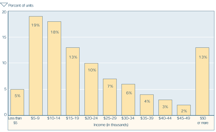
| Income (dollars) | Percent of aged units |
|---|---|
| Less than 5,000 | 5 |
| 5,000 to 9,999 | 19 |
| 10,000 to 14,999 | 18 |
| 15,000 to 19,999 | 13 |
| 20,000 to 24,999 | 10 |
| 25,000 to 29,999 | 7 |
| 30,000 to 34,999 | 6 |
| 35,000 to 39,999 | 4 |
| 40,000 to 44,999 | 3 |
| 45,000 to 49,999 | 2 |
| 50,000 or more | 13 |
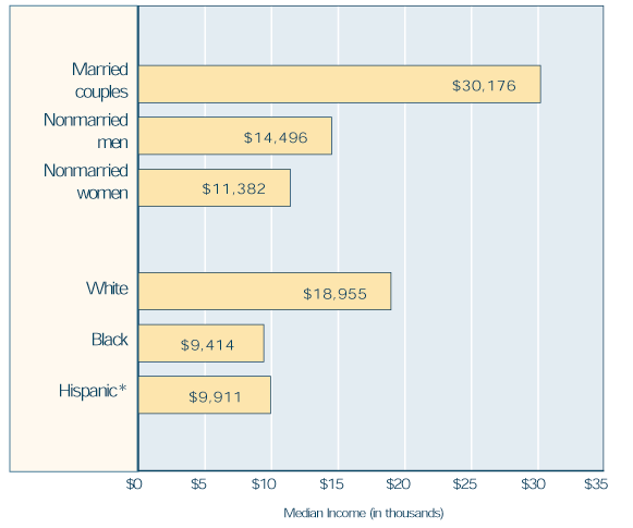
Median income, by marital status, race, and Hispanic origin, 1998
Demographic differences are associated with different levels of income
Income is highest for married couples, who have a median income more than twice that of nonmarried men and more than 2½ times that of nonmarried women. Whites have a median income double that of blacks, and more than 90% greater than Hispanics.
Poverty status, by marital status, race, and Hispanic origin, 1996
Nonmarried and minority aged have high proportions who are poor or near poor
The variations in income by marital status and by race are reflected in the poverty rates (based on family income of aged persons to conform with official measures of poverty) for these subgroups of the aged. Nonmarried men, nonmarried women, and minorities have the highest poverty rates, ranging from 14% to 26%. When the near poor (defined as having income between the poverty line and 125% of the poverty line) are included, the rates for the nonmarried and nonwhites range from 23% to 38%.
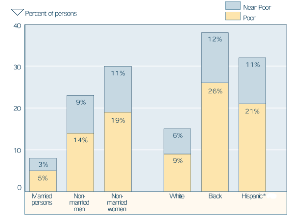
| Age | Poor | Near poor |
|---|---|---|
| Married persons | 3 | 5 |
| Nonmarried men | 9 | 14 |
| Nonmarried women | 11 | 19 |
| White | 6 | 9 |
| Black | 12 | 26 |
| Hispanic* | 11 | 21 |
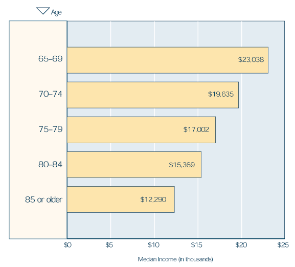
Median income, by age, 1998
Income differences by age are due in part to marital status differences
In every successively older age group, median income is lower. The striking differences by age shown in the following chart are due in part to the disproportionate number of nonmarried women in older age groups. The table below shows that in every age group, nonmarried women have a lower median income than nonmarried men or married couples. It also shows that nonmarried women far outnumber the others in the older age groups
| Sex and marital status | 65–69 | 70–74 | 75–79 | 80–84 | 85 or older |
|---|---|---|---|---|---|
| Median income (in thousands) | |||||
| Married couples | 35,134 | 30,345 | 27,874 | 25,680 | 24,345 |
| Nonmarried men | 15,215 | 14,399 | 14,118 | 14,968 | 13,750 |
| Nonmarried women | 12,193 | 11,675 | 11,344 | 11,509 | 10,446 |
| Percent of units | |||||
| Total number (in thousands) | 6,483 | 6,179 | 5,333 | 3,834 | 2,815 |
| Total percent | 100 | 100 | 100 | 100 | 100 |
| Married couples | 52 | 46 | 41 | 33 | 17 |
| Nonmarried men | 14 | 14 | 14 | 13 | 18 |
| Nonmarried women | 33 | 39 | 45 | 54 | 64 |
| Percents may not sum to 100 due to rounding. | |||||
Poverty status, by age, 1998
The oldest age group has the highest poverty rate
In addition to the lower median income of older age groups, poverty rates are often higher for those who are older. As with income, the large proportion of nonmarried women in the older age groups contributes to the difference in poverty rates by age. Nonmarried women are more likely than married persons to be poor or near poor in every age group.
| Age | Married persons |
Nonmarried men |
Nonmarried women |
|---|---|---|---|
| Percent poor | |||
| 65–69 | 4 | 16 | 19 |
| 70–74 | 5 | 15 | 18 |
| 75–79 | 6 | 14 | 20 |
| 80–84 | 6 | 11 | 18 |
| 85 or older | 7 | 9 | 19 |
| Percent poor or near poor b | |||
| 65–69 | 7 | 27 | 29 |
| 70–74 | 8 | 24 | 29 |
| 75–79 | 9 | 23 | 30 |
| 80–84 | 9 | 18 | 28 |
| 85 or older | 12 | 14 | 30 |
| a. Based on family income of aged persons to conform with official measures of poverty. | |||
| b. The near poor are defined as having income between the poverty line and 125% of the poverty line. | |||
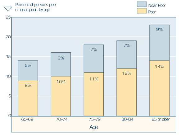
| Age | Poor | Near poor |
|---|---|---|
| 65–69 | 5 | 9 |
| 70–74 | 6 | 10 |
| 75–79 | 7 | 11 |
| 80–84 | 7 | 12 |
| 85 or older | 9 | 14 |
Sources of income, 1998
Social Security is a source of income for nearly all the aged
Nine out of 10 aged units receive Social Security benefits. Asset income is the next most common source of income, received by nearly two-thirds of the aged. Less than half (43%) receive pensions other than Social Security, and only 21% have earnings. Public assistance is received by 5% and veterans' benefits by only 4%.
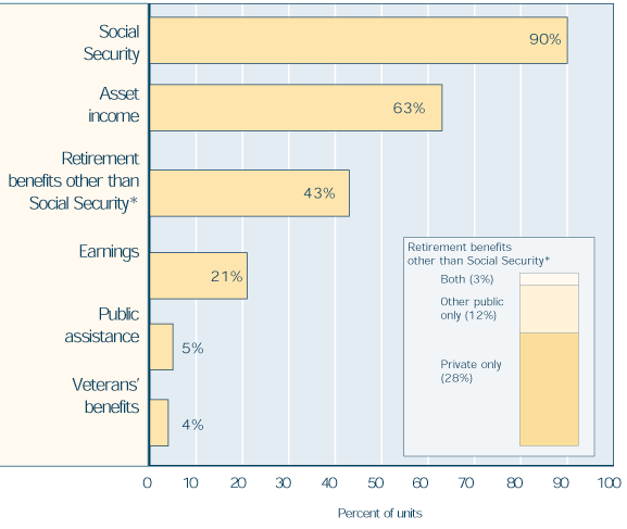
| Source of income | Percent of units |
|---|---|
| Social Security | 90 |
| Asset income | 63 |
| Retirement benefits other than Social Security* | 43 |
| Private only | 28 |
| Other public only | 12 |
| Both | 3 |
| Earnings | 21 |
| Public assistance | 5 |
| Veterans' benefits | 4 |
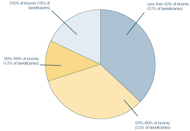
Percent of income from Social Security, 1998
Social Security provides at least half of total income for a majority of beneficiaries
Social Security pays benefits to more than 90% of those aged 65 or older. It is the major source of income (providing 50% or more of total income) for 63% of the beneficiaries. It contributes 90% or more of income for almost one-third of the beneficiaries and is the only source of income for 18% of them.
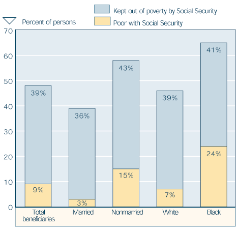
Social Security's role in reducing poverty, by marital status and race, 1998
Social Security plays a pivotal role in reducing poverty
Although there are aged beneficiaries with family income below the poverty line (based on family income of aged persons to conform with official measures of poverty), the poverty rate would be much higher if they did not have Social Security benefits. Nine percent of aged beneficiaries are poor, and 39% are kept out of poverty by their Social Security benefits—so that the total poverty rate without Social Security would be 48%. Although poverty rates vary considerably by marital status and race, the proportion kept out of poverty by their Social Security benefits is about 40% for all groups.
| Marital status and race | Poor with Social Security |
Kept out of poverty by Social Security |
|---|---|---|
| Total beneficiaries | 9 | 39 |
| Married | 3 | 36 |
| Nonmarried | 15 | 43 |
| White | 7 | 39 |
| Black | 24 | 41 |
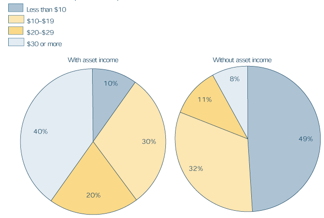
Size of income, by receipt of asset income, 1998
Receipt of asset income is associated with relatively high median income
The median income of those with asset income is more than twice as large as that of those with no asset income ($24,423, compared to $10,041). Aged units with no asset income are concentrated in the lowest income categories—49% have a total income below $10,000, and only 8% have an income of $30,000 or more. Among aged units with asset income, 10% have a total income of less than $10,000, and 40% have an income of $30,000 or more.
| Total income | Percent with asset income |
Percent without asset income |
|---|---|---|
| Less than $10 | 10 | 49 |
| $10 $19 | 30 | 32 |
| $20 $29 | 20 | 11 |
| $30 or more | 40 | 8 |
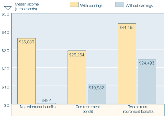
Median income, by receipt of earnings and retirement benefits, 1998
Receipt of earnings and retirement benefits also affects income size
About 7% of aged units have no retirement benefits. Of these, 38% have earnings; their median income is $36,089. Sixty-two percent have no earnings, and their median income is only $482. In the absence of earnings, median income rises markedly with the number of retirement benefits received, from $10,982 with one retirement benefit to $24,493 with two or more. For units with both earnings and retirement benefits, median incomes are $29,264 for those with one retirement benefit and $44,195 for those with more than one.
| Retirement benefits | With earnings | Without earnings |
|---|---|---|
| No retirement benefits | 36,089 | 482 |
| One retirement benefit | 29,264 | 10,982 |
| Two or more retirement benefits | 44,195 | 24,493 |
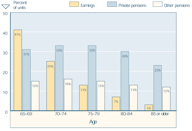
Receipt of income from earnings and pensions, by age, 1998
Age groups differ in their likelihood of receiving earnings and pensions
Earnings are much more common in the youngest age group than in the oldest group—41% compared to 3%. Private pensions and other pensions are also more common among the younger groups than the older ones. For the youngest group, earnings are a more common source of income than are either private or other pensions. Among the older cohorts, private pensions are a more common source of income than are earnings or other pensions.
| Age | Earnings | Private pensions |
Other pensions |
|---|---|---|---|
| 65–69 | 41 | 31 | 15 |
| 70–74 | 25 | 33 | 16 |
| 75–79 | 13 | 33 | 15 |
| 80–84 | 7 | 30 | 13 |
| 85 or older | 3 | 23 | 12 |
Receipt of income, by source, race, and Hispanic origin, 1998
Receipt of income from major sources varies by race and Hispanic origin
Among the aged, whites and blacks are somewhat more likely than Hispanics to receive Social Security. Whites are much more likely than blacks or Hispanics to receive income from assets and from pensions. The groups are about equally likely to have earnings. Minority aged units are much more likely to receive Supplemental Security Income (SSI) than are whites.
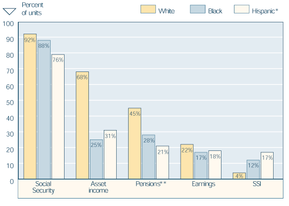
| Source | White | Black | Hispanic * |
|---|---|---|---|
| Social Security | 92 | 88 | 76 |
| Asset income | 68 | 25 | 31 |
| Pensions ** | 45 | 28 | 21 |
| Earnings | 22 | 17 | 18 |
| SSI | 4 | 12 | 17 |
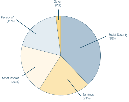
Share of income, by source, 1998
Social Security provides the majority of income for the aged
Money income for the population 65 or older comes largely from four sources. Social Security provides the largest portion—38%. Earnings, asset income, and pensions other than Social Security account for 21%, 20%, and 19%, respectively. Only 2% comes from other sources.
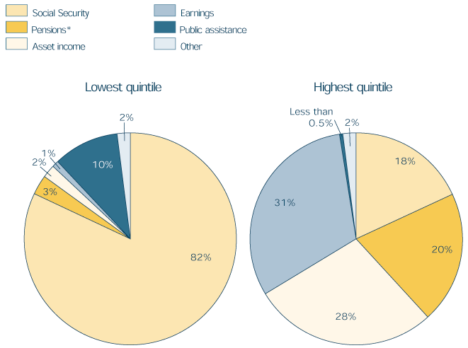
Share of income, by source and income level, 1998
The share supplied by each income source differs greatly by income level
Aged units are ranked by total income and divided into five groups of equal size called quintiles. Persons in the lowest quintile have the largest share of total income from Social Security benefits (82%), and public assistance provides the second largest share (10%). For those in the highest income quintile, earnings provides the highest share of income (31%), income from assets is the next most important (28%), followed by pensions (20%) and Social Security (18%).
| Source | Lowest | Second | Third | Fourth | Highest |
|---|---|---|---|---|---|
| Total percent | 100 | 100 | 100 | 100 | 100 |
| Social Security | 82 | 80 | 64 | 45 | 18 |
| Pensions a | 3 | 7 | 15 | 24 | 20 |
| Asset income | 2 | 6 | 10 | 14 | 28 |
| Earnings | 1 | 3 | 7 | 13 | 31 |
| Public assistance | 10 | 2 | 1 | b | b |
| Other | 2 | 2 | 3 | 3 | 2 |
| NOTE: Percents may not sum to 100 due to rounding. | |||||
| a. Includes private pensions and annuities, government employee pensions, Railroad Retirement, and IRA, Keogh, and 401(k) payments. | |||||
| b. Less than 0.5%. | |||||
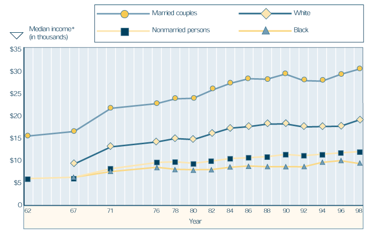
Change in median income since 1962
Median real income has risen substantially over the years
Between 1962 and 1998, the income of the aged increased even when adjusted for inflation. The increase was 95% for married couples and 98% for nonmarried persons. There were disproportionate increases by race. Between 1967 and 1998, the income of whites increased by 104%; that of blacks increased by 44%.
| Year | Marital status | Race | ||
|---|---|---|---|---|
| Married couples |
Nonmarried persons |
White | Black | |
| 1962 | 15,466 | 6,079 | * | * |
| 1967 | 16,461 | 6,374 | 9,282 | 6,559 |
| 1971 | 21,564 | 8,247 | 13,064 | 7,619 |
| 1976 | 22,602 | 9,625 | 14,151 | 8,565 |
| 1978 | 23,650 | 9,775 | 14,900 | 8,125 |
| 1980 | 23,777 | 9,456 | 14,678 | 8,031 |
| 1982 | 25,556 | 9,932 | 15,962 | 8,074 |
| 1984 | 27,062 | 10,495 | 17,194 | 8,581 |
| 1986 | 28,094 | 10,678 | 17,520 | 8,849 |
| 1988 | 27,977 | 10,924 | 18,073 | 8,685 |
| 1990 | 29,123 | 11,408 | 18,136 | 8,714 |
| 1992 | 27,670 | 11,100 | 17,455 | 8,670 |
| 1994 | 27,546 | 11,444 | 17,544 | 9,649 |
| 1996 | 29,030 | 11,741 | 17,613 | 10,024 |
| 1998 | 30,176 | 12,015 | 18,955 | 9,414 |
| NOTE: * = not available. | ||||
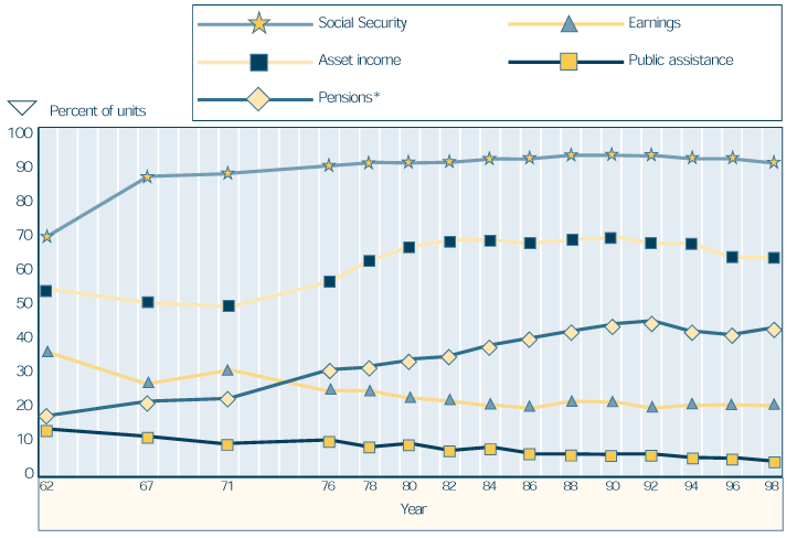
Change in income sources since 1962
Receipt of Social Security has become nearly universal since 1962
In 1962, 69% of the aged received Social Security benefits; in 1998, 90% of them did. Most of that increase occurred in the 1960s. Receipt of other pension income, which more than doubled from 1962 to 1992, has decreased slightly since then. The proportion of aged units with asset income, which had been about two-thirds since 1980, has dropped slightly since 1994. The proportion with earnings has declined since 1962, and since 1982 has been about 21%. The proportion receiving public assistance has also declined and is now about a third of its 1962 level.
| Year | Social Security |
Asset income |
Pensions a | Earnings | Public assistance |
|---|---|---|---|---|---|
| 1962 | 69 | 54 | 18 | 36 | 14 |
| 1967 | 86 | 50 | 22 | 27 | 12 |
| 1971 | 87 | 49 | 23 | 31 | 10 |
| 1976 | 89 | 56 | 31 | 25 | 11 |
| 1978 | 90 | 62 | 32 | 25 | 9 |
| 1980 | 90 | 66 | 34 | 23 | 10 |
| 1982 | 90 | 68 | 35 | 22 | 8 |
| 1984 | 91 | 68 | 38 | 21 | 9 |
| 1986 | 91 | 67 | 40 | 20 | 7 |
| 1988 | 92 | 68 | 42 | 22 | 7 |
| 1990 | 92 | 69 | 44 | 22 | 7 |
| 1992 | 92 | 67 | 45 | 20 | 7 |
| 1994 | 91 | 67 | 42 | 21 | 6 |
| 1996 | 91 | 63 | 41 | 21 | 6 |
| 1998 | 90 | 63 | 43 | 21 | 5 |
| a. Includes private pensions and annuities, government employee pensions, Railroad Retirement, and IRA, Keogh, and 401(k) payments. | |||||
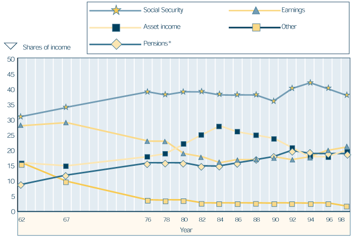
Change in shares of income, by source since 1962
Social Security continues to provide the largest share of total income for the aged
In 1962, Social Security provided the largest share of income for the aged, followed closely by earnings. In 1998, Social Security continues to provide the largest share but by a much wider margin compared to the other major sources of income. The share from asset income increased for over 20 years and has generally declined since the mid-1980s. The share from earnings has had the opposite pattern—declining until the mid-1980s and increasing since then. The share from pensions more than doubled over that period.
| Year | Social Security |
Asset income |
Pensions a | Earnings | Other |
|---|---|---|---|---|---|
| 1962 | 31 | 16 | 9 | 28 | 16 |
| 1967 | 34 | 15 | 12 | 29 | 10 |
| 1976 | 39 | 18 | 16 | 23 | 4 |
| 1978 | 38 | 19 | 16 | 23 | 4 |
| 1980 | 39 | 22 | 16 | 19 | 4 |
| 1982 | 39 | 25 | 15 | 18 | 3 |
| 1984 | 38 | 28 | 15 | 16 | 3 |
| 1986 | 38 | 26 | 16 | 17 | 3 |
| 1988 | 38 | 25 | 17 | 17 | 3 |
| 1990 | 36 | 24 | 18 | 18 | 3 |
| 1992 | 40 | 21 | 20 | 17 | 3 |
| 1994 | 42 | 18 | 19 | 18 | 3 |
| 1996 | 40 | 18 | 19 | 20 | 3 |
| 1998 | 38 | 20 | 19 | 21 | 2 |
| a. Includes private pensions and annuities, government employee pensions, Railroad Retirement, and IRA, Keogh, and 401(k) payments. | |||||