The Upper Part of the Earnings Distribution in the United States: How Has It Changed?
Social Security Bulletin, Vol. 64, No. 3, 2001/2002 (released January 2003)
This article examines the upper part of the earnings distribution for the period 1982-1995 using Social Security Administration data. The study shows that the earnings share of persons in the top 0.1 percent of the earnings distribution grew much faster over that period than did the share of those in any other part of the distribution.
The author is with the Division of Economic Research, Office of Research, Evaluation, and Statistics, Office of Policy, Social Security Administration.
Acknowledgments: Special thanks go to Greg Acs, Ben Bridges, Susan Grad, Thomas Hungerford, Howard Iams, Mike Leonesio, Joyce Manchester, Carolyn Puckett, Jim Sears, and Pat Vinkenes for providing comments and suggestions on earlier drafts of this article.
Contents of this publication are not copyrighted; any items may be reprinted, but citation of the Social Security Bulletin as the source is requested. The findings and conclusions presented in the Bulletin are those of the authors and do not necessarily represent the views of the Social Security Administration.
Summary
This article uses Social Security Administration data to examine changes in the upper end of the earnings distribution over the period 1982-1995. These data provide a unique opportunity for analyzing those changes because they come directly from W-2 forms and are not top-coded--obvious advantages over data typically provided by surveys such as the Current Population Survey. Although they do not provide some of the information necessary to explain what one observes occurring at the top of the earnings distribution (no educational attainment information, for example), these data are sufficient for describing in great detail what happened to high earners through the 1980s and into the 1990s.
This analysis clearly demonstrates the extent to which earnings are concentrated at the top of the distribution. The study's findings reinforce those of Feenberg and Poterba (2000) by showing that the very highest earners--those in the upper 1 percent--experienced the largest relative increase in earnings share from 1982 to 1995. Even within that upper 1 percent, those with earnings in the upper 0.1 percent were the ones driving the increase in the group's earnings share.
Perhaps not surprisingly, the overwhelming majority of the highest earners are white men who are in the middle to latter part of their working lives. Women have made strides toward entering this elite group of earners but still form a very small percentage of the group relative to their size in the working population. Very few blacks are in the extreme upper tail of the earnings distribution, and they have made very little progress (in absolute terms) over the period 1982-1995 in increasing their numbers. In contrast, persons of racial/ethnic backgrounds other than white or black have increased their presence among top earners. They went from being relatively underrepresented in the top 0.1 percent in 1982 to being overrepresented by 1995; that is, they accounted for a larger share of the top 0.1 percent of earners than they did of the entire working population.
Finally, the study also finds that the percentage of overall wage and salary earnings from Social Security-covered employment that is not taxed for the purposes of Old-Age, Survivors, and Disability Insurance because of the taxable maximum generally increased over the 1982-1995 period. Wage and salary earnings above the taxable maximum rose at a faster rate than is the average wage.
Introduction
A large body of literature has developed over the past 25 years that examines changes in income and earnings distributions in the United States. Relatively little has been written, however, about the extreme upper end of the earnings distribution--those whose earnings place them in the top 1 percent of all earners.
The chief reason for the lack of research dealing with top earners is the lack of data sources with credible information about earnings. Public-use survey data files of the type most frequently used to study income and earnings distributions are typically top-coded, a process under which earnings for persons near the top of the distribution are masked to prevent identification of a specific individual. This article, however, uses a Social Security Administration (SSA) 1 percent sample file that contains earnings records for around 1 million individuals for each year between 1982 and 1995. The file is available only to researchers within SSA and to a small number of researchers in other agencies in order to keep the data confidential.
Only a few other studies have specifically examined the very top of the income and earnings distributions. Perhaps the best of them was done by Feenberg and Poterba (2000), who used tax return data from the U.S. Treasury to look at changes among top earners. In their analysis of annual income distributions for the period 1960-1995, Feenberg and Poterba focused on the upper 0.5 percent of the taxpaying households in their database. They examined the various components of income and documented how those components change over time, including changes in earnings that should be roughly comparable with those found in this study. Note, however, that while Feenberg and Poterba focused on the taxpaying unit (generally a household), this analysis focuses on the individual wage and salary earner.
Feenberg and Poterba found that the share of adjusted gross income (AGI) of the upper 0.5 percent of taxpayers generally increased over the 1980s and early 1990s and, in particular, increased from around 7.8 percent to around 11.2 percent between 1982 and 1995. They argued that some of this increase might be attributed to income-retiming strategies (shifting income from one year to the next to take advantage of more favorable marginal tax rates) brought about by changes in the tax code included in the Tax Reform Act of 1986 (TRA86). However, the fact that this increase in AGI persisted through the mid-1990s means that not all of the increase can be attributed to transitory effects of income-shifting. Feenberg and Poterba also found that labor income has become a much larger component of the income of the top 0.5 percent of the income distribution. In 1962, only 3 percent of the AGI of those in the upper 0.5 percent came from wage and salary income, compared with nearly 93 percent from interest and dividends. By 1995, income from wages and salaries accounted for nearly 28 percent, and interest and dividends had fallen to about 19 percent.1
This study uses a very large SSA data set to examine changes in the upper end of the earnings distribution over the period 1982-1995. The article:
- Provides a detailed description of the data used to generate the results,
- Presents results that generally support the findings of Feenberg and Poterba, and
- Shows how changes in the extreme upper portion of the earnings distribution have interacted with taxable maximum earnings under the Old-Age, Survivors, and Disability Insurance (OASDI) program to permit an ever larger portion of wage and salary earnings to go untaxed for OASDI purposes.2
Description of the Data
This study used a subset of files from the Social Security Administration's Continuous Work History Sample (CWHS) family of files.3 These files provide information on the sex, race, year of birth, annual OASDI taxable wages, and total wage compensation for a 1 percent sample of Social Security numbers (SSNs) for which wage and salary employment was reported over the period 1982-1995. Data were reported for individuals with wage and salary earnings in jobs covered by Social Security, not covered by Social Security, or both. Because of limitations in the earlier annual data gathered by the Social Security Administration, 1982 was chosen to be the first year in the analysis.
Total wage compensation consists of wage and salary earnings by individuals without regard to the OASDI taxable maximum amount. Any wages, tips, and other compensation reported by employers on the W-2 form are included. Other types of earnings, such as the realization of certain stock options or bonuses, are included in total wage compensation to the extent that employers are required to report them by the relevant Internal Revenue Service regulations. Note, however, that the earnings numbers used probably understate the true total wage compensation because they do not include pretax contributions to tax-deferred saving plans, medical saving plans, and so on.
Self-employment earnings are not used in this analysis. Until very recently, SSA received information only on self-employment income that was taxable for OASDI purposes. The extent to which the omission of self-employment earnings might affect the results is not clear. Feenberg and Poterba (2000) found that their results were essentially unchanged when they excluded all income other than wage and salary earnings.
The CWHS data provide three main advantages over survey data for examining the earnings of individuals in the upper portion of the earnings distribution. First, the information comes directly from the W-2 form, thus mitigating the problem with self-reporting found in most surveys.4 Second, the earnings data are not top-coded and therefore provide actual wage and salary information for those at the upper end of the distribution.5 Third, the large sample sizes for the years under study, ranging from slightly more than 975,000 individuals in 1982 to around 1,360,000 individuals in 1995, provide adequate numbers for studying in great detail the top 1 percent of the distribution.
The major drawback to using the CWHS data when analyzing changes in earnings distributions is the lack of certain types of socioeconomic information for individuals in the data set, particularly the lack of information regarding educational attainment. Many studies have pointed to differences in education and to increased returns to education as possible reasons for changes in earnings distributions over the period being examined. Without any way to identify differences in education among individuals in the sample, the ability to explain any changes found in the upper portion of the earnings distribution is limited. This article, therefore, merely describes those changes.
Results
This section presents the results from two different vantage points. The first examines the upper tail of the earnings distribution, shows how earnings shares for various quantiles have changed over time, and looks at the composition of the various quantiles by sex, race and ethnicity, and age group. The second examines these changes in the earnings distribution relative to the OASDI annual taxable maximum.6
The Upper Tail
Individuals in the top 1 percent of the earnings distribution collected an increasing share of total wage and salary earnings during the period 1982-1995, with most of that increase occurring in the upper 0.1 percent (see Table 1).7 The earnings share of the top 0.1 percent rose nearly 65 percent, from 2.0 percent in 1982 to 3.3 percent in 1995.
| Top 0.1 percent |
Top 1 percent | Top 10 percent | ||||
|---|---|---|---|---|---|---|
| Overall | Excluding earnings from the top 0.1 percent |
Overall | Excluding earnings from the top 1 percent |
Excluding earnings from the top 0.1 percent |
||
| 1982 | 2.0 | 8.2 | 6.2 | 33.2 | 25.0 | 31.2 |
| 1983 | 2.2 | 8.3 | 6.1 | 32.9 | 24.7 | 30.7 |
| 1984 | 2.5 | 8.7 | 6.1 | 33.4 | 24.7 | 30.9 |
| 1985 | 2.3 | 8.5 | 6.2 | 33.2 | 24.7 | 30.9 |
| 1986 | 2.5 | 8.9 | 6.4 | 33.7 | 24.8 | 31.2 |
| 1987 | 3.8 | 10.7 | 6.9 | 35.0 | 24.4 | 31.3 |
| 1988 | 3.8 | 10.9 | 7.1 | 35.4 | 24.4 | 31.6 |
| 1989 | 3.3 | 10.3 | 7.0 | 34.9 | 24.6 | 31.7 |
| 1990 | 3.3 | 10.3 | 7.0 | 34.8 | 24.5 | 31.5 |
| 1991 | 3.2 | 10.1 | 6.9 | 34.8 | 24.7 | 31.6 |
| 1992 | 3.8 | 11.0 | 7.2 | 35.6 | 24.6 | 31.8 |
| 1993 | 3.6 | 10.8 | 7.2 | 35.8 | 25.0 | 32.2 |
| 1994 | 3.9 | 11.1 | 7.1 | 36.0 | 25.0 | 32.1 |
| 1995 | 3.3 | 10.7 | 7.3 | 35.8 | 25.1 | 32.5 |
| Change, 1982-1995 | ||||||
| In percentage points | 1.3 | 2.5 | 1.1 | 2.6 | 0.1 | 1.3 |
| In percent | 64.8 | 29.7 | 18.3 | 7.8 | 0.6 | 4.1 |
| SOURCE: Author's calculations using administrative data from the Continuous Work History Sample. | ||||||
Of particular note is the rather large (at least in percentage terms) increase in earnings share from 1986 to 1987 among those in the top 0.1 percent. Feenberg and Poterba (2000) found a similar effect when examining tax return data and attributed much of the change to TRA86, which lowered the tax rate of those in the upper tax bracket from 50 percent to 28 percent. With the decrease in the marginal tax rate, high earners may have felt less need to legally avoid taxes by, for example, replacing earnings with fringe benefits. Also, as Feenberg and Poterba pointed out, individuals who typically receive large bonuses or who bill clients for services had great incentive in 1986 to defer as much of that activity as possible to 1987 or later, when the marginal tax rates were much lower. One might argue that the reverse occurred in 1992. In anticipation of higher tax rates in 1993 (the top marginal tax rate jumped from 31 percent to 39.6 percent in 1993), a significant number of those in the top 0.1 percent of the distribution may have accelerated their earnings in order to have them taxed at the lower 1992 marginal tax rate.8
Earners in the top 0.1 percent also account for a disproportionate part of the earnings share of those in the upper percentile of the earnings distribution. The earnings share for those in the top 1 percent increased by nearly 30 percent from 1982 to 1995 (from 8.2 percent to 10.7 percent of earnings), but if one removes the earnings of those in the top 0.1 percent, the increase in earnings share of the rest of the upper percentile is only 18 percent (from 6.2 percent to 7.3 percent of earnings), as shown in Table 1. This relationship is best shown by calculating Gini coefficients, which economists use to measure inequality (see the appendix). The calculations, both with and without the earnings of the upper 1 percent of the distribution, show that the Gini coefficient rises by nearly 4 percent from 1982 to 1995 if the earnings from the upper 1 percent are included (indicating higher inequality) but by only slightly more than 1 percent if they are not.
By contrast, individuals in the upper percentile, other than those in the top 0.1 percent, may have had relatively less discretion in the timing of bonuses or in shifting fringe benefits to earnings, as evidenced by the much smaller (in percentage terms) jump in the earnings share of the top 1 percent between 1986 and 1987. Excluding those in the upper 0.1 percent, the earnings share of those in the top 1 percent increased by only about 8 percent--from 6.4 percent to 6.9 percent--from 1986 to 1987. By comparison, those in the upper 0.1 percent saw their earnings share rise 52 percent--from 2.5 percent to 3.8 percent.
In 1995, those in the top 10 percent of the distribution had nearly 36 percent of the total earnings received by those in the sample, an increase in earnings share from about 33 percent in 1982.9 Furthermore, nearly all of that increase came from the larger share of earnings of those in the upper percentile (see Table 1). If one removes the earnings of the upper percentile from the distribution, the earnings share of the top 10 percent increased by only 0.6 percent (from 25.0 percent to 25.2 percent). Although such a result--a large increase in the earnings share of the upper 0.1 percent of the distribution with little or no growth in the upper 10 percent--could be generated by a large increase in the number of wage and salary earners at the bottom of the distribution, the numbers in Table 2 show that is not the case. The earnings break points in Table 2 reveal that a generally higher earnings amount is required to be in the upper 0.1 percent. Table 2 also shows that the minimum earnings amount necessary to be in the upper 10 percent has increased over time, although at a much slower rate (7 percent) than that for the upper 0.1 percent or 1 percent (48 percent and 20 percent, respectively). Furthermore, if one removes the earnings of the top 0.1 percent and then recalculates the annual earnings shares of the upper decile, one finds that growth in the earnings share held by the upper decile is nearly halved. One can speculate that individuals in the upper decile of the earnings distribution, excluding those in the upper percentile, might have done relatively less to change the timing of their earnings or to shift away from fringe benefits to wage and salary earnings in response to TRA86, as evidenced by relatively steady earnings shares for the group throughout the mid-1980s.
| Year | Top 0.1 percent | Top 1 percent | Top 10 percent |
|---|---|---|---|
| 1982 | 259,678 | 96,736 | 42,792 |
| 1983 | 264,431 | 95,457 | 43,338 |
| 1984 | 282,026 | 98,110 | 44,362 |
| 1985 | 287,057 | 100,463 | 45,088 |
| 1986 | 308,494 | 102,591 | 45,328 |
| 1987 | 381,839 | 107,154 | 45,584 |
| 1988 | 400,459 | 109,243 | 45,423 |
| 1989 | 374,265 | 108,924 | 45,277 |
| 1990 | 384,498 | 107,888 | 45,077 |
| 1991 | 366,040 | 107,552 | 44,947 |
| 1992 | 409,485 | 111,002 | 45,480 |
| 1993 | 389,636 | 113,384 | 45,578 |
| 1994 | 374,979 | 112,221 | 45,575 |
| 1995 | 384,532 | 115,673 | 45,792 |
| Percentage increase, 1982-1995 | 48 | 20 | 7 |
| SOURCE: Author's calculations using administrative data from the Continuous Work History Sample. | |||
By Sex and Race. Women made up a generally increasing segment of the top 0.1 percent, the upper percentile, and the upper decile of the earnings distribution over the period studied (see Table 3).10 The percentage of women in the top 0.1 percent more than quadrupled over the period, increasing from 1.5 percent to 6.2 percent. For the upper decile, the percentage who were women increased by more than 2.5 times, from 8 percent to 21 percent. However, although women constituted nearly 50 percent of the earners in the sample over the various years, they formed a much smaller percentage of the earners in the various upper quantiles presented here; in 1995, for instance, only about 6 percent of individuals in the upper 0.1 percent were women.
| Year | Top 0.1 percent |
Top 1 percent |
Top 10 percent |
Total sample |
|---|---|---|---|---|
| Women | ||||
| 1982 | 1.5 | 3.0 | 8.0 | 43.9 |
| 1983 | 2.2 | 3.8 | 9.3 | 44.9 |
| 1984 | 2.4 | 4.3 | 10.0 | 45.3 |
| 1985 | 2.2 | 4.7 | 10.9 | 45.8 |
| 1986 | 2.9 | 5.2 | 12.2 | 46.3 |
| 1987 | 9.4 | 6.7 | 13.3 | 46.4 |
| 1988 | 3.1 | 6.6 | 14.6 | 46.7 |
| 1989 | 3.8 | 6.9 | 15.8 | 46.7 |
| 1990 | 3.8 | 7.8 | 17.2 | 47.0 |
| 1991 | 4.9 | 8.2 | 18.8 | 47.1 |
| 1992 | 4.4 | 9.2 | 19.6 | 47.3 |
| 1993 | 5.8 | 9.8 | 20.6 | 47.4 |
| 1994 | 7.7 | 9.9 | 20.3 | 47.7 |
| 1995 | 6.2 | 9.8 | 21.0 | 47.7 |
| Change, 1982-1995 | ||||
| In percentage points | 4.7 | 6.8 | 13.0 | 3.8 |
| In percent | 313.3 | 226.7 | 162.5 | 8.7 |
| Blacks | ||||
| 1982 | a | 1.0 | 3.7 | 10.9 |
| 1983 | 0.7 | 0.9 | 4.3 | 11.1 |
| 1984 | 0.7 | 1.1 | 4.4 | 11.3 |
| 1985 | 1.2 | 1.0 | 4.4 | 11.4 |
| 1986 | 1.5 | 1.1 | 4.4 | 11.5 |
| 1987 | 1.2 | 1.1 | 4.5 | 11.6 |
| 1988 | 1.1 | 1.2 | 4.6 | 11.7 |
| 1989 | 0.9 | 1.2 | 4.7 | 11.6 |
| 1990 | 1.1 | 1.3 | 4.8 | 11.6 |
| 1991 | 1.5 | 1.4 | 4.9 | 11.4 |
| 1992 | 1.3 | 1.4 | 5.1 | 11.4 |
| 1993 | 1.6 | 1.6 | 5.2 | 11.5 |
| 1994 | 1.8 | 1.5 | 5.2 | 11.6 |
| 1995 | 1.4 | 1.5 | 5.2 | 11.7 |
| Change, 1982-1995 | ||||
| In percentage points | 0.7 | 0.5 | 1.5 | 0.8 |
| In percent | 100.0 | 50.0 | 40.5 | 7.3 |
| Other racial or ethnic groups (neither white nor black) | ||||
| 1982 | 3.2 | 5.5 | 5.2 | 5.7 |
| 1983 | 5.7 | 6.1 | 5.6 | 6.0 |
| 1984 | 5.6 | 6.4 | 5.9 | 6.2 |
| 1985 | 5.8 | 7.0 | 6.3 | 6.4 |
| 1986 | 7.4 | 7.6 | 6.7 | 6.5 |
| 1987 | 8.9 | 8.4 | 7.1 | 6.8 |
| 1988 | 8.3 | 8.3 | 7.4 | 7.0 |
| 1989 | 9.6 | 9.3 | 7.8 | 7.1 |
| 1990 | 10.5 | 9.9 | 8.3 | 7.4 |
| 1991 | 11.6 | 10.4 | 8.6 | 7.6 |
| 1992 | 10.1 | 10.6 | 8.9 | 7.8 |
| 1993 | 12.4 | 11.0 | 9.2 | 8.0 |
| 1994 | 12.6 | 11.5 | 9.2 | 8.2 |
| 1995 | 13.1 | 12.2 | 9.6 | 8.4 |
| Change, 1982-1995 | ||||
| In percentage points | 9.9 | 6.7 | 4.4 | 2.7 |
| In percent | 309.4 | 121.8 | 84.6 | 47.4 |
| SOURCE: Author's calculations using administrative data from the Continuous Work History Sample. | ||||
| a. Fewer than five individuals. | ||||
The upper quantiles of the earnings distribution are disproportionately composed of those categorized as white or other (neither white nor black), and those identified as black are underrepresented. In 1995, for example, only about 8.5 percent of the total sample fell into the "other" category, but 13 percent of those in the top 0.1 percent did. By contrast, only 1.4 percent of the upper 0.1 percent was identified as black, even though 11.7 percent of the overall sample reported themselves as black when they applied for a Social Security number. Over the period studied, the proportion of those in the top 0.1 percent identified as black nearly doubled, but blacks still accounted for a very small portion of top earners relative to the other racial and ethnic groups. The proportion of those identifying themselves as neither black nor white increased from 1.0 percent in the upper percentile in 1982 to 1.4 percent by 1995 (not shown in Table 3). In fact, by 1995, a higher proportion of those categorized as "other" than of those categorized as white had earnings in the upper percentile. About 1.1 percent of those classified as white had earnings in the upper 1 percent of the distribution both in 1982 and in 1995.
By Age. Over the 1982-1995 period, there was a relative decline in the number of individuals in the 15-24, 25-34, and 55-64 age groups and a relative increase in the number in the 35-54 and 65-80 groups (see Table 4). Those trends are due to the passing of the baby-boom generation out of the 15-24 age group, through and mostly out of the 25-34 age group, and nearly fully into the 35-54 age group. The small increase in relative numbers of those in the 65-80 age group may represent a lengthening of the average lifespan in the United States over the period.
| Year | 15-24 | 25-34 | 35-54 | 55-64 | 65-80 |
|---|---|---|---|---|---|
| Overall sample | |||||
| 1982 | 25.6 | 28.3 | 33.0 | 10.2 | 2.8 |
| 1983 | 24.3 | 28.4 | 34.1 | 10.3 | 2.8 |
| 1984 | 24.3 | 28.5 | 34.5 | 10.0 | 2.7 |
| 1985 | 23.5 | 28.7 | 35.1 | 9.9 | 2.7 |
| 1986 | 23.1 | 28.8 | 35.7 | 9.6 | 2.8 |
| 1987 | 22.6 | 28.7 | 36.4 | 9.4 | 2.8 |
| 1988 | 22.3 | 28.6 | 37.0 | 9.2 | 2.9 |
| 1989 | 21.7 | 28.4 | 37.8 | 9.1 | 3.0 |
| 1990 | 20.9 | 28.1 | 38.9 | 9.1 | 3.0 |
| 1991 | 20.0 | 27.8 | 40.2 | 9.0 | 3.1 |
| 1992 | 19.6 | 27.1 | 41.1 | 9.0 | 3.2 |
| 1993 | 19.3 | 26.5 | 41.9 | 9.1 | 3.3 |
| 1994 | 19.2 | 26.0 | 42.6 | 9.0 | 3.3 |
| 1995 | 19.0 | 25.6 | 43.2 | 9.0 | 3.2 |
| Change, 1982-1995 | |||||
| In percentage points | -6.6 | -2.7 | 10.2 | -1.2 | 0.4 |
| In percent | -25.8 | -9.5 | 30.9 | -11.8 | 14.3 |
| Top 0.1 percent | |||||
| 1982 | a | 5.2 | 63.6 | 24.5 | 6.4 |
| 1983 | a | 6.1 | 63.4 | 24.8 | 5.5 |
| 1984 | 0.5 | 6.0 | 64.2 | 23.5 | 5.8 |
| 1985 | 0.6 | 5.5 | 65.3 | 22.3 | 6.3 |
| 1986 | 0.6 | 6.3 | 65.9 | 21.6 | 5.7 |
| 1987 | 5.6 | 8.2 | 63.1 | 19.6 | 3.5 |
| 1988 | 1 | 6.2 | 67.2 | 20.6 | 5.0 |
| 1989 | 0.5 | 7.1 | 67.6 | 19.1 | 5.6 |
| 1990 | 0.4 | 6.2 | 69.4 | 17.6 | 6.4 |
| 1991 | 0.4 | 5.2 | 69.2 | 19.0 | 6.1 |
| 1992 | 0.4 | 5.1 | 70.9 | 18.2 | 5.4 |
| 1993 | a | 5.8 | 71.1 | 18.2 | 4.7 |
| 1994 | 1.9 | 6.2 | 70.3 | 16.4 | 5.1 |
| 1995 | 0.4 | 4.4 | 70.3 | 19.7 | 5.2 |
| Change, 1982-1995 | |||||
| In percentage points | -0.1 | -0.8 | 6.7 | -4.8 | -1.2 |
| In percent | -20 | -15.4 | 10.5 | -19.6 | -18.8 |
| Top 1 percent | |||||
| 1982 | 0.1 | 8.4 | 65.3 | 22.0 | 4.1 |
| 1983 | 0.2 | 8.8 | 66.4 | 20.3 | 4.2 |
| 1984 | 0.3 | 8.9 | 66.8 | 20.0 | 4.1 |
| 1985 | 0.2 | 8.8 | 67.2 | 19.8 | 4.0 |
| 1986 | 0.2 | 9.4 | 67.3 | 19.1 | 4.0 |
| 1987 | 0.8 | 10.3 | 66.4 | 18.3 | 4.2 |
| 1988 | 0.2 | 9.6 | 67.6 | 18.2 | 4.4 |
| 1989 | 0.2 | 9.5 | 68.3 | 17.8 | 4.2 |
| 1990 | 0.1 | 9.2 | 68.9 | 17.5 | 4.2 |
| 1991 | 0.1 | 8.8 | 69.4 | 17.5 | 4.2 |
| 1992 | 0.1 | 8.5 | 69.9 | 17.4 | 4.0 |
| 1993 | 0.1 | 8.3 | 70.5 | 17.2 | 3.8 |
| 1994 | 0.2 | 7.5 | 71.2 | 17.1 | 4.0 |
| 1995 | 0.1 | 7.2 | 71.6 | 17.2 | 3.9 |
| Change, 1982-1995 | |||||
| In percentage points | 0 | -1.2 | 6.3 | -4.8 | -0.2 |
| In percent | 0 | -14.3 | 9.6 | -21.8 | -4.9 |
| Upper 10 percent | |||||
| 1982 | 1.0 | 21.1 | 59.9 | 16.2 | 1.8 |
| 1983 | 0.7 | 20.1 | 61.4 | 16.0 | 1.8 |
| 1984 | 0.6 | 20.0 | 61.7 | 15.9 | 1.8 |
| 1985 | 0.5 | 19.9 | 62.2 | 15.5 | 1.8 |
| 1986 | 0.5 | 19.8 | 62.8 | 15.0 | 1.9 |
| 1987 | 0.6 | 19.5 | 63.5 | 14.5 | 1.9 |
| 1988 | 0.5 | 19.4 | 64.0 | 14.1 | 2.0 |
| 1989 | 0.4 | 19.0 | 64.8 | 13.8 | 2.0 |
| 1990 | 0.4 | 18.4 | 65.6 | 13.7 | 2.0 |
| 1991 | 0.3 | 17.5 | 66.8 | 13.4 | 2.0 |
| 1992 | 0.3 | 16.7 | 67.9 | 13.1 | 2.0 |
| 1993 | 0.3 | 15.7 | 68.7 | 13.4 | 2.0 |
| 1994 | 0.2 | 15.1 | 69.5 | 13.3 | 2.0 |
| 1995 | 0.2 | 14.6 | 70.1 | 13.2 | 2.0 |
| Change, 1982-1995 | |||||
| In percentage points | -0.8 | -6.5 | 10.2 | -3.0 | 0.2 |
| In percent | -80.0 | -30.8 | 17.0 | -18.5 | 11.1 |
| SOURCE: Author's calculations using administrative data from the Continuous Work History Sample. | |||||
| a. Fewer than five individuals. | |||||
The vast majority of top earners were in the 35-54 age group, as shown in Table 4. Although this age group is the largest in the sample, it is clearly overrepresented in terms of sheer numbers of individuals in the quantiles examined here.11 Not surprisingly, those in the 55-64 age group--individuals who are generally considered to be in their prime earning years--are also overrepresented, relative to their numbers in the population at large, at the upper end of the earnings distribution. What might be somewhat surprising is the small cadre of individuals in the 65-80 age group with high relative earnings. Notice that relatively more individuals in the 65-80 age group are in the upper 0.1 percent and upper 1 percent than are in the overall sample but that relatively fewer individuals aged 65-80 are in the upper 10 percent. This finding might indicate that there exists a small group of individuals aged 65-80 who have relatively high earnings and a very large group of like-aged individuals who have relatively lower earnings. Those in the two youngest age groups are under-represented among top earners, probably because they are either still in school and have only part-time, partial-year earnings (those aged 15-24) or because they are just beginning their careers and have not yet entered their maximum earnings years (those aged 25-34 group).12
Another interesting finding is that the percentages of individuals within age groups at the upper end of the distribution either held steady or declined over the study period. In 1982, very few of those in the youngest age group had sufficient earnings to be in the top 1 percent (not shown in Table 4). That remained true throughout the 1982-1995 period. Likewise, 0.3 percent of those in the 25-34 age group were in the upper 1 percent of the earnings distribution in 1982, with that percentage rising slightly through the middle years of the study and gradually falling back to 0.3 percent by 1995. The percentage of the 35-54 age group in the upper 1 percent of the earnings distribution gradually fell from a high of 2.0 percent in 1982 to 1.7 percent by 1995. Those aged 55-64 had 2.2 percent of their group in the upper 1 percent of earners in 1982 but saw that percentage decline to 1.9 percent by 1995. Finally, 1.5 percent of those in the oldest age group had earnings sufficient to be in the upper 1 percent of earners in 1982, compared with only 1.2 percent in 1995.
Changes Relative to the OASDI Taxable Maximum
Changes in the distribution of earnings relative to the maximum taxable earnings for Social Security show a mixed picture.13 On the one hand, the percentage of individuals who had any wage and salary earnings above the taxable maximum generally decreased over the 1982-1995 period (see Table 5). On the other hand, the percentage of overall earnings not taxed for OASDI purposes generally increased. In other words, relatively fewer individuals had relatively larger amounts of wage and salary earnings that are not subject to the OASDI payroll tax, as shown quite clearly in Table 5.14 Mean earnings above the OASDI taxable maximum generally increased throughout the period.
| Year | Percentage with earnings above the taxable maximum |
Mean dollar amount above the taxable maximum |
Percentage of overall earnings not taxed for OASDI |
|---|---|---|---|
| 1982 | 7.1 | 28,183 | 9.9 |
| 1983 | 6.1 | 31,408 | 9.4 |
| 1984 | 6.0 | 33,415 | 9.7 |
| 1985 | 6.0 | 33,520 | 9.7 |
| 1986 | 5.7 | 36,044 | 9.7 |
| 1987 | 5.7 | 45,783 | 11.9 |
| 1988 | 5.9 | 46,285 | 12.4 |
| 1989 | 5.6 | 44,750 | 11.5 |
| 1990 | 5.1 | 46,850 | 11.1 |
| 1991 | 5.1 | 45,903 | 11.0 |
| 1992 | 5.2 | 50,558 | 12.0 |
| 1993 | 5.1 | 50,149 | 11.8 |
| 1994 | 4.8 | 52,786 | 11.6 |
| 1995 | 5.1 | 49,777 | 11.6 |
| Change, 1982-1995 | |||
| In percentage points | -2.0 | . . . | 1.7 |
| In percent | -28.2 | 76.6 | 17.2 |
| SOURCE: Author's calculations using administrative data from the Continuous Work History Sample. | |||
| NOTE: . . . = not applicable. | |||
Appendix: Calculating the Gini Coefficient
The Gini coefficient can be represented graphically by using a Lorenz curve, as in Chart A-1. The Lorenz curve in the example is a plot of the cumulative percentage of total earnings against the cumulative percentage of earners, where the observations are ranked from lowest earnings to highest earnings. Point A on the Lorenz curve in Chart 1, for example, shows that the bottom 60 percent of earners in this example (bottom with respect to their position in the earnings distribution) accounted for approximately 25 percent of the total wage and salary earnings. The line of equality shows where the Lorenz curve would be positioned if everyone in the sample had equal earnings. Therefore, the greater the area between the Lorenz curve and the line of equality, the greater the inequality present in the sample. The traditional Gini coefficient is equal to the ratio of the area between the line of equality and the Lorenz curve and the area beneath the line of equality--in other words, Area B divided by Areas B+C. As Area B gets smaller (meaning the Lorenz curve gets nearer to the line of equality and inequality decreases), the Gini coefficient gets smaller.
Illustrative calculation of the Gini coefficient
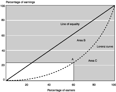
Text Description for Chart A-1.
Illustrative calculation of the Gini coefficient
There are two lines on the chart, labeled line of equality and Lorenz curve. The horizontal axis is labeled percentage of earners. The vertical axis is labeled percentage of earnings. Both axes range from zero to 100 in increments of 20. In the chart, both lines begin at the zero-zero coordinate and end at the 100-100 coordinate.
The line of equality is a straight line. The Lorenz curve bends away from and appears below the line of equality. The Lorenz curve's maximum departure from the line of equality is near point A, at approximately the 60-25 coordinate. The area between the line of equality and the Lorenz curve is labeled Area B. The area below the Lorenz curve is labeled Area C.
Notes
1.The "other income" component of AGI (income from partnerships or rental properties, for example) increased dramatically, from around 4 percent of AGI in 1962 to around 53 percent of AGI by 1995. Goolsbee (2000) argues that the distinction between labor and capital income has blurred because of the increased prevalence of stock options as a form of executive compensation. When those options are exercised, he argues, most of the gains are reported as ordinary income.
2. OASDI taxable wages are the annual wage and salary earnings by individuals in jobs covered under the Social Security Act and its various amendments, up to the amount of the OASDI taxable maximum amount.
3. For a more complete description of the data used in this article, see Utendorf (1999).
4. This is particularly important when examining individuals in the upper part of the earnings distribution, who are believed to be more likely to underreport their earnings.
5. The March Supplement to the Current Population Survey (CPS), for example, top-codes wage and salary earnings so that an individual does not show earnings in any one job of more than $100,000 per year. For several of the years in this study, the CPS supplement top-coded wage and salary earnings at $75,000. In contrast, the mean wage and salary earnings of individuals in the upper 0.1 percent of the earnings distribution in 1995 in CWHS data were slightly less than $740,000.
6. The annual taxable maximum (or, simply, taxable maximum) indicates the amount of earnings in any calendar year that are subject to the OASDI tax. See any recent Annual Statistical Supplement to the Social Security Bulletin for more information about the OASDI taxable maximum.
7. The total personal consumption expenditure deflator is used to adjust earnings for changes in the price level over time. Dollar amounts, where given, are in 1992 dollars.
8. Feenberg and Poterba (2000) found a similar "1992" effect.
9. Prior work shows that the earnings share for each of the bottom nine deciles decreased over the period 1982-1995. See Utendorf (1998 and 1999). The earnings shares for the upper 10 percent differ slightly from those given in Utendorf (1999) because of the lower maximum age (80) used in the current analysis.
10. Note that men are excluded from Table 3 for expository reasons. Values for men can easily be constructed, however, by subtracting the women's values from 100 percent. Similarly, the table also excludes values for whites.
11. Keep in mind that only individuals with wage and salary earnings are in the sample.
12. An unexplained "blip" in the data for those in the 15-24 age group is especially noticeable for those in the upper 0.1 percent of the distribution. In 1987, 5.6 percent of those in the upper 0.1 percent were between the ages of 15 and 24. That percentage is much higher than in any other year of the study. All of the raw data appear to be reasonable, so that some other, as yet unexplained force must be generating this result.
13. In order to make the numbers more relevant, the sample was adjusted to include only those individuals working in OASDI covered employment (those jobs in which employers and employees are required to pay OASDI taxes). For example, for individuals who held two jobs during a given year--the one an OASDI taxed job and the other a job not taxed for OASDI purposes--only the earnings from the job in OASDI covered employment for that year were used in this restricted sample.
14. To keep everything in real terms, the taxable maximum amounts, like all other dollar amounts, were adjusted by the total personal consumption expenditures deflator. Throughout the period being studied, between 93 percent and 95 percent of the individuals had all of their wage and salary earnings fall below the OASDI taxable maximum.
References
Feenberg, D., and J. Poterba. 2002. "The Income and Tax Share of Very High-Income Households, 1960-1995." American Economic Review 90(3): 264-270. Papers and Proceedings of the 114th Annual Meeting of the American Economic Association, edited by J. David Baldwin and Ronald L. Oaxaca. May.
Goolsbee, A. 2000. "Taxes, High-Income Executives, and the Perils of Revenue Estimation in the New Economy." American Economic Review 90(2): 271-275. Papers and Proceedings of the 114th Annual Meeting of the American Economic Association, edited by J. David Baldwin and Ronald L. Oaxaca. May.
Social Security Administration. Various years. Annual Statistical Supplement to the Social Security Bulletin. Washington, D.C.: U.S. Government Printing Office.
Utendorf, K. 1998. "Recent Changes in Earnings Distributions in the United States." Social Security Bulletin 61(2): 12-28.
_________. 1999. "Recent Changes in Earnings Distributions in the United States: Age and Cohort Effects." Social Security Bulletin 62(2): 14-29.