Trends in the Economic Status of the Elderly, 1976–2000
Social Security Bulletin, Vol. 64, No. 3, 2001/2002 (released January 2003)
The elderly (persons aged 65 or older) are financially better off than ever before. Overall, poverty rates for the elderly have fallen since 1976, median real income has risen, and median income relative to that of the working-age population has been relatively stable. One factor in these improvements is increases in Social Security benefits that generally pay enough to keep independently living elderly persons out of poverty. Most demographic subgroups have shared the reduction in poverty rates. By all measures, however, the economic status of elderly Hispanics has not improved.
The authors are with the Division of Policy Evaluation, Office of Research, Evaluation, and Statistics, Office of Policy, Social Security Administration. Howard Iams is director of that division.
Acknowledgments: The authors thank Susan Grad for her comments on previous drafts.
Contents of this publication are not copyrighted; any items may be reprinted, but citation of the Social Security Bulletin as the source is requested. The findings and conclusions presented in the Bulletin are those of the authors and do not necessarily represent the views of the Social Security Administration.
Summary
The economic well-being of elderly Americans (aged 65 or older) improved between 1976 and 2000. Overall, poverty rates fell during this period, median real income rose, and median income relative to the working-age population was relatively stable. Most population subgroups shared in the reduced poverty rates; however, the economic status of elderly Hispanics did not improve.
This article attempts to explain those economic trends by identifying changes in five sources of income for the elderly and analyzing the changes in the context of demographic changes in the elderly populations over the past 25 years. As a result of increased longevity, for example, larger proportions of elderly men and women are now 80 or older, and smaller proportions are 65 to 69. Hispanics and Asian Americans make up a larger share of the elderly population and whites a smaller share. The fraction of women who are married has increased, the fraction who are widowed has fallen, and the fraction who are divorced has grown. Such demographic changes can greatly affect the economic status of subgroups as well as the overall elderly population.
Of the five sources of income for the elderly, Social Security remains the most prevalent and important. While both the rate of receipt and the share of aggregate income from Social Security benefits stayed relatively steady over the past 25 years, the average real Social Security benefit increased because of rising wages. Income from assets, the second most important source of income for the elderly, fluctuated. Because the elderly are more likely to hold interest-bearing assets such as bonds rather than stocks, their asset income is responsive to changes in nominal interest rates and bond yields.
Receipt of pension income increased during this period, although it leveled off during the 1990s. Factors contributing to this pattern include enactment of the Employee Retirement Income Security Act of 1974, which increased protections of pension benefits for spouses, and improved labor market opportunities for blacks and women. In recent years, defined contribution pension plans have become more prevalent than defined benefit plans, but the full effect of this change on pension income may not yet be apparent.
After decades of decline, labor force participation rates of older men leveled out in the mid-1980s and then increased. For older women, the trend before the mid-1980s was flat, but since then rates have risen substantially. The increased use of part-time jobs or self-employment to ease the transition into retirement, the economic expansion of the 1990s, and the liberalization of the Social Security earnings test may all have contributed to those trends. Although the percentage of elderly people with earnings has increased only modestly in the past few years, the share of income from earnings has grown substantially--from 16 percent of income in 1984 to 23 percent in 2000.
Finally, Supplemental Security Income (SSI) benefits are indexed for inflation but not for growth in real wages. As real incomes of the elderly rose, therefore, fewer elderly persons were eligible to receive SSI or, for those receiving SSI, were eligible for smaller benefits. The proportion of elderly persons receiving public assistance, primarily SSI, declined from 11 percent in 1976 to 5 percent in 2000.
Introduction
The elderly (persons aged 65 or older) are financially better off today than ever before (Farley 1996). A smaller proportion live in poverty, and a larger proportion live independently. The official poverty rate for the elderly fell from 15 percent in 1976 to 10 percent in 2000. Moreover, between 1980 and 1990 (the latest year for which disaggregated decennial Census data are available), the proportion of elderly women living with a relative other than their spouse or in an institution declined from 25 percent to 20 percent (Farley 1996, Table 4-6, 144). One reason for these improvements is increases in Social Security benefits, which generally pay enough to keep the elderly who live independently out of poverty.
Since its inception, Social Security has become the major source of income for many elderly people. Today, almost all of them receive Social Security benefits, and almost all workers are covered by Social Security. In general, almost two-thirds of the elderly relied on Social Security for over half of their income in 2000, but that reliance has fluctuated over the past 25 years (see Chart 1). In 1976, two-thirds of the elderly received 50 percent or more of their income from Social Security, but by 1988, only 60 percent did. Since 1988, as noted, that proportion has gone back up to two-thirds.
Proportion of the elderly relying on Social Security for most of their income, 1976–2000
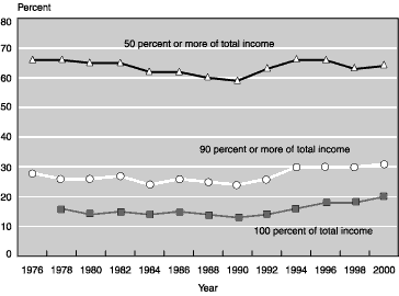
| Year | 50 percent or more of total income | 90 percent or more of total income | 100 percent of total income |
|---|---|---|---|
| 1976 | 66 | 28 | -- |
| 1978 | 66 | 26 | 16 |
| 1980 | 65 | 26 | 14 |
| 1982 | 65 | 27 | 15 |
| 1984 | 62 | 24 | 14 |
| 1986 | 62 | 26 | 15 |
| 1988 | 60 | 25 | 14 |
| 1990 | 59 | 24 | 13 |
| 1992 | 63 | 26 | 14 |
| 1994 | 66 | 30 | 16 |
| 1996 | 66 | 30 | 18 |
| 1998 | 63 | 30 | 18 |
| 2000 | 64 | 31 | 20 |
| NOTE: -- = not available. | |||
Most subgroups of the elderly population also experienced a U-shaped pattern of reliance on Social Security for 50 percent or more of their income, but the proportion of each subgroup differed dramatically. In 2000, about half of married couples relied on Social Security for over half of their income, compared with about three-quarters of nonmarried women, all blacks, and all Hispanics.
The trend among elderly people who rely on Social Security for all of their income is very different. In 1980, 14 percent of the elderly relied solely on Social Security.1 After remaining steady in the 1980s, that proportion went from 13 percent in 1990 to 20 percent by 2000. Similar patterns can be observed in the various demographic subgroups over the same 10-year period. In 1990, 18 percent of nonmarried elderly women were completely reliant on Social Security; by 2000, 25 percent were. The percentage of elderly whites who were completely reliant on Social Security rose from 12 percent to 18 percent between 1990 and 2000, while the percentage of elderly blacks grew from 31 percent to 38 percent and the percentage of elderly Hispanics from 27 percent to 38 percent.
Many experts state that a financially adequate retirement depends on the three-legged stool of retirement income--Social Security, pensions, and savings. But these trends in the elderly's reliance on Social Security show that other sources of retirement income have not kept pace with Social Security benefits. For example, the proportion of the elderly receiving income from assets and the share of aggregate income from that source both fell after 1988. The proportion of the elderly receiving public assistance (mainly Supplemental Security Income) has been steadily declining over the past 25 years. In addition, the two demographic groups that tend to rely most heavily on Social Security--Hispanics and the oldest old (persons aged 75 or older)--now make up a larger share of the elderly population than they did 25 years ago.
This article examines changes since 1976 in the receipt and relative importance of income from five sources (Social Security benefits, asset income, pension income, earnings, and cash public assistance benefits), as well as changes in the demographic composition of the elderly. The purpose is to identify trends in the economic status of the elderly and to offer possible explanations for them.
The Social Security Administration (SSA) has been documenting the income of the elderly since 1976, using the Census Bureau's March Current Population Survey.2 Most of the information for this article was drawn from various issues of SSA's Income of the Population 55 or Older and additional analysis of the March Current Population Surveys. The concern here is with the income received by elderly people rather than the income of the families in which elderly individuals or couples live. Consequently, the analysis focuses on the income of an aged unit--a married couple living together, at least one of whom is 65 or older, or a nonmarried person 65 or older. Persons who are married but not living with a spouse are counted as nonmarried. A married couple (and their joint income) is treated as a single unit rather than as two persons, because marriage is, among other things, an economic partnership. Income of other family members is not included. We use the term elderly instead of aged units throughout this article.
Demographic Changes and Effects on Income
To put recent income trends into context, a brief look at the demography of the elderly population is in order.3 Income and poverty trends vary widely by demographic subgroup. Older widows, for example, tend to be poorer than younger women or married couples. Indeed, demographically speaking, the elderly have never been a homogeneous group, and the composition of the elderly has been in a state of flux. Table 1 compares the demographic characteristics of the elderly in 1976 and 2000.
| Characteristic | Men | Women | ||
|---|---|---|---|---|
| 1976 | 2000 | 1976 | 2000 | |
| Age | ||||
| 65-69 years | 39.8 | 31.5 | 35.3 | 26.6 |
| 70-79 years | 44.7 | 48.0 | 45.7 | 47.9 |
| 80 years or more | 15.5 | 20.5 | 19.0 | 25.5 |
| Race and ethnicity | ||||
| White | 88.4 | 83.8 | 89.2 | 83.0 |
| Black | 8.4 | 7.8 | 8.1 | 8.7 |
| Hispanic | 2.0 | 5.2 | 1.9 | 5.5 |
| Other | 1.2 | 3.2 | 0.8 | 2.8 |
| Marital status | ||||
| Married | 76.4 | 72.6 | 36.7 | 41.3 |
| Widowed | 13.8 | 14.4 | 52.8 | 45.3 |
| Separated | 2.6 | 2.6 | 1.8 | 2.6 |
| Divorced | 2.8 | 6.1 | 2.8 | 7.2 |
| Never married | 4.4 | 4.2 | 5.9 | 3.6 |
| Work status | ||||
| Full-time | 8.9 | 8.5 | 2.9 | 3.4 |
| Part-time | 8.3 | 8.5 | 4.5 | 5.5 |
| Not working | 82.8 | 83.0 | 92.6 | 91.1 |
| SOURCE: Social Security Administration's analysis of the March 1976 and March 2000 Current Population Surveys. | ||||
| NOTE: Sample weights used. | ||||
One of several important changes is in the age composition. Because health care improved--and therefore longevity increased--over this period, a larger proportion of elderly men and women were 80 or older in 2000 (21 percent versus 16 percent for men and 26 percent versus 19 percent for women). A smaller proportion were 65 to 69 years old in 2000 than in 1976 (a drop of 8 to 9 percentage points for both men and women).
The racial and ethnic composition of the elderly also changed somewhat. Whites continued to be the dominant group in 2000, accounting for over 80 percent of the elderly, but that proportion was down slightly from 1976. Blacks made up about 8 percent of the elderly population (unchanged from 1976), and Hispanics accounted for more than 5 percent (up from 2 percent). Other racial groups (primarily Asian) accounted for about 3 percent of the elderly population in 2000--an increase of 2 percentage points.
Changes in the marital status of the elderly reflect both greater longevity and increasing divorce. The proportion of women who are married increased from about 37 percent to 41 percent between 1976 and 2000, while the proportion who are widowed decreased from over half to 45 percent. The major reason for this change is the increased life expectancy of men--husbands are living longer. Wives still tend to outlive their husbands, however, so women are, on average, older than men, a large proportion of women are widowed, and a large proportion of men are married. The proportion of elderly men and women who are divorced more than doubled, from less than 3 percent to more than 6 percent.
The proportion of elderly women who work increased slightly, from 7 percent to 9 percent, but there was virtually no change in the work status of elderly men. To get an idea of how much each spouse in a married couple contributes to the couple's total family income, the study examined in greater detail the employment and income characteristics of elderly couples (most, but not all, of the spouses are elderly themselves).
Overall, there has been only a slight change in the proportion of elderly spouses who work (see Table 2)--an increase of 2 percentage points in elderly men's wives and a decline of 1 percentage point in elderly women's husbands. For men, the proportion of total income derived from their wife's earnings remained virtually unchanged between 1976 and 2000, while for women the share from their husband's earnings fell from 9 percent to 7 percent. The major change occurred in the share of a couple's income contributed by wives from earnings, pension income, and all other income sources.4 That share increased from about 22 percent in 1976 to 32 percent in 2000, largely as a result of increases in women's pension coverage (and thus pension income). Husbands' contributions fell correspondingly, from three-quarters of a couple's income in 1976 to less than two-thirds by 2000.
| Men | Women | |||
|---|---|---|---|---|
| 1976 | 2000 | 1976 | 2000 | |
| All married couples, at least one of whom is 65 or older | ||||
| Percentage with spouse working | 14.6 | 16.4 | 17.4 | 16.1 |
| Spouse's earnings as a percentage of total income | 6.0 | 6.4 | 8.5 | 6.5 |
| Spouse's income as a percentage of total income | 21.5 | 32.3 | 74.4 | 63.7 |
| Married couples in which one member is younger than 65 | ||||
| Percentage with younger spouse | 36.6 | 26.3 | 7.5 | 4.0 |
| Percentage with spouse working | 29.2 | 38.0 | 52.6 | 48.8 |
| Spouse's earnings as a percentage of total income | 13.2 | 16.7 | 38.2 | 31.6 |
| Spouse's income as a percentage of total income | 22.2 | 31.8 | 75.2 | 61.5 |
| Memorandum: Average age difference between spouses a (years) |
5.1 | 4.2 | -2.1 | -2.0 |
| SOURCE: Social Security Administration's analysis of the March 1976 and March 2000 Current Population Surveys. | ||||
| NOTES: Sample weights used.
Total income includes earnings, pension income, and all other income of both spouses.
|
||||
| a. The age gap is defined as the difference between a married person's age and the age of his or her spouse. For married women, the gap is negative (-2 in 2000), indicating that married women are, on average, 2 years younger than their husbands. The gap is positive for married men, who tend to be older than their wives. | ||||
The proportion of married elderly men and women with nonelderly spouses (that is, under age 65) decreased between 1976 and 2000. The proportion of elderly wives with nonelderly husbands, never particularly large, fell from 8 percent to 4 percent in 2000. However, over one-third of elderly husbands had nonelderly wives in 1976, compared with about one-quarter in 2000. The proportion of younger wives who worked increased by 8 percentage points between 1976 and 2000, and the share of a couple's total income contributed by these younger wives increased from 22 percent in 1976 to 32 percent in 2000.
The age gap between elderly men and their wives decreased from 5 years in 1976 to 4 years in 2000. The age gap between elderly women and their husbands remained unchanged in that period, with women being, on average, 2 years younger than their husbands.
Trends in Economic Well-Being of the Elderly
The economic well-being of the elderly can be derived from three key measures:
- The poverty rate,
- Median real income, and
- Median income relative to the earnings of the working-age population.
The poverty rate focuses on the least well off in society. In this article, poverty rates are calculated for aged units. That unit of analysis differs from the one the Census Bureau uses to calculate official poverty rates; the Census Bureau uses persons as the unit of analysis and basis its measure on family income. For example, this study considers an elderly widow to be an aged unit even if she lives with other family members, such as an adult child. If her income is below the single-person poverty threshold, she is counted as poor, even though she may live in a family that is not poor. The Census Bureau, however, would not count this widow as poor. The measure used in this study is designed to be consistent with the analysis of income sources and to provide a measure of how well the elderly would be doing if they all lived independently.
The trend in median real income is adjusted by the consumer price index (CPI) and indicates how the middle of the income distribution is doing.5 The trend in median income relative to the earnings of the working-age population is an indicator of the relative standard of living of the elderly (Danziger and Gottschalk 1995). SSA's average wage index--the national average wage level of all workers covered by Social Security--is used to measure the earnings of the working-age population.
The overall poverty rate of the elderly fell from 25 percent in 1976 to 17 percent in 2000, a 32 percent decline (see Chart 2).6 In general, the trend for all subgroups was also steadily downward. The poverty rate fell 44 percent (or 4 percentage points) for married couples, 32 percent (12 percentage points) for nonmarried women, 39 percent (9 percentage points) for whites, and 38 percent (20 percentage points) for blacks. Hispanics saw very little improvement in poverty rates after 1984, the first year in which data were available for them.
Poverty rates of the elderly, 1976–2000
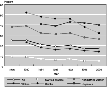
| Year | All | Married couples |
Nonmarried women |
Whites | Blacks | Hispanics |
|---|---|---|---|---|---|---|
| 1976 | 25 | 9 | 38 | -- | -- | -- |
| 1980 | 25 | 9 | 39 | 23 | 52 | -- |
| 1984 | 21 | 7 | 32 | 18 | 48 | 41 |
| 1988 | 19 | 6 | 31 | 16 | 46 | 39 |
| 1992 | 20 | 7 | 32 | 17 | 46 | 43 |
| 1996 | 17 | 5 | 28 | 15 | 38 | 42 |
| 2000 | 17 | 5 | 26 | 14 | 32 | 40 |
| NOTE: -- = not available. | ||||||
Yet, with the exception of Hispanics, each group retained its relative position in poverty between 1976 and 2000. Between 1992 and 1996, elderly blacks and Hispanics exchanged places, with Hispanics becoming the group experiencing the highest poverty rates. Even with the improvements since 1976, however, one-quarter of nonmarried elderly women had income below the poverty threshold in 2000, as did one-third of elderly blacks and 40 percent of elderly Hispanics.
Overall, real median income of the elderly increased by 32 percent between 1976 and 2000 (see the top panel of Chart 3). In addition, all subgroups of the elderly population experienced an increase in real median income. For example, nonmarried women saw a 23 percent increase, and married couples experienced a 31 percent increase. Hispanics' real income increased by only 5 percent between 1984 and 2000, compared with a 36 percent increase for blacks and a 9 percent increase for whites. Between 1976 and 2000, whites' median income rose 32 percent and blacks' rose 36 percent. Most of the improvement in the median income of whites occurred before 1984, whereas for blacks the improvement occurred after 1992. As a result of the rapid increase in median income of elderly blacks after 1992, this group had a higher median income in 2000 than either nonmarried women or Hispanics.
Real median income of the elderly in dollars and as a percentage of income of the working-age population, 1976–2000
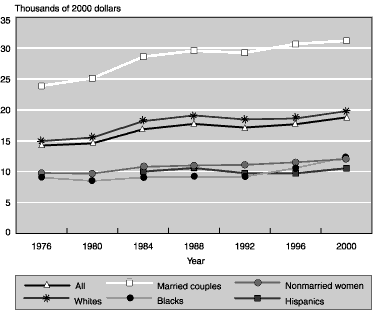
| Year | All | Married couples |
Nonmarried women |
Whites | Blacks | Hispanics |
|---|---|---|---|---|---|---|
| Real median income of the elderly | ||||||
| 1976 | 14,224 | 23,878 | 9,775 | 14,950 | 9,049 | -- |
| 1980 | 14,566 | 25,120 | 9,676 | 15,506 | 8,485 | -- |
| 1984 | 16,855 | 28,590 | 10,773 | 18,165 | 9,066 | 10,010 |
| 1988 | 17,719 | 29,556 | 10,997 | 19,093 | 9,175 | 10,577 |
| 1992 | 17,133 | 29,232 | 11,098 | 18,440 | 9,160 | 9,747 |
| 1996 | 17,669 | 30,669 | 11,505 | 18,607 | 10,590 | 9,717 |
| 2000 | 18,778 | 31,188 | 12,035 | 19,790 | 12,333 | 10,544 |
| Real median income of the elderly as a share of income of the working-age population | ||||||
| 1976 | 51 | 86 | 35 | 54 | 32 | -- |
| 1980 | 56 | 96 | 37 | 59 | 33 | -- |
| 1984 | 63 | 107 | 40 | 68 | 34 | 37 |
| 1988 | 63 | 105 | 39 | 68 | 33 | 38 |
| 1992 | 61 | 104 | 39 | 66 | 33 | 35 |
| 1996 | 62 | 108 | 40 | 65 | 37 | 34 |
| 2000 | 58 | 97 | 37 | 62 | 38 | 33 |
| NOTE: -- = not available. | ||||||
Looking at the overall income of the elderly, relative to the average wage index, the general trend is an improvement between 1976 and 1984, little change between 1984 and 1996, and then a decline after 1996 (see the bottom panel of Chart 3). However, the trend for minorities differs greatly from the overall trend. Blacks essentially saw no change in median income relative to the index between 1976 and 1992 and a slight improvement after 1992. Hispanics' relative income fell throughout the period for which we have information (1984 to 2000). These results suggest that while the real median income of the elderly (the buying power of their income) has increased in recent years, their relative income (the buying power of their income relative to the buying power of the average worker's earnings) has not improved since 1984.
Sources and Relative Importance of Income
The study examined five broad sources of income: Social Security, assets (interest payments, dividends, rent, royalties, and trusts), pensions, earnings, and cash public assistance. Trends in the proportion of the elderly receiving income from the five income sources and in the share of aggregate income derived from each source are shown in Chart 4. This chart shows the relative importance of each source, not the absolute amount of aggregate income. Furthermore, just because the share of income from a certain source decreases (increases) does not necessarily mean that the absolute amount of income from this source decreased (increased). Income generally rose between 1976 and 2000, and it is possible that income from all sources increased, but at different rates.
Sources of income of the elderly, 1976–2000
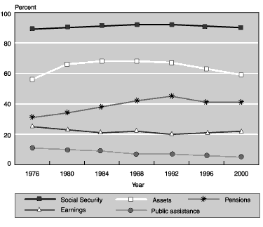
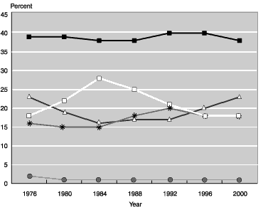
| Year | Social Security |
Assets | Pensions | Earnings | Public assistance |
|---|---|---|---|---|---|
| Percentage receiving income, by source | |||||
| 1976 | 89 | 56 | 31 | 25 | 11 |
| 1980 | 90 | 66 | 34 | 23 | 10 |
| 1984 | 91 | 68 | 38 | 21 | 9 |
| 1988 | 92 | 68 | 42 | 22 | 7 |
| 1992 | 92 | 67 | 45 | 20 | 7 |
| 1996 | 91 | 63 | 41 | 21 | 6 |
| 2000 | 90 | 59 | 41 | 22 | 5 |
| Share of aggregate income, by source | |||||
| 1976 | 39 | 18 | 16 | 23 | 2 |
| 1980 | 39 | 22 | 15 | 19 | 1 |
| 1984 | 38 | 28 | 15 | 16 | 1 |
| 1988 | 38 | 25 | 18 | 17 | 1 |
| 1992 | 40 | 21 | 20 | 17 | 1 |
| 1996 | 40 | 18 | 18 | 20 | 1 |
| 2000 | 38 | 18 | 18 | 23 | 1 |
Social Security
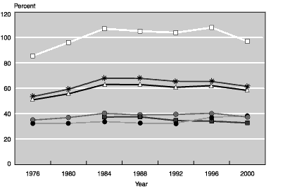
Overall, about 90 percent of the elderly received Social Security income each year over the last quarter of a century (see the top panel of Chart 4). Furthermore, the proportion of each demographic subgroup receiving Social Security remained fairly steady over this period. However, a smaller proportion of minorities received Social Security (88 percent of blacks and 77 percent of Hispanics in 2000) than whites (91 percent in 2000). Part of the explanation for the lower receipt by Hispanics may be recent immigration and immigrants' not having worked the requisite number of quarters in the United States to be eligible for Social Security.7 Note, however, that the groups for which trends are being shown are constantly changing: additional people reach age 65, older people die, and some people immigrate after age 65.
The overall share of aggregate income from Social Security held fairly steady between 1976 and 2000 at about 40 percent (see the bottom panel of Chart 4). Furthermore, Social Security was the largest source of income. These trends have been fairly steady for each racial or ethnic subgroup, but significant differences by marital status exist. As would be expected, Social Security accounted for a larger share of income for nonmarried women (51 percent in 2000) than for married couples (34 percent in 2000) because nonmarried women are less likely to receive income from other sources.
Although the receipt and share of Social Security income were fairly constant, the average real Social Security benefit increased over the past 25 years, for two reasons. First, Social Security benefits have been automatically adjusted for cost-of-living changes since 1972 (with some subsequent adjustments to the indexing formula). Thus, once a retired worker begins to receive benefits, Social Security income keeps up with inflation. Second, each new cohort of beneficiaries receives higher initial benefits than the previous cohort because real wages have been growing since World War II and initial benefits are based on lifetime wages. As Chart 4 shows, income from other sources as a whole has kept pace with Social Security.
Assets
Income from assets is the next most prevalent source of retirement income (see Chart 4).8 The proportion of the elderly receiving asset income increased from 56 percent to 68 percent between 1976 and 1984 but fell to 59 percent in 2000. There are wide disparities by subgroup in the receipt of asset income. In 2000, 63 percent of whites received income from assets whereas less than 30 percent of blacks and Hispanics did.
Income from assets made up the second largest share of aggregate income for the elderly. Asset income grew in importance until 1984--increasing from 18 percent to 28 percent of aggregate income--before falling back to 18 percent by 2000. Large racial and ethnic disparities exist in the share of income from assets, with the share for whites being two to three times that for blacks or Hispanics.
Portfolio experts recommend that older investors invest more heavily in safe, interest-bearing assets such as bonds than in assets with higher but more variable returns such as stocks, which may also produce capital gains. Iams (1994, 66) notes that "the relatively high proportions with asset income among aged beneficiaries may not be indicative of large amounts of asset income, given the widespread ownership of such assets as an interest-bearing checking, saving, or money market account." Kennickell, Starr-McCluer, and Surette (2000) find that a larger proportion of the elderly in 1998 held checking and savings accounts (92 percent), certificates of deposit (33 percent), and cash value life insurance (36 percent) than directly held stocks (20 percent).9 Thus it appears that the elderly are sensitive in their private savings to fluctuations in interest rates. Consequently, part of the explanation for the pattern in the receipt and importance of assets may be the fluctuations in nominal bond yields over the period studied. For example, nominal interest rates and bond yields were high in the early 1980s and relatively low in the 1990s. The yield for 30-year Treasury bonds was about 12 percent in 1984 and 6 percent in 1999; corporate bond yields followed a similar trend. The receipt and importance of asset income to the elderly increased in the early 1980s and declined over the mid-1990s, when interest rates were low. Many elderly persons receive small amounts of income from assets: in 2000, about a quarter of the elderly who received asset income reported less than $250 from this source. For those with little asset income, and therefore fairly small asset values, the decline in interest rates may result in the complete spending of assets.
Pensions
The receipt of pension income increased steadily between 1976 and 1992, from 31 percent of the elderly to 45 percent (see Chart 4). After 1992, the proportion receiving pension income leveled out at 41 percent. The proportion of each subgroup receiving pension income also increased between 1976 and 2000, but large disparities by race and ethnicity existed: 43 percent of whites received pension income in 2000, compared with 33 percent of blacks and only 22 percent of Hispanics. The share of income from pensions fluctuated between 15 percent and 20 percent over this period, with no clear pattern.
Some explanation for the fluctuations in pension receipt and share of aggregate income can be found in policy and labor market changes. Particularly important for older women were changes to protect survivor benefits. The Employee Retirement Income Security Act (ERISA), which was enacted in 1974, provided federal protection of pension benefits. Changes to ERISA in 1984 increased protection for spouses by making joint and survivor annuities the default option for pension payout at retirement (General Accounting Office 1992).10 With a joint and survivor annuity, the surviving spouse (usually the wife) will receive some pension income after the pensioner dies. The General Accounting Office (1992) noted a steady increase of 15 percentage points in the proportion of retired married men who retained a joint and survivor annuity over the first 5 years after the 1984 ERISA changes.
A second development is improved labor market opportunities for certain groups, since access to jobs with better wages and pension coverage will lead to increased pension receipt and income when workers retire. Following civil rights legislation in the 1960s, blacks had access to better jobs (Farley 1996). As those workers retire, they will receive more pension income than did previous cohorts of black retirees. However, after the mid-1970s, real earnings of blacks stagnated (Farley 1996) and pension coverage fell (Chen 2001), perhaps reflecting shifts in the economy away from manufacturing, a sector in which large numbers of blacks were employed (Levy 1998).
The gender gap in pension coverage among full-time workers in the private sector narrowed considerably between 1976 and 1995 as women's pension coverage increased and men's decreased (Johnson 1999; Shaw and Hill 2002). Furthermore, real earnings for women also improved somewhat over this period. In the future, more women will receive pension income, but gender differences in receipt may persist, since men are much more likely than women to work in full-time jobs, and full-time jobs are much more likely to offer pensions as an employee benefit.
The principal factors that relate to pension receipt and share of aggregate income are pension coverage and preretirement earnings. However, the effects of improvements in labor market opportunities for certain groups, as well as the shift from defined benefit plans to defined contribution pension plans, have not been fully realized in terms of pension receipt by today's elderly.
Earnings
The proportion of the elderly receiving income from earnings varied between 20 percent and 25 percent over the past 25 years, with a slight downward trend overall (see Chart 4). Racial and ethnic differences in the receipt of earned income were relatively small--23 percent of whites versus 19 percent of minorities. However, only 11 percent of nonmarried women received income from earnings, compared with 36 percent of married couples, in which either the husband or the wife may work. Overall, the share of aggregate income from earnings had a U-shaped pattern--decreasing from 23 percent in 1976 to 16 percent in 1984 and then rising back to 23 percent in 2000.
Labor force participation of older men (aged 65 to 69) fell until the mid-1980s and then leveled out; older women's participation was steady until the mid-1980s and then increased (Quinn 1999). Retirement has increasingly become a process rather than an event. More and more workers are choosing to leave their full-time career jobs to work part-time in a bridge job or become self-employed before withdrawing completely from the labor force (Bruce, Holtz-Eakin, and Quinn 2000). However, many of those workers applied for Social Security when they first became eligible, at age 62, and receive Social Security benefits in addition to their earnings (Iams 1987).
The economic recessions in the early 1980s and early 1990s may have reduced labor market opportunities for workers aged 65 or older, but the strong economy of the later 1980s and mid-1990s improved them. The improved markets probably increased the earnings of elderly persons who were working, thereby raising the share of aggregate income from earnings for the elderly population as a whole.
Another reason for the changes in earnings may be changes in the retirement earnings test for Social Security beneficiaries. After 1981, the earnings test was eliminated for workers over age 70, and the benefit reduction factor for workers over 65 dropped in 1990 from $1 for each $2 of earnings to $1 for each $3 of earnings above the exempt amount. Furthermore, between 1981 and 1999, the exempt amount increased by 40 percent in inflation-adjusted terms, allowing working beneficiaries to earn more without any reduction in benefits. The retirement earnings test was eliminated altogether in 2000 for Social Security beneficiaries aged 65 or older. Consequently, it is possible that earnings will become a more important source of retirement income in the future.
Taken together, the changing labor force participation of men and women, the increasing use of bridge jobs and self-employment to ease the transition into retirement, fluctuations in the economy, and liberalizations of the earnings test resulted in only modest changes in overall rates of earnings receipt by the elderly during the study period, but they caused larger changes in the share of income from earnings.
Public Assistance
The proportion of the elderly receiving cash public assistance declined from 11 percent in 1976 to 5 percent in 2000 (see Chart 4). All demographic subgroups also experienced a decline, although racial differences remain, with 4 percent of whites, 11 percent of blacks, and 16 percent of Hispanics receiving public assistance income. The share of aggregate income from public assistance has always been low--2 percent in 1976 and about 1 percent in 2000.
The Supplemental Security Income (SSI) program is the major cash public assistance program for the elderly. The elderly SSI caseload of just over 2 million persons in 1976 fell to slightly over 1 million persons in 2000. During this period, median real income of the elderly increased by 32 percent and their poverty rates decreased by 32 percent.
The SSI program has both income and resource (or asset) limits for eligibility.11 As Social Security income increased, SSI payments fell for those receiving both Social Security and SSI. Most SSI beneficiaries also received Social Security (78 percent in 1976 and 64 percent in 2000).
Notes
1. The Social Security Administration's Income of the Population Aged 55 or Older began this tabulation in 1978.
2. The Census Bureau also undertakes the Survey of Income and Program Participation (SIPP), which was developed to improve measurement of income. SSA is currently working on a comparison of results from the SIPP and the Current Population Survey.
3. This section was compiled using the Census Bureau's 1976 and 2000 Current Population Surveys. The CPS is a random sample of the noninstitutionalized population and includes demographic information for family members as well as employment information. The March supplement includes detailed demographic and income information from the previous year. Extracts of elderly individuals (65 or older) from the two CPSs were prepared for analysis, and sample weights were used throughout.
4. See Iams 1995 for a discussion of pension income.
5. Half of the aged units will have income above the median and half will have income below it. The income of the aged unit is not adjusted to account for differences in the number of people in the unit used in calculating the median.
6. The Census Bureau's poverty rate explained earlier for persons aged 65 or older fell from 15 percent in 1976 to 10 percent in 2000, a drop of one-third. Although both poverty measures changed by a similar rate, our poverty rate is higher in magnitude because it considers only individual income (not family income), and it considers married couples, who historically are less likely to be poor, as a single unit rather than as two units.
7. A worker is fully insured for Social Security once he or she has 40 quarters of covered earnings.
8. Asset income includes interest, dividends, rent, royalties, and estates or trusts. The Census Bureau does not include capital gains in its definition of income.
9. The latter percentage does not include stocks in mutual funds, which may therefore underestimate somewhat the proportion holding stocks.
10. Originally, ERISA allowed married retirees to choose a single-life annuity without their spouse's approval, although a joint and survivor annuity was the default option. The Retirement Equity Act of 1984 increased protection for retiring workers' spouses by requiring written spousal consent for a single-life annuity. However, that applies only for defined benefit pension plans and for defined contribution plans that require retirees to annuitize their pension assets (some defined contribution plans allow workers to take lump-sum distributions or phased withdrawals).
11. As Social Security benefits rise above $20 per month, SSI benefits are reduced by $1 for each $1 of Social Security income. In addition, as earnings rise above $65 per month, SSI benefits are reduced by $1 for every $2 of earnings. The income disregards have remained fixed since the start of the program in 1974. Individuals with more than $2,000 in assets and couples with more than $3,000 in assets are not eligible for SSI benefits. From the beginning of SSI to 1984, the asset limits were $1,500 for individuals and $2,250 for couples. Between 1985 and 1989, the limits were gradually increased to their current levels, which have been fixed since 1990.
References
Bruce, Donald; Douglas Holtz-Eakin; and Joseph Quinn. 2000. "Self-Employment and Labor Market Transitions at Older Ages." Mimeo, Boston College.
Chen, Yung-Ping. 2001. Employee Preferences as a Factor in Pension Participation by Minority Workers. Submitted to U.S. Department of Labor under contract.
Danziger, Sheldon, and Peter Gottschalk. 1995. America Unequal. Cambridge, Mass.: Harvard University Press.
Farley, Reynolds. 1996. The New American Reality: Who We Are, How We Got There, Where We Are Going. New York: Russell Sage Foundation.
General Accounting Office. 1992. Pension Plans: Survivor Benefit Coverage for Wives Increased After 1984 Pension Law. GAO/HRD-92-49. February.
Iams, Howard M. 1987. "Jobs of Persons Working After Receiving Retired-Worker Benefits." Social Security Bulletin 50(11): 4-18.
_________. 1994. "Statistical Notes from the New Beneficiary Data Survey," Social Security Bulletin 57(1): 60-71.
_________. 1995. "The 1993 SIPP and CPS Pension Surveys." Social Security Bulletin 58(4): 125-130.
Johnson, Richard W. 1999. The Gender Gap in Pension Wealth: Is Women's Progress in the Labor Market Equalizing Retirement Benefits? The Retirement Project, Brief Series No. 1. Washington, D.C.: Urban Institute.
Kennickell, Arthur B.; Martha Starr-McCluer; and Brian J. Surette. 2000. "Recent Changes in U.S. Family Finances: Results from the 1998 Survey of Consumer Finances." Federal Reserve Bulletin 86: 1-29.
Levy, Frank. 1998. The New Dollars and Dreams. New York: Russell Sage Foundation.
Quinn, Joseph. 1999. Retirement Patterns and Bridge Jobs in the 1990s. EBRI Issue Brief No. 206. Washington, D.C.: Employee Benefit Research Institute.
Shaw, Lois, and Catherine Hill. 2002. The Gender Gap in Pension Coverage: What Does the Future Hold? Washington, D.C.: Institute for Women's Policy Research.
Social Security Administration. Various years. Income of the Population 55 or Older. Washington, D.C.: U.S. Government Printing Office.