A Field Guide to Social Security Distributional Analysis
Research and Statistics Note No. 2017-02 (released December 2017)
The author is with the Office of Retirement Policy, Office of Retirement and Disability Policy, Social Security Administration.
Acknowledgments: The author would like to thank Joni Lavery, Jessie Dalrymple, Richard Chard, Karen Glenn, Eli Donkar, Anya Olsen, and Natalie Lu for many helpful suggestions and feedback.
The findings and conclusions presented in this note are those of the author and do not necessarily represent the views of the Social Security Administration.
Introduction
| AIME | average indexed monthly earnings |
| COLA | cost of living adjustment |
| CPI-E | Consumer Price Index for the Elderly |
| EEA | early eligibility age |
| FRA | full retirement age |
| MINT | Modeling Income in the Near Term |
| RET | retirement earnings test |
| SSA | Social Security Administration |
Assume that you work for a time-pressed policymaker who wants to know how much Social Security benefits would change if the early eligibility age (EEA) of 62 and the full retirement age (FRA) of 67 were increased one year, to 63 and 68, respectively. You construct an example where a woman claims Social Security benefits at age 67, a year before her FRA of 68. Compared with current law, her benefits would drop by 6.7 percent because of the increase in the EEA and FRA.1 This stylized example neatly and efficiently answers the question of how much Social Security benefits would change because the worker's situation is straightforward and does not require demographic or statistical knowledge to understand. You send the example to your boss.
However, your boss responds with follow-up questions. How many people are like that worker? What about people who retire at different ages? Would anyone fall into poverty? To answer these questions, you need to use distributional analysis. Distributional analysis examines how something, such as income, benefits, or height, is distributed across a group of people.2 For instance, using distributional analysis to examine proposed tax changes usually means analyzing the changes according to income levels in a given year. For the EEA/FRA question, Table 1 shows a simple distributional analysis using the Social Security Administration's (SSA's) Modeling Income in the Near Term model, version 7 (MINT7)3 to project the effects of policy changes in 2050.
| Household income quintile (2015 $) | Median percentage change in— | Change in poverty population a | |
|---|---|---|---|
| Individual benefit | Household income | ||
| Total | 0 | 0 | +182,000 |
| 200,444 or more | -1 | 0 | +7,000 |
| 103,985–200,443 | -1 | 0 | +1,000 |
| 60,527–103,984 | -1 | 0 | +12,000 |
| 33,157–60,526 | 0 | 0 | +78,000 |
| 33,156 or less | 0 | 0 | +82,000 |
| SOURCE: Author's calculations from MINT7 projections. | |||
| a. Total does not equal the sum of rounded components. | |||
Table 1 raises further questions, such as why it uses some measures and not others, and why its results appear contradictory (an increase in poverty but no change in household income). This note will address these questions, but for now, just observe that a distributional analysis is more complicated than a stylized example. An analyst could perform a number of breakouts and analyses to determine what was driving results and why. The beneficiary population is composed of a variety of people with dramatically different circumstances. The people in the population can experience a range of effects from a policy change, including no effect at all. It is easy to get lost in seemingly contradictory results, interpreting the statistics, understanding the subgroup composition, and then synthesizing the key information for a nontechnical audience. It takes more time, effort, and persistence to understand distributional analysis than to use stylized examples.
This note describes the use of distributional analysis in Social Security policy discussions by analyzing the distributional effects of three real-life Social Security policy options (hereafter, “the options”). The first section describes the options and their effective dates. The next sections describe the three-step process to create an overview table and the various ways to segment populations when an overview table does not provide enough information. The final sections discuss analyzing results by income quintiles and among population subgroups along with creating stylized examples.
The Options
Typically, a distributional analysis compares the effects of a policy change to the current law, rather than to other options. However, this note compares three proposed policy options to one another and to current law to show how different analysis techniques can change the results for different options.4 Some of the options affect almost all beneficiaries while others are narrowly targeted. They also vary in the magnitude of the effect on benefits, income, and poverty. This note uses the following options to show how to answer common analytical questions:
- CPI-E COLA: Increase the cost of living adjustment (COLA) by the elderly price index.5
- EEA/FRA: Increase the retirement ages.6
- Minimum benefit: Create a minimum benefit up to 125 percent of the monthly poverty level.7
CPI-E COLA Option
The CPI-E COLA option would increase Social Security benefits by using an experimental consumer price index (CPI), which the Bureau of Labor Statistics designed to more closely track the expenses of the elderly (CPI-E).8 This price index generally climbs faster (about 0.2 percentage points per year) than the wage earner price index currently used by Social Security (the CPI-W), in part because the elderly have medical expenses that grow faster than the CPI-W and take up a substantial proportion of their income. Table 2 compares the COLAs based on the two CPIs for a Social Security benefit first received in 2040. The first two columns show the assumed annual growth in the two different COLAs based on the 2012 Trustees Report intermediate assumptions.9 The last two columns show the cumulative effect on the COLAs. For beneficiaries who start benefits in 2040, within 10 years their monthly payments would be almost 32 percent higher under current law, but over 34 percent higher using the CPI-E.
| Year | Annual growth assumption a | Cumulative COLA relative to a 2040 benefit | ||
|---|---|---|---|---|
| CPI-W | CPI-E | CPI-W | CPI-E | |
| 2041 | 2.8 | 3.0 | 2.8 | 3.0 |
| 2045 | 2.8 | 3.0 | 14.8 | 15.9 |
| 2050 | 2.8 | 3.0 | 31.8 | 34.4 |
| SOURCE: SSA (n.d. b). | ||||
| a. Based on Board of Trustees (2012) intermediate assumptions used in MINT7. | ||||
EEA/FRA Option
The EEA/FRA option increases the EEA starting in 2017 and increases the FRA beyond the current law increases starting in 2022. Currently, the EEA is 62, and the FRA is 66 but is scheduled to gradually increase to 67 by 2022.10 This option would begin a gradual EEA increase when the scheduled FRA increase begins in 2017, increasing both the EEA and FRA by 2 months every year until 2022. Both the EEA and FRA would then increase at the rate of 1 month every 2 years without end, as shown in Table 3. For workers turning 62 in 2050 (born 1988), the EEA would be 64 and 2 months and the FRA would be 68 and 2 months.
| For age 62 in— | Current law | Option | ||
|---|---|---|---|---|
| EEA | FRA | EEA | FRA | |
| 2017 | 62 | 66 and 2 months | 62 and 2 months | 66 and 2 months |
| 2022 | 62 |
67 | 63 | 67 |
| 2030 | 62 | 67 | 63 and 4 months | 67 and 4 months |
| 2050 | 62 | 67 | 64 and 2 months | 68 and 2 months |
| SOURCE: SSA (n.d. c). | ||||
Minimum Benefit Option
The minimum benefit option would increase the primary insurance amount—which is based on a worker's highest 35 years of earnings and is used to calculate his or her monthly Social Security benefit—for workers with long careers at low earning levels. Workers who have earned four Social Security credits11 per year for 30 years (or 30 years of coverage) would qualify for a minimum monthly benefit equal to 125 percent of the poverty guideline (about $1,256 per month in 201712). Workers who have less than 30 years of coverage would receive 5 percent of the minimum benefit for each year over 10, as shown in Table 4. For example, a worker with 15 years of coverage would receive a minimum monthly benefit of at least $314. Also, the poverty guideline would be indexed to wage growth after 2017.
| Total years of coverage | Percent of full minimum benefit (%) | Monthly benefit amount (2017 $) |
|---|---|---|
| 30 | 100 | 1,256 |
| 20 | 50 | 628 |
| 15 | 25 | 314 |
| SOURCE: SSA (n.d. d). | ||
The Options: Effective Dates
For the options analyzed in this note, the CPI-E COLA option would have started in 2015 and would affect everyone receiving a COLA in 2015 and later. The EEA/FRA increase would start in 2017 (when the current-law FRA increase begins) for those reaching age 62 in 2017 or later. The minimum benefit option would have started in 2015 but would have affected only newly eligible beneficiaries (for retired workers that means those reaching EEA in 2015 or later). For all the options, it would take decades to substantially affect most of the retired population. For example, an option that affects only those aged 62 or younger in 2015 would take 30 years to affect the population aged 62 to 92 in 2045. Even the CPI-E COLA option, which would affect all beneficiaries in 2015, is a small change that grows over retirement and it would take a couple of decades to see the cumulative effect on the oldest retirees.
Because these options would not affect most of the retired population until decades in the future, this note analyzes projections from MINT7 using records for real individuals from the Census Bureau's Survey of Income and Program Participation (SIPP) matched to their lifetime earnings and Social Security benefits from SSA administrative data to project future work, marriage, and retirement trends (Smith and Favreault 2014). This note examines the effects of these options on retired beneficiaries in 2050, when all the options would have been in effect long enough to affect most retired beneficiaries. See the “Population of Interest and Analysis Year” section for more details.
Starting Point: Overview Table
How to segment the population, measure the population's characteristics, determine the key metrics of interest, and display and explain those key findings to a policymaking audience are among the many choices analysts need to make when conducting distributional analyses. It can be overwhelming. As difficult as all these choices can be for an experienced technical expert, imagine time-pressed policymakers trying to navigate these complex choices. Thus, the more understandable a distributional analysis is, the more useful it is to policymakers and those concerned about the distributional effects of policy changes.
With all these overwhelming choices, an overview table of the results is a helpful starting point. It will not answer all of an analyst's questions, but will answer some basic ones and provide context for deeper data dives. In a time-crunch, if you can only provide one table of results, use an overview table. Table 5 is an overview table comparing all the options and shows the median change in individual benefits, the median change in household income, and the change in the number of people in poverty. These key outcome measures, described in detail later, provide a broad overview of each option's effects at the median and on poverty.
| Option | Median percentage change in— | Change in poverty population | |
|---|---|---|---|
| Individual benefit | Household income | ||
| CPI-E COLA | +2 | 0 | -238,000 |
| EEA/FRA | 0 | 0 | +182,000 |
| Minimum benefit | 0 | 0 | -655,000 |
| SOURCE: Author's calculations from MINT7 projections. | |||
To create an overview table, an analyst follows three steps:
- Choose the population of interest and analysis year.
- Choose the outcome measures.
- Choose the statistics to apply to the outcome measures.
Population of Interest and Analysis Year
Analysts should choose the population of interest carefully as it can be the most important factor in determining the results (other than the policy option itself). Policy changes can affect segments of a population differently. The beneficiary population—those who are receiving Social Security benefits—is the natural starting point for defining a population that would be affected by benefit-rule policy changes. Social Security benefits include those for retired and disabled workers, spouses, and dependent children and parents. No disabled beneficiaries are older than FRA, because they automatically convert to retired-worker beneficiaries at FRA, and no retired workers are younger than the minimum eligibility age of 62. There are also categories of dependent beneficiaries that have no age requirements and can include the worker's parents, spouse, and children.
More than 80 percent of Social Security beneficiaries are aged 62 or older (SSA 2017). Many policy options either explicitly or implicitly exempt younger beneficiaries (such as the EEA/FRA option). Because policy options can affect beneficiaries differently at different ages, it is important to include a range of ages, rather than limiting the population to beneficiaries who are all the same age. Although retired workers cannot receive benefits before age 62, aged surviving spouses (widow(er)s) can start receiving reduced survivor benefits at age 60 and are the youngest of the aged beneficiaries. For this reason, this note's population of interest is current-law beneficiaries aged 60 or older.13
Choosing an appropriate population also means choosing the correct year to analyze them. For survey data, it is usually the most recent year of data available. However, if future projections are available, it would be when the policy changes are effective or have phased in. The options all begin in 2015–2017, but would need decades to achieve their full effect on the aged beneficiary population. Table 6 shows how the options affect the aged population in 2030, 2050, and 2070.14 Using a year closer to the present, such as 2030, would mean only the youngest retirees would be subject to the policy changes.
| Option | 2030 | 2050 | 2070 |
|---|---|---|---|
| CPI-E COLA | 82 | 83 | 84 |
| EEA/FRA | 24 | 70 | 81 |
| Minimum benefit | 10 | 16 | 17 |
| SOURCE: Author's calculations from MINT7 projections. | |||
Table 6 shows that only 24 percent of aged beneficiaries would be affected by the EEA/FRA option in 2030, but the option would affect almost triple that proportion, 70 percent, by 2050 and 81 percent in 2070. In comparison, the percent affected by the CPI-E COLA option effectively peaks by 2030, and by 2050 for the minimum benefit option.15 Using the year 2070 would ensure the highest number of affected beneficiaries in the sample population, but projections are inherently less reliable the farther they go into the future. Choosing the analysis year is a balancing act between projection quality and policy relevance. In this note, I attempt to strike that balance by focusing on current-law beneficiaries aged 60 or older in 2050.
Outcome Measures
In the context of distributional analysis, outcome measures (or the columns in the table) usually measure economic well-being. MINT can report a range of outcome measures affected by Social Security policy changes because of the richness of matched SIPP and SSA administrative data. Table 7 lists common outcome measures, their definitions, the data needed to produce each measure, and the difficulty in obtaining the data.
| Outcome measure | Definition | Data needed to produce | Ease of obtaining data |
|---|---|---|---|
| Individual benefit | An individual's monthly benefit amount | Earnings and claiming age for worker benefit | Easy |
| Household benefit | An individual's monthly benefit amount plus spousal or dependent benefits | Individual benefit amount for each household member | Difficult |
| Individual income | An individual's own income sources, excluding other family members' income | Individual benefit amount plus all other income sources | Difficult |
| Household income | An individual's own income sources plus other family members' income; provides a more comprehensive picture of a beneficiary's financial resources | Individual income for all household members | Very difficult |
| Household poverty | Household income measured relative to the federal government's poverty guidelines, which account for household size | Household income plus household size | Very difficult |
| SOURCE: Author's creation. | |||
The outcome measure most used in Social Security discussions is the individual benefit.16 It is the standard outcome measure used for stylized examples because retired workers are the largest proportion of the beneficiary population and an analyst only needs a worker's earnings history and benefit rules. Using the household benefit as the outcome measure requires knowing about a spouse, if any, and the spouse's earnings history. The household income and household poverty outcome measures require all the information needed for a household benefit plus information about other members of the household and all income sources, which many analysts do not have.
Household income represents the total amount of money a household has in a given year to pay for expenses and save for the future. Social Security benefits are often discussed as a share of household income to indicate the importance of the benefits as an income source (Fisher 2007, Center on Budget and Policy Priorities 2017). Household income data are difficult to obtain because it requires knowing about all possible household income sources, which can mean the individual income of multiple people. It can also be difficult to estimate because data on some income sources (nonspouse coresident income, asset income) are hard to obtain. The change in household poverty status is a measure of changes in household income often used in distributional analyses (Bipartisan Policy Center 2016). It is featured in SSA's MINT results because policymakers expect to see this outcome measure.17 Therefore, this note uses individual benefit changes, household income changes, and poverty changes as outcome measures in its tables.
An analyst also has to determine how to present the outcome measures. For the individual benefit, the current law and policy option dollar amounts, the dollar change in benefits from current law, and the percentage change in benefits are some of the choices. Generally, the analyst should choose whatever presentation method is best for the intended audience. A policymaker without a quantitative background may have different preferences for results than academic researchers looking to replicate the results themselves.
This note uses the percentage change in individual benefits and household income. The percentage change in benefits is faster and easier for a reader to understand than the current law and policy option dollar amounts, which require the user to calculate the differences between them. Displaying projected dollar amounts, in this case in 2050 dollars, would also add another layer of complication, even if the amounts were shown in today's dollars. On the other hand, the percentage change shows the change relative to the underlying benefit or income without requiring any calculation on the part of the reader. It is a commonly used measure to show the change in Social Security benefits and income (Congressional Budget Office 2015; Favreault and Karamcheva 2011).
The note also shows the change in the poverty population because policymakers typically are most interested in the number of people lifted out of, or moved into, poverty due to a policy option.18 Some policymakers also request the percentage point change in the poverty rate, but that calculation requires the size of the overall poor population to understand the magnitude of the change.19 Other ways to show the effect on poverty include the poverty rate and the total number of poor under each option.
Statistics Applied to the Outcome Measures
In distributional analyses, the statistics applied to the outcome measures are usually simple descriptive statistics, such as an average. Deeper research may use regressions, correlations, confidence intervals, and p-values, but for most policymaking audiences, either the mean or the median is appropriate as nontechnical audiences typically are not eager to examine percentiles of the population or other more complicated descriptive statistics.
The median is the statistic that tells you where half the population falls above or below in the distribution for that particular outcome measure. The mean is the sum of all the population's outcomes divided by the population size. Choosing the median, the mean, or some other statistic generally depends on the type of distribution. Typically, the median or both the median and the mean are used to characterize the highly skewed distributions of income.20 For policy effects, the distributions could be highly idiosyncratic, depending on the population and the proposed policy.
Consider the distributions of individual benefit changes under the options in Chart 1. The percentage changes are sorted from low to high and the mean and median benefit percentage changes differ in each option. The starkest difference between the median and mean occurs under the minimum benefit option where the mean change (3 percent) is higher than the 0 percent change that at least 75 percent of the population would receive. The median and mean are closest under the CPI-E COLA option, where the 3 percent mean benefit increase still exceeds the 2 percent median benefit increase, but is in line with the distribution.
Percentage change in individual benefits under the options in 2050, by selected percentiles and the mean
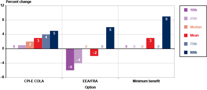
| 10th percentile | 25th percentile | Median | Mean | 75th percentile | 90th percentile | |
|---|---|---|---|---|---|---|
| CPI-E COLA | 0 | 1 | 2 | 3 | 4 | 5 |
| EEA/FRA | -6 | -4 | 0 | -2 | 0 | 6 |
| Minimum benefit | 0 | 0 | 0 | 3 | 0 | 9 |
The easiest, most useful percentile is the 50th percentile, or the median. Other percentiles, such as the interquartile range (between the 25th and 75th percentiles) or the 10th and 90th percentiles, can illuminate the range of the population's outcomes better than a single point. Chart 1 shows how the options' range of outcomes differ from one another. Focusing just on the percentile bars (including the median), the CPI-E COLA option shows a linear distribution pattern, from 0 to 5 percent. The distribution of changes under the EEA/FRA option ranges from −6 percent to 6 percent, with at least 25 percent of the population (those between the median and the 75th percentile) having zero change. Finally, the minimum benefit option shows a 9 percent change for just 10 percent of the population while at least 75 percent of the population has zero change. This makes sense because the minimum benefit option only affects about 16 percent of aged beneficiaries in 2050 (Table 6).
Now that we have the applied the statistics to the outcome measures, let's revisit Table 5, which shows the median percentage change in individual benefits and household income, and the change in the poverty population among beneficiaries aged 60 or older in our selected analysis year, 2050.
At first glance, it looks like the options would not affect individual benefits or household income much and appear to have conflicting effects. The minimum benefit option moves the most people out of poverty and yet shows no change in benefits at the median. None of the options change median household income, but all would increase or decrease the number of people in poverty by over 100,000. The only way to resolve these seemingly contradictory results is to dive deeper into the data.
Beyond an Overview Table: Population Segmentation
When the overview table fails to answer all questions, as it always does, the analyst's first instinct is to question whether the outcome measures or the statistics were the right choice. The analyst may be tempted to change the median to mean, look at household benefit and individual income instead, or start hunting through the subgroup breakouts (such as education, marital status, race, sex, or income) to figure out what is going on. These steps are usually, but not always, premature. Typically, the analyst needs to segment the population, which can be done in a variety of ways, some of which are discussed below.
Segment the Affected Population
When in doubt, question the population definition first. That does not mean that the population of interest is the wrong one, it just needs to be segmented into three subpopulations to answer more questions:
- The affected—those who are actually affected by the policy change and would receive either an increase or reduction in benefits.
- The increased—those who would receive an increase in benefits.
- The decreased—those who would receive a reduction in benefits.
The affected population are those in the population of interest with a change in benefits of at least 1 percent, as shown in Table 8.21 In comparing policy options, the percentage of the population affected by each option and the depth of the change in benefits could be major factors in explaining the overall results. The first step is to learn what those proportions are and how they compare.
| Option | Affected | Decreased benefits | Increased benefits |
|---|---|---|---|
| CPI-E COLA | 83 | 0 | 83 |
| EEA/FRA | 70 | 49 | 21 |
| Minimum benefit | 16 | 0 | 16 |
| SOURCE: Author's calculations from MINT7 projections. | |||
Note that the CPI-E COLA option affects a much higher percentage of beneficiaries but would have less than half the poverty reduction effect of the minimum benefit option (Table 5). This suggests that the minimum benefit option would better target lower earners, and that its effect on benefits would not register for the total aged beneficiary population's median (which only shows when at least half the population would experience a change). The EEA/FRA option produces a more complicated picture: at the median, there would be no change in benefits, but it would reduce benefits for just under half the population and would increase them for over 20 percent. The reduced 49 percent would have their worker benefits reduced more for claiming earlier than the higher FRA. The one-fifth who would receive increases would also face reductions in their worker benefits; but other program rules, such as the retirement earnings test and spousal benefits, would more than offset reductions and produce a net increase.
For all the options, looking at the change in benefits for the overall population of interest (beneficiaries aged 60 or older in 2050) is not sufficient to understand their effects (in fact, the median changes in individual benefits and household income would not distinguish the EEA/FRA option from the minimum benefit option). Nor is it sufficient to know that the minimum benefit option would affect only a small portion of the population and the CPI-E COLA option would affect an overwhelming majority.
It is important to note that comparing the affected population size from any two options can be a mismatch. Table 9 shows that not only do the sizes of the affected populations differ, but the composition of those populations probably differ as well. One group of affected beneficiaries may be richer or poorer, older or younger, or less or more educated than another. However, comparing them can still provide useful information and insights.
| Option | Number affected (thousands) | Percent with college education | Percent in poverty |
|---|---|---|---|
| CPI-E COLA | 72,795 | 59.4 | 3.3 |
| EEA/FRA | 59,860 | 59.4 | 3.4 |
| Minimum benefit | 14,358 | 36.3 | 7.4 |
| SOURCE: Author's calculations from MINT7 projections. | |||
For a more complete picture of all the options, an analyst has to remove the unaffected population and examine the affected population alone. Table 10 shows the same measures as Table 5 but the population is restricted to those affected by the options.
| Option | Median percentage change in— | Change in poverty population a | |
|---|---|---|---|
| Individual benefit | Household income | ||
| CPI-E COLA | +3 | +1 | -230,000 |
| EEA/FRA | -2 | 0 | +175,000 |
| Minimum benefit | +13 | +4 | -655,000 |
| SOURCE: Author's calculations from MINT7 projections. | |||
| a. The poverty numbers differ slightly between the total and affected population because there are beneficiaries who are unaffected individually but who are in a household with income that changes enough to change their poverty status. Also, note that the poverty population is expected to decline over time under current law. For more information, see our Program Explainer https://www.socialsecurity.gov/retirementpolicy/program/poverty-decline.html. | |||
The minimum benefit option has the largest effect on individual benefits, and its larger effect on poverty makes more sense because of the population the option targets. In the total population, the minimum benefit option's greater effect was masked by the smaller proportion affected by it (16 percent compared with 70 percent to 83 percent for the other two options.) In the affected population, the median changes in household income now align with the changes in poverty for the CPI-E COLA and minimum benefit options.
The lack of a change in household income for the EEA/FRA option is due to the affected population including both those with increased benefits and those with decreased benefits. There is a distributional tug-of-war happening between people with increased and decreased benefits across the three outcome measures, which results in median household income remaining unchanged but poverty increasing. The first thought a reader may have is that there must have been a mistake in either modeling the option or in constructing the table. However, note that household income changes less than individual benefits in the other two options. Other income sources dilute the effect of a Social Security change on household income.
Some readers may be skeptical of comparing affected populations. The affected populations for each option are hard, maybe impossible, to compare because they vary so much in size and composition. In addition, some of the affected include individuals with increases, decreases, or a mix of both. Analyzing the affected population is meant only to answer questions about the degree to which the options would change benefits, undiluted by the zero effects from the unaffected beneficiaries. The comparison will not answer every analytical question, especially in cases of mixed effects. Some policymakers and analysts will want deeper analysis of the increased and decreased populations in isolation.
Segment the Affected Population with Mixed Effects
For some options, like the CPI-E COLA, all beneficiaries are affected in the same way, meaning the option increases or decreases benefits for all affected beneficiaries. However, under other options such as the EEA/FRA, the affected population is mixed; that is, some individuals would receive increased benefits and some would receive decreased benefits.
When affected populations have mixed effects, divide the affected population into two subgroups: individuals who would face an increase and individuals who would face a decrease in their benefits. Policymakers may refer to these two groups as “winners” and “losers,” but because those terms can be pejorative, this note uses the terms “increased benefits” and “decreased benefits.” Table 11 shows how those subgroups differ from one another and from the entire affected population under the EEA/FRA option.
| Population subgroup | Percent affected | Median percentage change in— | Change in poverty population | |
|---|---|---|---|---|
| Individual benefit | Household income | |||
| Affected | 100 | -2 | 0 | +175,000 |
| Increased | 30 | +5 | +1 | -163,000 |
| Decreased | 70 | -4 | -1 | +338,000 |
| SOURCE: Author's calculations from MINT7 projections. | ||||
Note that among affected beneficiaries in Table 11, the percentage whose benefits increase under the option (30 percent) is less than half the percentage whose benefits decrease under the option (70 percent). However, the increased population would reduce the number of people who become poor under the option by almost half and would negate the median change in household income for the affected beneficiaries overall. The increased and decreased populations could be analyzed the same way as the overall and affected populations, looking at their composition to learn who they are, how their individual benefits and household income would change, and so on.
Segment the Affected Population to Examine Counterintuitive Effects
Sometimes policy options have a counterintuitive effect. For example, the EEA/FRA option generally is considered a benefit reduction,22 but it sometimes causes benefits to increase. Isolating the increased population allows us to examine in detail how the option produces that result. As explained in Olsen (2012), part of increasing the EEA means that earnings at younger ages are wage-indexed in a later year than they would be. Presently, a worker's earnings are indexed to average wage growth in the period between when they were earned and age 60. Under the EEA/FRA option, earnings would continue to be indexed until 2 years before the new EEA. If a worker's EEA is 65, all earnings before age 65 would be indexed up to age 63 rather than age 60, meaning each year of earnings would be indexed for 3 more years of wage growth.23 For some workers, that indexing would cause their primary benefit to increase enough to offset any reductions resulting from the increase in the FRA (Olsen and Romig 2013).24
The opposite scenario can be seen in beneficiaries receiving decreased benefits under the minimum benefit option, which increases benefits for low earners. Although Table 8 shows 0 percent of current-law beneficiaries in 2050 would receive decreased benefits under the minimum benefit option, that does not mean zero people. There are 385,000 beneficiaries who would receive decreased benefits, or 0.43 percent of the 87.6 million current-law beneficiaries aged 60 or older in 2050. Table 12 sheds a little more light on the characteristics of those 385,000 beneficiaries and hints at why they would receive an overall benefit decrease from an option that only ostensibly increases benefits.
| Characteristic | Percent decreased | Median percentage change in— | Change in poverty population | |
|---|---|---|---|---|
| Individual benefit | Household income | |||
| Total | 100.0 | -2 | 0 | 0 |
| Women | 76.4 | -2 | 0 | 0 |
| Married | 82.8 | a | a | 0 |
| Spousal beneficiary | 66.7 | a | a | 0 |
| SOURCE: Author's calculations on MINT7 projections. | ||||
| a. Insufficient sample size. | ||||
The lack of any change in the poverty population suggests that this group is mostly not poor and not threatened by the option with falling into poverty. In fact, the poverty rate for the decreased beneficiaries is 0.0 percent under current law and the option. Table 12 indicates that two-thirds of the beneficiaries whose benefits would decrease receive a spousal benefit. A spousal benefit is an auxiliary benefit based on the earnings of a higher-earning spouse. A beneficiary can either receive the spousal benefit alone or be dually entitled to both his or her own worker benefit and a spousal or survivor benefit.25 The spousal benefit breakout in Table 12 hints at what proportion of these beneficiaries would receive an individual benefit reduction from a general benefit increase. Let's look at the changes in the worker and spousal benefits separately to make sure that there is no error in how the minimum benefit option is calculated for the worker benefit and to understand how an overall reduction under this kind of option would take place.
Table 13 shows that beneficiaries who end up with overall decreases to their Social Security benefit have an increase in their worker benefit and a substantial decrease in their auxiliary benefit. The net effect of these two changes is a −2 percent change. The dual-entitlement rules drive the large reductions in the auxiliary benefit because they reduce the auxiliary benefit if the worker benefit increases. Some of these beneficiaries will lose their entire spousal or widow(er) benefit while others will lose most of it. These are not always dollar-for-dollar adjustments.26 The takeaway here is that an increase in a worker benefit can cause a benefit reduction overall.
| Benefit type | Median percentage change |
|---|---|
| Worker | +19 |
| Auxiliary | -68 |
| Total (worker plus auxiliary) | -2 |
| SOURCE: Author's calculations from MINT7 projections. | |
In general, policy changes to Social Security rules can cause counterintuitive results for some small proportion of beneficiaries. A couple of current-law rules often drive these results. In addition to auxiliary benefit rules, such as dual-entitlement, the retirement earnings test (RET) can often turn a benefit increase into a decrease and vice versa. This counterintuitive effect is due to how the RET functions: It reduces benefits because of excess earnings before the FRA but permanently increases benefits at FRA to compensate.27
Income Quintile Breakouts
In addition to population segmentation, analysts can break out results by income level. Household income quintiles provide the most comprehensive picture of the financial resources available to an individual because individual income quintiles do not differentiate beneficiaries by the income of spouses or coresident family members, which may be unrelated to the individual's career earnings or individual benefits. Both of these measures focus on money income received in the year of analysis.
Many distributional analyses of Social Security benefits use quintiles based on a lifetime measure of earnings because this measure parallels the program's worker benefit calculations, which are based on the highest 35 years of a worker's earnings (Favreault and Karamcheva 2011). One such measure, shown in Table 14, is shared lifetime earnings. For years when a worker is married, the earnings of both spouses are summed and split equally between them. Shared lifetime earnings provide more accurate comparisons between married and single people. Another possible measure is average indexed monthly earnings (AIME), which orders beneficiaries by the Social Security program's own measure of lifetime earnings.28
| Quintile (2015 $) | Median percentage change in— | Change in poverty population | |
|---|---|---|---|
| Individual benefit | Household income | ||
| Household income | |||
| 200,444 or more | +10 | 0 | -1,000 |
| 103,985–200,443 | +11 | +1 | -5,000 |
| 60,527–103,984 | +12 | +2 | -1,000 |
| 33,157–60,526 | +14 | +5 | -15,000 |
| 33,156 or less | +15 | +11 | -632,000 |
| Individual income | |||
| 110,753 or more | +9 | 0 | -3,000 |
| 58,631–110,752 | +9 | +1 | -4,000 |
| 35,672–58,630 | +13 | +2 | -6,000 |
| 21,676–35,671 | +10 | +3 | -43,000 |
| 21,675 or less | +16 | +8 | -597,000 |
| Shared lifetime earnings | |||
| 120,693 or more | +2 | 0 | 0 |
| 82,627–120,692 | +5 | 0 | 0 |
| 57,676–82,626 | +8 | +1 | -8,000 |
| 35,575–57,675 | +9 | +3 | -54,000 |
| 35,574 or less | +19 | +8 | -593,000 |
| SOURCE: Author's analysis of MINT7 projections. | |||
With MINT projections, an analyst can examine a number of different quintiles to provide different looks at how effects are distributed across the income or earnings spectrum.29 Table 14 shows that different income quintile breakouts provide different results but tell essentially the same story: the lowest quintiles would receive the biggest benefit increases and largest poverty population reductions under the minimum benefit option. However, there are also some substantial differences in the results. For example, the median benefit increase for the highest household income quintile (10 percent) is five times that of the highest shared lifetime earnings quintile (2 percent). This happens because the option provides a benefit increase tied to lifetime earnings (30 years of coverage for the full increase), and it is possible for a lifetime steady low earner to live in a high-income household in 2050 (for example, married to a higher-earning spouse).
As typically happens in distributional analyses of simulated or survey microdata, digging deeper into the results prompts more questions. Table 14 poses one such question: How can there be people in the highest household income quintiles who are also below the poverty line? This is due to a mismatch between the income sources used for household income versus poverty status: The official poverty guidelines do not include income from assets, while the household income measure does.
Analyze Differences and Similarities Among Subgroups
A major benefit of distributional analysis is that it can explain the effects of policy changes by subgroups that are typically unavailable in stylized examples. To return to the Introduction's stylized example, we only have results for a single worker retiring at age 67. What about the benefit change for a married couple who both claim benefits at age 70? Microsimulation models (such as MINT) and survey data allow us to analyze the different ways a policy change can affect unique groups within the population of interest. This section will look at the ways a population can be broken out into subgroups to analyze how a policy option can affect those subgroups differently or similarly.
Subgroups can range from those that help understand the given population, like sex, race, education, and marital status, to policy lever groupings such as income, earnings, poverty status, or program-specific thresholds. The particular subgroups available for an analysis mainly depend on the richness of the underlying data.
Table 15 shows the effects by age group for each of the options. The benefit increase under the CPI-E COLA option increases as a beneficiary ages because the difference between the current law COLA and the CPI-E COLA option compounds the longer a beneficiary receives benefits. The table also shows that even decades after the minimum benefit option begins to phase in by birth cohort (in this case, for newly eligible beneficiaries in 2015 and later), the younger beneficiaries will have larger effects because not all of the oldest old (those aged 90 or older) were subject to the benefit increase. Beneficiaries aged 90 or older in 2050 were aged 55 or older in 2015, so only those who were aged 55 to 62 would be affected, while those who were aged 63 or older in 2015 would not be affected.30
| Age group | CPI-E COLA | EEA/FRA | Minimum benefit |
|---|---|---|---|
| 60–69 | +1 | -5 | +16 |
| 70–79 | +2 | -3 | +13 |
| 80–89 | +4 | -1 | +10 |
| 90 or older | +6 | +2 | +12 |
| SOURCE: Author's calculations from MINT7 projections. | |||
The EEA/FRA option results are perhaps the most interesting, which makes sense because the option is age-based. The reductions would be highest for the youngest retirees, because as the EEA and FRA continue to increase, individuals in the 60–69 age group have to wait longer to start benefits. The 2 percent increase for the age 90 or older subgroup may seem curious because they had no change in their own EEA or FRA, but, for the majority of this subgroup, the benefit increase comes from a reduction in their early claiming penalty because of the option's effects on the RET.31
It is critical to understand that the effects of policy changes on a descriptive group are mostly indirect and better explained with prescriptive subgroup breakouts. Table 16 shows the effects of the options by marital status, which is a descriptive group for these options (but it would be a prescriptive group for an option that changed survivor benefits, for example).
| Marital status | CPI-E COLA | EEA/FRA | Minimum benefit |
|---|---|---|---|
| Married | +2 | -3 | +13 |
| Divorced | +3 | -2 | +14 |
| Widowed | +4 | -2 | +12 |
| Never-married | +2 | -3 | +16 |
| SOURCE: Author's calculations from MINT 7 projections. | |||
Readers may wonder why the minimum benefit option increases benefits more for never-married beneficiaries than for widowed beneficiaries, and the CPI-E COLA option provides widowed beneficiaries with the largest benefit increase, yet neither option changes rules by marital status. The effect by marital status is an indirect effect of the options, and the factor driving both odd-seeming results is the one that relates directly to the options: Age.
Table 17 shows the age breakdowns for the total, widowed, and never-married beneficiary populations. Widowed beneficiaries as a group are older than the overall aged beneficiary population and much older than the never-married. More than 60 percent of the widowed subgroup is aged 80 or older compared with just under 20 percent of the never-married group. Because of their older ages, the widow(er)s would receive more years of cumulative increases from the CPI-E COLA option. Never-married beneficiaries are younger and therefore would have smaller benefit increases under the CPI-E COLA option.
| Age group | Total a | Widowed | Never-married |
|---|---|---|---|
| 60–69 | 30 | 11 | 43 |
| 70–79 | 37 | 28 | 38 |
| 80–89 | 25 | 39 | 15 |
| 90 or older | 9 | 23 | 4 |
| SOURCE: Author's calculations from MINT7 projections. | |||
| NOTE: Rounded components of percentage distributions do not necessarily sum to 100. | |||
| a. I am using the total, rather than the affected population, to make a more general point about subgroup composition regardless of how many individuals are affected by a particular option. The mix of people in a subgroup drives how many of the subgroup are affected. | |||
Table 18 shows the same populations as Table 17 but shows the differences between AIME quintiles instead of age groups. The AIME quintiles are the “paying AIME,” meaning the AIME that pays the highest possible benefit. For retired workers, this will be their own AIME calculated from their earnings records. For dually entitled and spousal- or survivor-only beneficiaries, this will be their spouses' AIME calculated from their spouses' earnings records.
| AIME quintile (2015 $) | Total a | Widowed | Never-married |
|---|---|---|---|
| 11,316 or more | 20 | 25 | 11 |
| 7,742–11,315 | 20 | 24 | 15 |
| 5,466–7,741 | 20 | 20 | 17 |
| 3,488–5,465 | 20 | 16 | 24 |
| 3,487 or less | 20 | 15 | 33 |
| SOURCE: Author's calculations from MINT7 projections. | |||
| a. I am using the total, rather than the affected population, to make a more general point about subgroup composition regardless of how many individuals are affected by a particular option. The mix of people in a subgroup drives how many of the subgroup are affected. | |||
Table 18 shows that more of the never-married are lower lifetime earners (more than half are in the lowest two AIME quintiles) than widow(er)s and all aged beneficiaries. In part, this is because they do not have spousal or survivor benefits in addition to their own worker benefits; they are more typical of the long-working, low-wage worker that the minimum benefit is designed to help. More widow(er)s are in the upper AIME quintiles and are therefore less affected by the minimum benefit.
Descriptive subgroups, although informative, cannot explain how or why the results turned out a certain way. Therefore, it is important to look at results by the prescriptive subgroups. Depending on the policy option, some subgroups (such as adjusted gross income [AGI] quintiles) are not related to the options and serve as quasi-descriptive groups but can still be used for analysis.
All of these possible analytical breakouts can be overwhelming to sort through and understand. The different income measures especially show different results, although they can tell a similar story in some situations. The amount of correlation between any two income measures used for MINT distributional analysis (such as household income and shared lifetime earnings) is generally less than 40 percent.32
Although all of these breakouts are unnecessary in every analysis, analysts often must find a balance between digging deep enough to understand what is happening and creating confusion from information overload. The tricky part is that this balance can be different for each analysis, depending on how many people an option affects, how much it affects them, and why.
However, sometimes the audience needs something simpler, and that is when the overview table discussed earlier can be useful; but if an overview table is too complicated or does not cover the points that the analyst or policymaker wants to address, then a stylized example may be the best choice. Even in that situation, distributional analysis can be useful in constructing detailed stylized examples.
Creating Stylized Examples
Creating a stylized example from distributional results requires simplifying the details and nuances in results for a population. There are two general approaches to doing this: simple and specific.
The simple approach presents the results for one subgroup as a stylized example. For example, showing how the CPI-E COLA option would affect the oldest old might be useful because they receive the most years of benefits. The following simple stylized example is created from Table 15:
Simple stylized example: The average 90-year-old beneficiary in 2050 would have a 6 percent increase in benefits under the CPI-E COLA option compared to current law.
The 90-year-old beneficiary mentioned above could be male or female, widowed or married, rich or poor. Table 19 shows a specific stylized example that works better if you want a more relatable, but narrower, example. One could generate increasingly narrower subsets as long as the sample size remained large enough to avoid disclosure issues.
| Subgroup | Sample size | Median percentage change in individual benefits |
|---|---|---|
| Affected widowed women, age 90, in the middle household income quintile | 29 | +6 |
| SOURCE: Author's calculations from MINT7 projections. | ||
Specific stylized example: The average 90-year-old widowed woman in the middle household income quintile who is affected by the CPI-E COLA option would receive a 6 percent increase in benefits compared to current law.
The results in Table 19 show that sample size prevents us from applying more than five characteristics and it equals the median percent change in the simple stylized example above. Although the subset described in Table 19 creates a more relatable example, the tradeoff is that it requires more time and work to produce it.
Conclusion
Distributional analysis is a complicated endeavor requiring care and skill to understand the quality and availability of relevant data, define the population of interest, choose the appropriate analytical measures, and communicate sometimes counterintuitive results that can be confusing to policymakers.
However, distributional analysis can go much further than stylized examples to explain and analyze the varied effects of proposed policy changes. This note has suggested some standard steps for conducting and presenting distributional analyses. It analyzed the distributional effects of three Social Security policy options to show the advantages and disadvantages of different analytical approaches.
The key is to start with an overview for the population of interest and to think through the outcome measures and statistics that would work best to show the effects of the policy option. An overview cannot answer all questions, so deeper analyses of the effects should look at subgroups that are actually affected by the option and possibly separating out subgroups with increased benefits or income versus subgroups with decreases to their benefits or income.
Distributional analysis can also show the policy effects on household income and poverty. Future research could focus on further developing ways to communicate these analyses so they are easier to understand and produce.
Notes
1 For more information on calculating early retirement penalties, see https://www.socialsecurity.gov/oact/quickcalc/early_late.html.
2 The widely used term could mean the distribution of income, specific characteristics, or a policy's effects across a population. A more descriptive label is “population analysis” or, in Social Security's case, “beneficiary analysis.”
3 The MINT7 data used for this brief are based on the 2012 Trustees Report (Board of Trustees 2012). For more information on MINT7, see SSA (n.d. a and n.d. e).
4 I chose these options strictly for demonstration purposes and you should not infer any support or lack of support in choosing these options and not others. My aim was to show options with very different effects to make this note more applicable to different analytical situations.
5 For more information on the CPI-E option, see SSA (n.d. b).
6 For more information on the EEA/FRA option, see SSA (n.d. c).
7 For more information on the minimum benefit option, see SSA (n.d. d).
8 The Bureau of Labor Statistics created the CPI-E as directed by the Older Americans Act of 1987. For more information, see https://www.bls.gov/cpi/cpieart2009.pdf.
9 The CPI-W growth rate is available at https://www.bls.gov/opub/ted/2012/ted_20120302.htm.
10 For details on the current EEA and FRA, see https://www.socialsecurity.gov/planners/retire/agereduction.html.
11 In 2017, a worker must earn $1,300 to earn one credit and $5,200 to earn four credits in a year. For more information, see https://www.socialsecurity.gov/planners/credits.html.
12 Based on the annual poverty threshold ($12,060) for a single person for the 48 contiguous states and the District of Columbia. See the official poverty guidelines at https://aspe.hhs.gov/poverty-guidelines.
13 Specifying “current law” here distinguishes from nonbeneficiaries under current law who may become beneficiaries because of a policy option.
14 This note only compares benefits to scheduled benefits, which assumes that promised benefit levels are paid. If the trust funds are depleted and no action is taken, then payable benefits will be lower than scheduled benefits.
15 Although all beneficiaries receiving benefits for more than 1 year would be affected by the CPI-E COLA option by 2017, the change in benefits remains under 1 percent for the first couple of years.
16 For examples, see http://www.cbpp.org/blog/raising-social-securitys-retirement-age-cuts-benefits-for-all-retirees, http://www.cbpp.org/research/why-the-presidents-social-security-proposals-could-ultimately-lead-to-the-unraveling-of, and https://www.aei.org/publication/social-security-do-earned-benefits-stand-in-the-way-of-effective-reforms/.
17 For examples, see https://www.socialsecurity.gov/retirementpolicy/projections/retirement-age/increase-fra-and-eea-2030.html and Figure 2 of Bipartisan Policy Center (2016), which shows poverty rates under scheduled benefits, payable benefits, and the Commission package, but requires the reader to compare three different bars to roughly estimate the change in the poverty rate. For a discussion of other ways to calculate changes in household poverty, see http://www.aei.org/publication/how-much-does-social-security-really-reduce-poverty/.
18 For example, see http://www.cbpp.org/research/social-security/social-security-keeps-22-million-americans-out-of-poverty-a-state-by-state.
19 Small subgroups, such as the divorced, may have high poverty rates and large percentage point changes but may involve a smaller absolute change in the number in poverty than a lower percentage point change for a larger population.
20 The Census Bureau shows the median (http://www.census.gov/data/tables/2016/demo/income-poverty/p60-256.html) while the 2013 Survey of Consumer Finances (SCF) shows both median and mean (http://www.federalreserve.gov/pubs/bulletin/2014/pdf/scf14.pdf). Note that the SCF shows decreasing median income and increasing mean income from 2010 to 2013.
21 Other examples of analyses of affected populations include examinations of the Social Security taxable maximum (Whitman and Shoffner 2013) and price indexing options that are targeted at higher earners (Sarney 2010).
22 For example, consider a male worker who plans to claim benefits at age 67, his FRA under current law. If the EEA/FRA option is enacted and this worker's FRA is adjusted to 68 but he still claims benefits at 67, his monthly benefit would be reduced for claiming earlier than his FRA. Workers who claim at the same age under the policy option as they would under current law have a larger benefit reduction for early retirement and a smaller benefit increase for delayed retirement (Olsen and Romig 2013).
23 The EEA is tied to a number of other benefit rules that can cause other unanticipated changes in benefits (Vinkenes and others 2007).
24 Some benefit increases result from decreases in the reduction for early retirement because of interactions between the EEA/FRA option and the earnings test rules, as described in Olsen and Romig (2013).
25 Dual entitlement reduces the spousal benefit by the amount of the worker benefit so that the total benefit received still roughly equals the total spousal benefit amount. For example, assume a worker qualifies for a $20 spousal benefit and an $8 worker benefit (on his or her own work record). This worker would receive the $8 worker benefit and get “topped up” $12 to make a total benefit of $20.
26 To continue the example in the previous footnote, assume the $8 worker benefit is reduced 25 percent for early claiming and drops to $6. Assume the beneficiary claims the spousal benefit at FRA and it stays at $12, so the total benefit under current law would be $18. If the minimum benefit increased the worker benefit before reductions from $8 to $12, the “topped up” spousal benefit would drop from $12 to $8. The worker benefit would drop 25 percent to $9 because of the claiming reduction, and so the total benefit would be $17; $1 less than current law.
27 The RET reduces benefits before the FRA depending on how far earnings exceed a threshold but increases benefits permanently at FRA according to how many months of benefits were lost or reduced before FRA. For more information, see https://www.socialsecurity.gov/retirementpolicy/program/retirement-earnings-test.html.
28 The AIME is used to calculate all benefits. The worker's highest 35 years of earnings are indexed to the average wage when the worker is age 60, summed, and divided by 420 (35 years times 12 months) to produce monthly terms. For more information on how the AIME is calculated, see https://www.socialsecurity.gov/OACT/COLA/Benefits.html.
29 Earnings quintiles are often used as proxies for income quintiles because most income of the working-age population is from wages and because earnings data can be easier to obtain than income data.
30 Note that spousal and widowed beneficiaries in the age 90 or older subgroup in 2050 may not be eligible for the minimum benefit if the spouse whose earnings record provides the auxiliary benefit was older than 62 in 2015.
31 A quirk in the RET rules spreads reductions to both the worker and the spouse who receive benefits based on that worker's earnings record. If the spouse receives a higher or lower benefit under the option than under current law because the spouse's own EEA or FRA changes, that benefit change can bounce back to affect the worker's reductions under the RET, which then changes the worker's early retirement penalty recalculation at FRA.
32 Author's calculation of correlation based on MINT7.
References
Bipartisan Policy Center. 2016. Report of the Commission on Retirement Security and Personal Savings. Washington, DC: BPC https://bipartisanpolicy.org/wp-content/uploads/2016/06/BPC-Retirement-Security-Report.pdf.
[Board of Trustees] Board of Trustees of the Federal Old-Age and Survivors Insurance and Federal Disability Insurance Trust Funds. 2012. The 2012 Annual Report of the Board of Trustees of the Federal Old-Age and Survivors Insurance and Federal Disability Insurance Trust Funds. Washington, DC: Government Printing Office. https://www.socialsecurity.gov/oact/TR/2012/tr2012.pdf.
Center on Budget and Policy Priorities. 2017. “Policy Basics: Top Ten Facts about Social Security.” http://www.cbpp.org/research/social-security/policy-basics-top-ten-facts-about-social-security.
Congressional Budget Office. 2015. Social Security Policy Options, 2015. Washington, DC: CBO. https://www.cbo.gov/sites/default/files/114th-congress-2015-2016/reports/51011-SSOptions_OneCol-2.pdf.
Favreault, Melissa, and Nadia Karamcheva. 2011. How Would the President's Fiscal Commission's Social Security Proposals Affect Future Beneficiaries? Washington, DC: Urban Institute. http://www.urban.org/research/publication/how-would-presidents-fiscal-commissions-social-security-proposals-affect-future-beneficiaries/view/full_report.
Fisher, T. Lynn. 2007. “Measuring the Relative Importance of Social Security Benefits to the Elderly.” Social Security Bulletin 67(2): 65–72. https://www.socialsecurity.gov/policy/docs/ssb/v67n2/v67n2p65.html.
Olsen, Anya. 2012. “Mind the Gap: The Distributional Effects of Raising the Early Eligibility Age and Full Retirement Age.” Social Security Bulletin 72(4): 37–46. https://www.socialsecurity.gov/policy/docs/ssb/v72n4/v72n4p37.html.
Olsen, Anya, and Kathleen Romig. 2013. “Modeling Behavioral Responses to Eliminating the Retirement Earnings Test.” Social Security Bulletin 73(1): 39–58. https://www.socialsecurity.gov/policy/docs/ssb/v73n1/v73n1p39.html.
Sarney, Mark. 2010. “Distributional Effects of Price Indexing Social Security Benefits.” Policy Brief No. 2010-03. https://www.socialsecurity.gov/policy/docs/policybriefs/pb2010-03.html.
Smith, Karen E., and Melissa M. Favreault. 2014. A Primer on Modeling Income in the Near Term, Version 7 (MINT7). Washington, DC: Urban Institute. http://www.urban.org/research/publication/primer-modeling-income-near-term-version-7-mint7.
[SSA] Social Security Administration. 2017. Fast Facts & Figures About Social Security, 2017. SSA Publication No. 13-11785. Washington, DC: SSA. https://www.socialsecurity.gov/policy/docs/chartbooks/fast_facts/2017/fast_facts17.html#page10.
———. n.d. a. “MINT Overview.” https://www.socialsecurity.gov/policy/about/mint.html.
———. n.d. b. “Policy Option Projections: Cost of Living Adjustment Changes. Increase the Cost of Living Adjustment.” https://www.socialsecurity.gov/retirementpolicy/projections/colas/CPI-E-2050.html.
———. n.d. c. “Policy Option Projections: Retirement Age Changes. Increase the EEA from 62 and the FRA from 67.” https://www.socialsecurity.gov/retirementpolicy/projections/retirement-age/increase-fra-and-eea-2050.html.
———. n.d. d. “Policy Option Projections: Worker Benefit Changes. Reconfigure the Minimum Benefit.” https://www.socialsecurity.gov/retirementpolicy/projections/worker-benefit/minimum-benefit-2050.html.
———. n.d. e. “Projection Methodology.” https://www.socialsecurity.gov/retirementpolicy/projection-methodology.html.
Vinkenes, Pat, Alice Wade, Mark Sarney, and Tim Kelley. 2007. “Considerations for Potential Proposals to Change the Earliest Eligibility Age for Retirement.” Policy Brief No. 2007-01. https://www.socialsecurity.gov/policy/docs/policybriefs/pb2007-01.html.
Whitman, Kevin, and David Shoffner. 2013. “The Projected Effects of Social Security Benefit Increase Options for Older Beneficiaries.” Policy Brief No. 2013-01. https://www.socialsecurity.gov/policy/docs/policybriefs/pb2013-01.html.